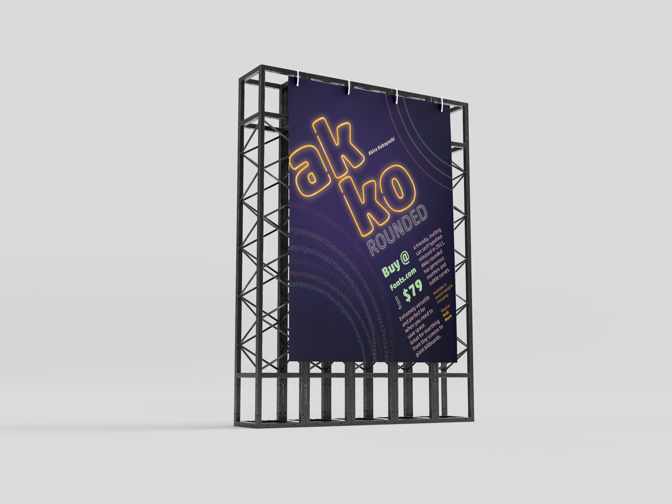

In one of my classes, we were given the task to create a promotional print poster for a typeface for fonts.com. I was assigned Akko Rounded. Akira Kobayashi wanted to design a font that exhibited a “fun, friendly” nature. I wanted to highlight that feeling and the curves of the style of the font in my poster.
Beginning Ideas
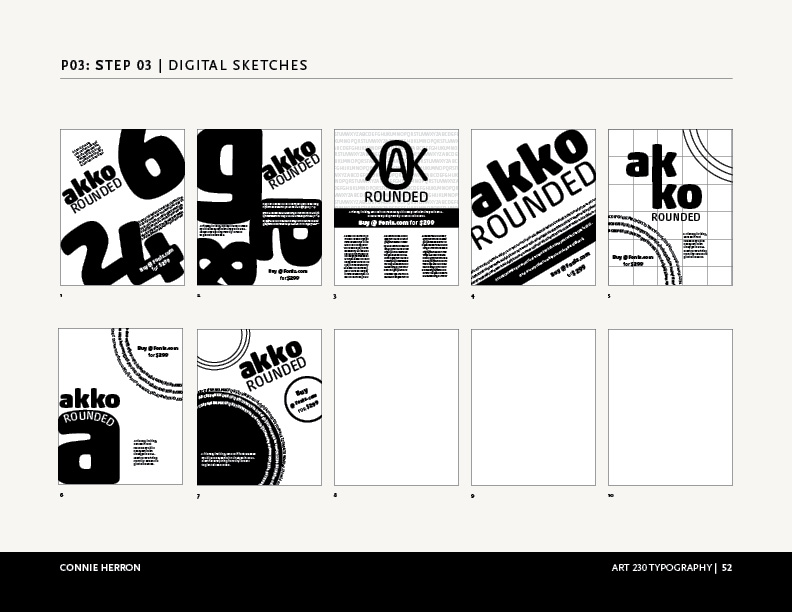
As I first started working on ideas, I played with several different ways information could be placed on the poster. I needed to have the name of the font, the designer, cost to purchase it, where to purchase it, the font, and historical background. Focusing on negative space, alignment and overlapping seemed to work the best for as I tried to visualize this. The longer I worked with Akko Rounded the more I felt like I was moving towards designing a poster from the Eighties. So, why not take it that direction as much as possible?
Final Version
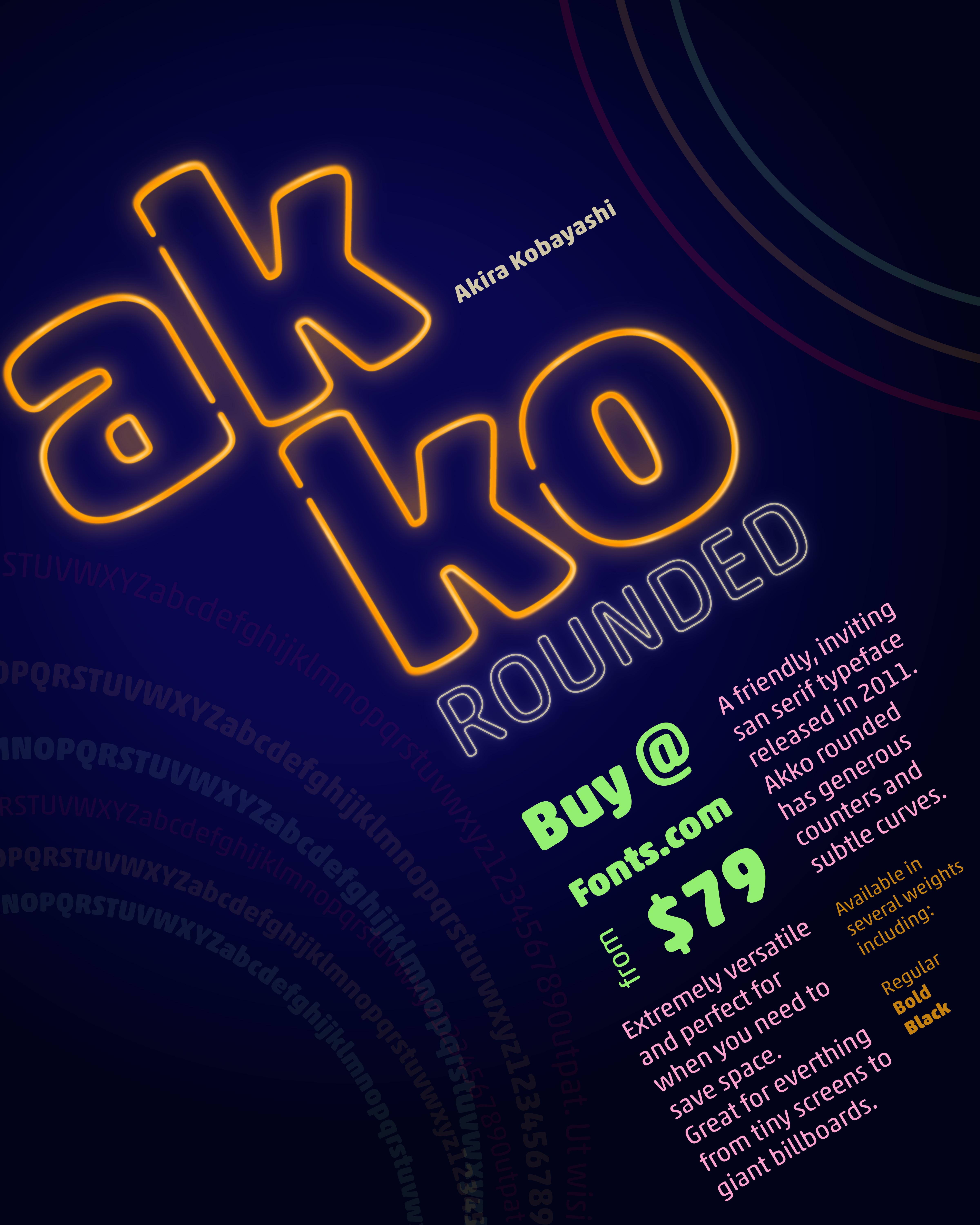
I chose a neon pallet for the poster and created a neon effect on the name, “Akko Rounded”. I wanted the rings to feel like they were flashing in the background. I gave the information about where to buy it and the amount the next level in the hierarchy, with its color and placement. The sizes and other details are next in the grid surrounding that information. Then, I placed all of that on the diagonal instead of keeping it vertical to give it visual interest. This is what allowed me to add movement to the circles in the corners. I also used the circles to create some asymmetrical balance by having one be the font weights.
I enjoyed working on this project and with Akko Rounded. It is, as described, a fun and friendly typeface.
Leave a Reply