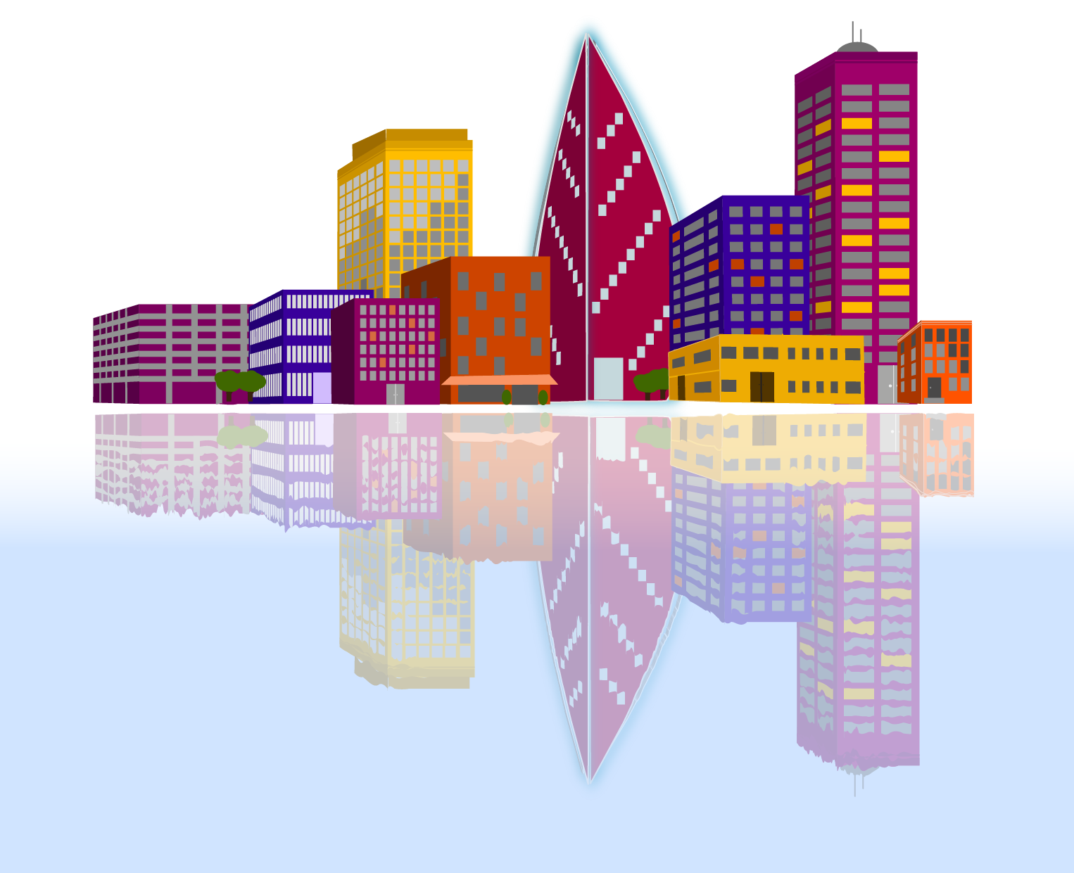
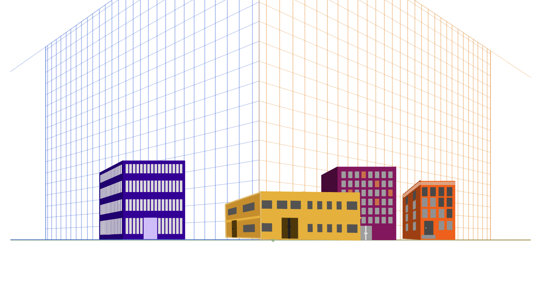
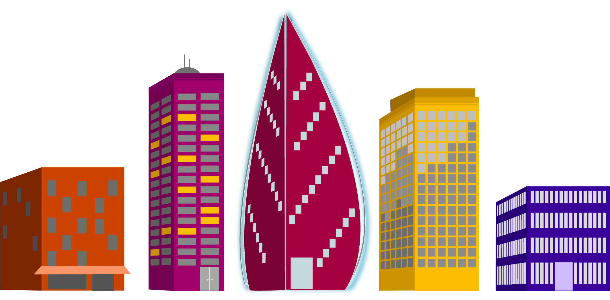
For a recent project we were given the task to create a relected city using a provided grid. My first task was to decide on my color pallet. I like to use coolers color generator for this. Once I had my colors, I began to create my buildings.
We were given a list of buildings to create. 4 small “supporting” buildings, 3 medium “generic” buildings, 2 large “interesting” buildings, and 1 skyscraper. I had decided I wanted my skyscraper to have a modern feel, and then created buildings that were a bit more modern to go with it as well. It’s a city that is working towards revitalization.
As I created the buildings I tried to think about the direction of the sun in the final scene and how it might be reflecting on the windows. I also thought about where light might be coming from lights being on inside.
The last step was to layer them together and then reflect that city. I created a gradient on a layer beneath the reflected layer, then used the warp tool to create waves in the lines of the reflected buildings.
The project itself earned the stamp of approval from my daughter and that’s good enough for me.
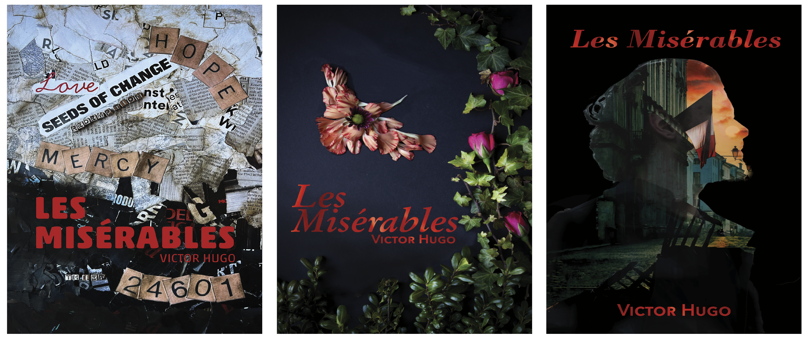
Another school project completed in April 2023 was a redesign the cover from a classic novel. We were to create three unique covers focusing on aspects of the book using different design techniques. Additionally, we were to work to find deeper meanings within the book, rather than the traditionally popular themes.
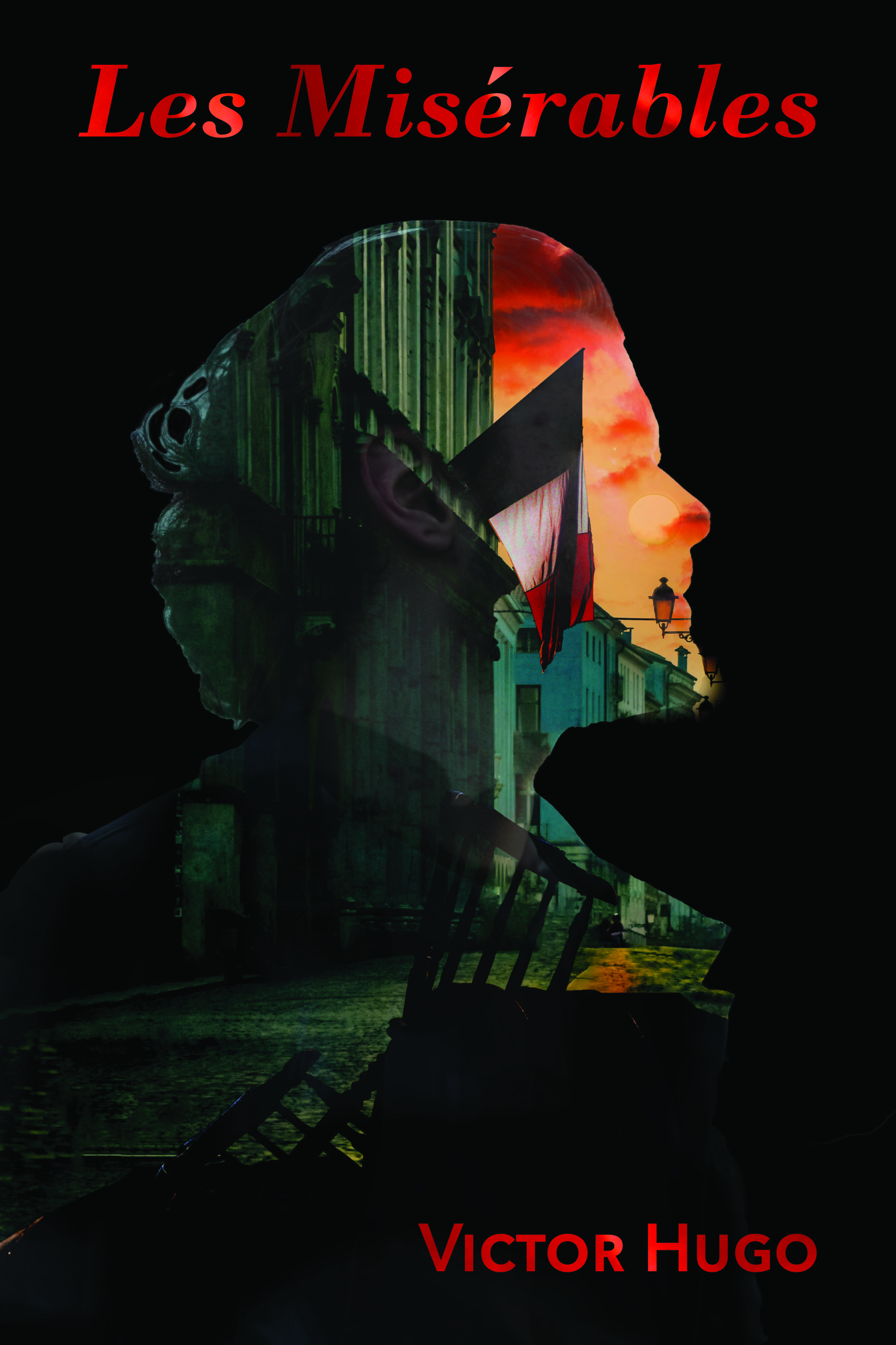
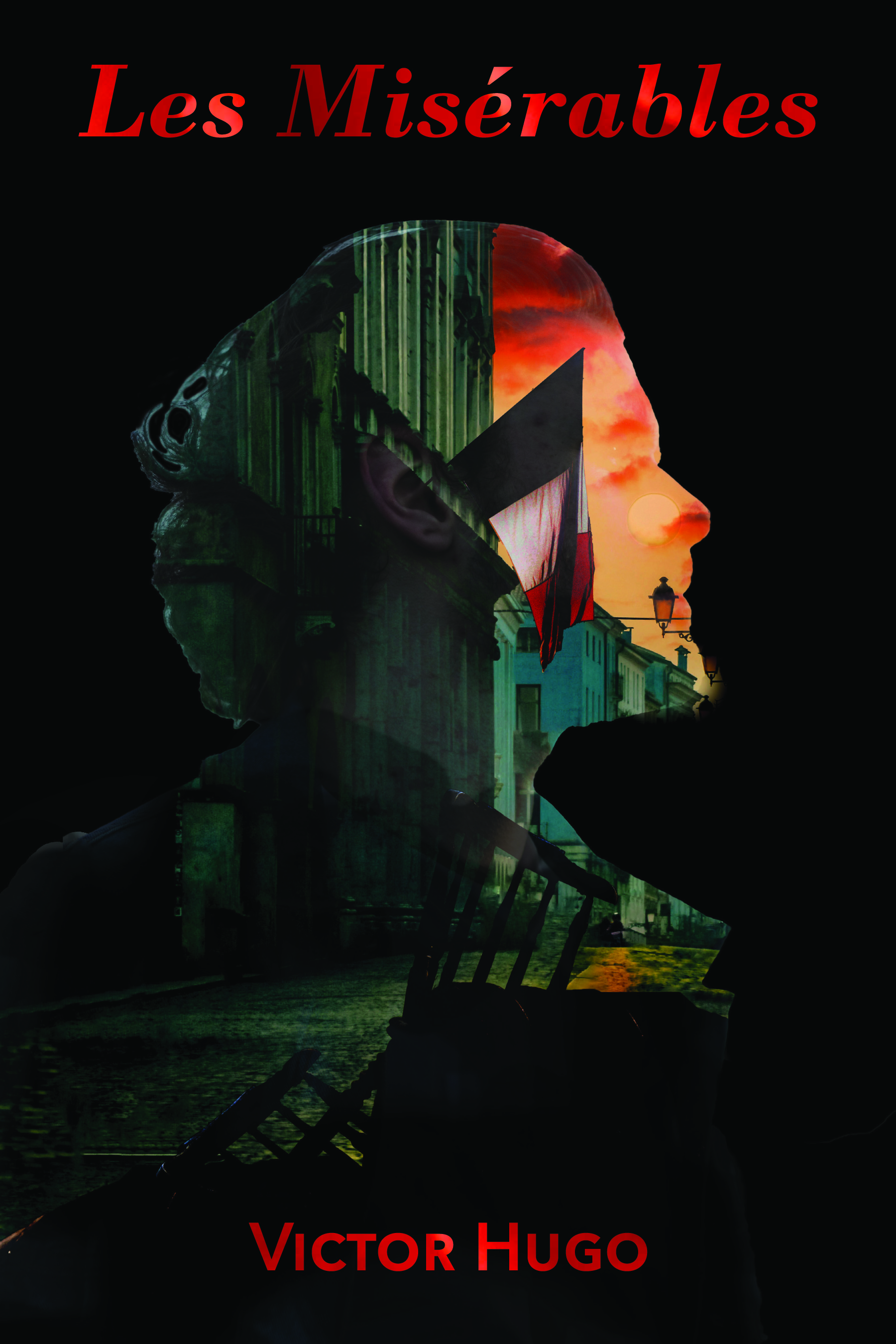
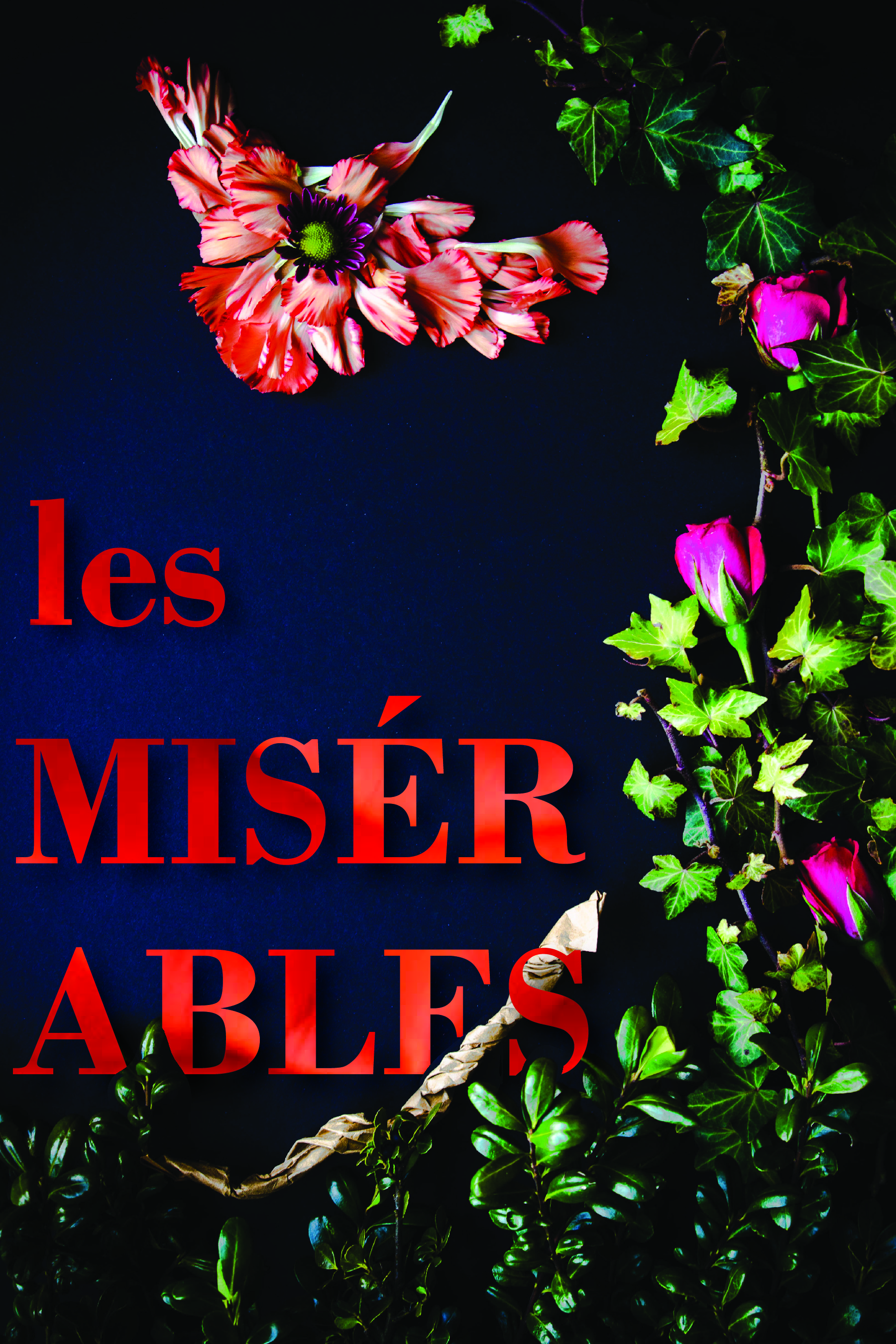
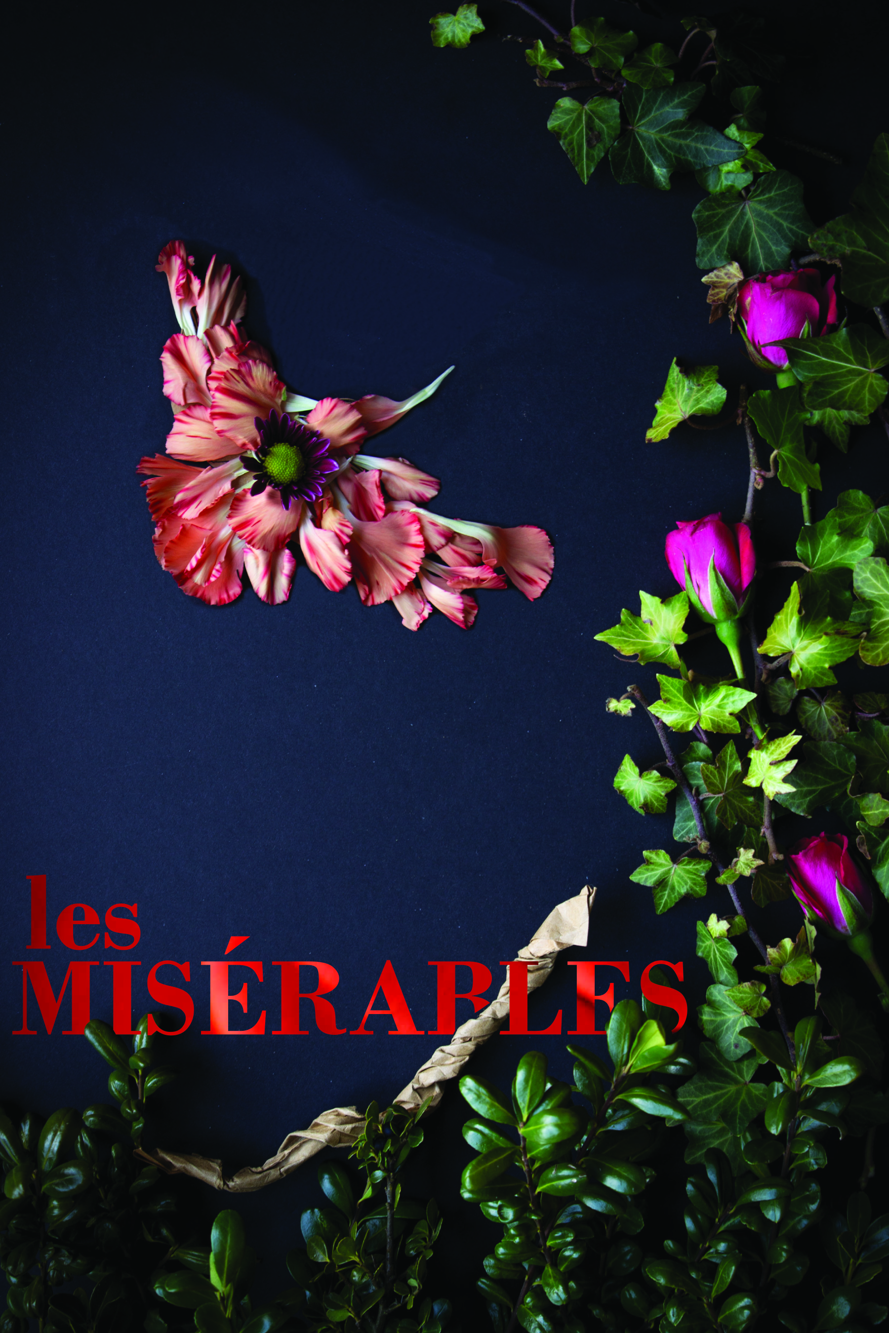
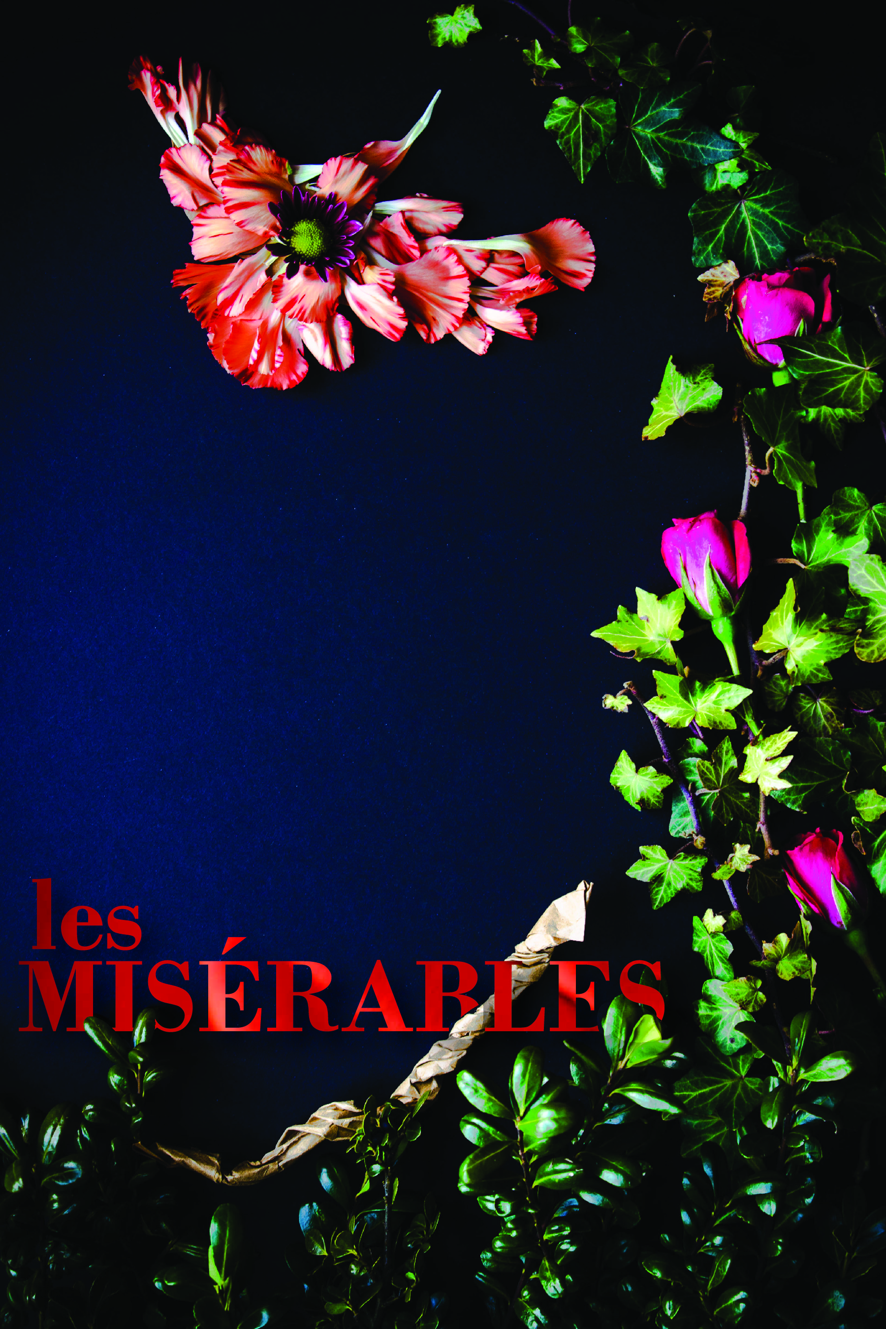
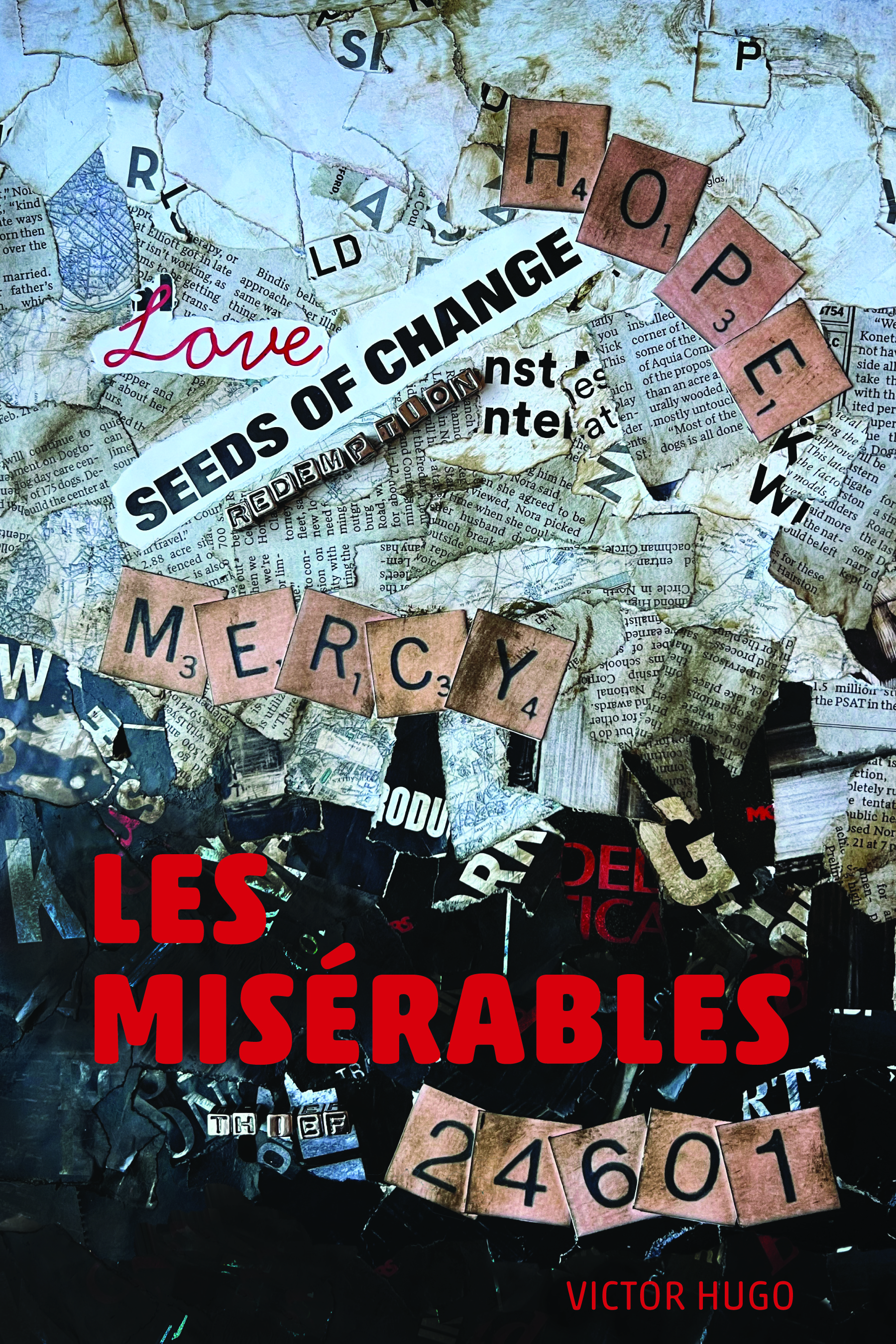
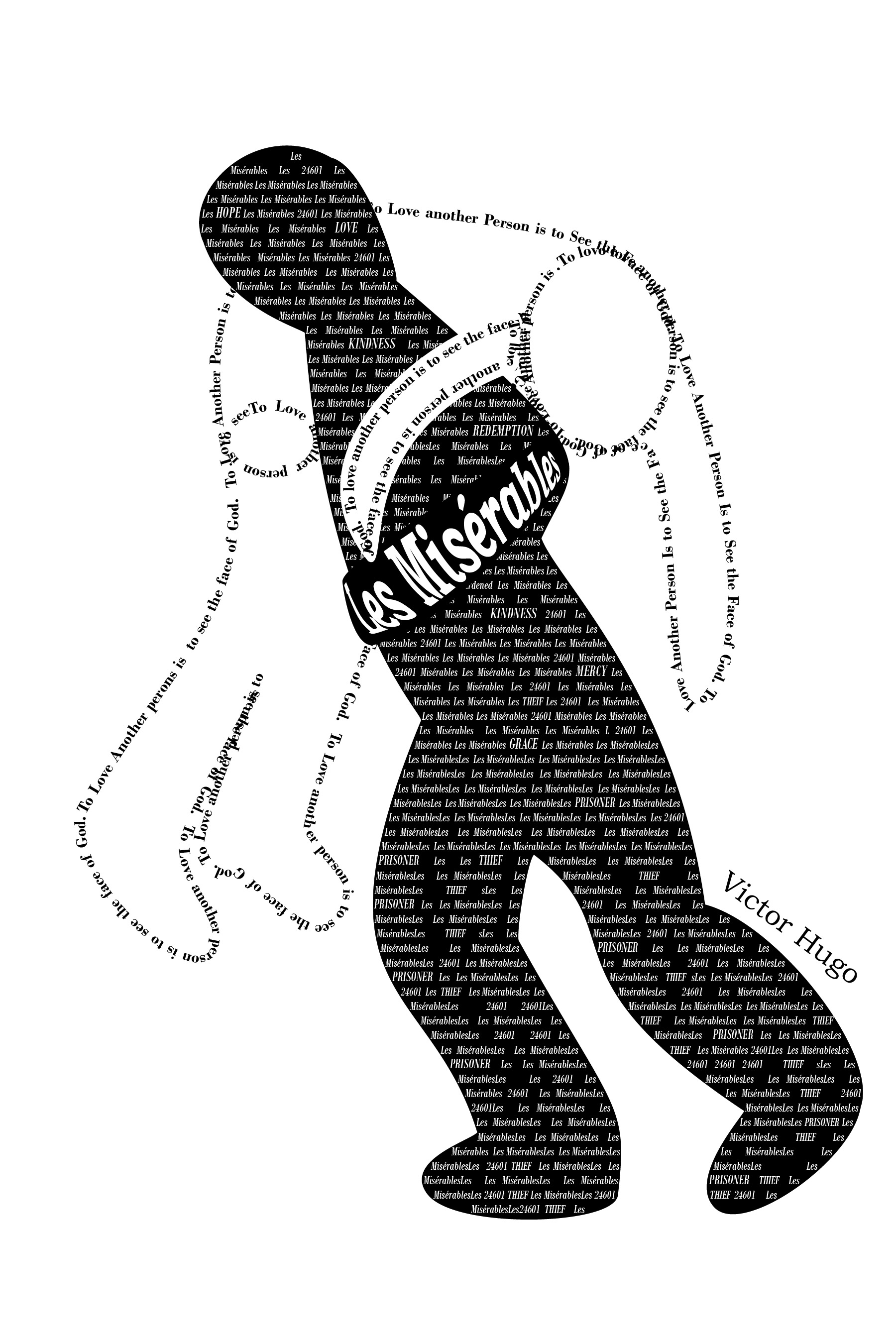
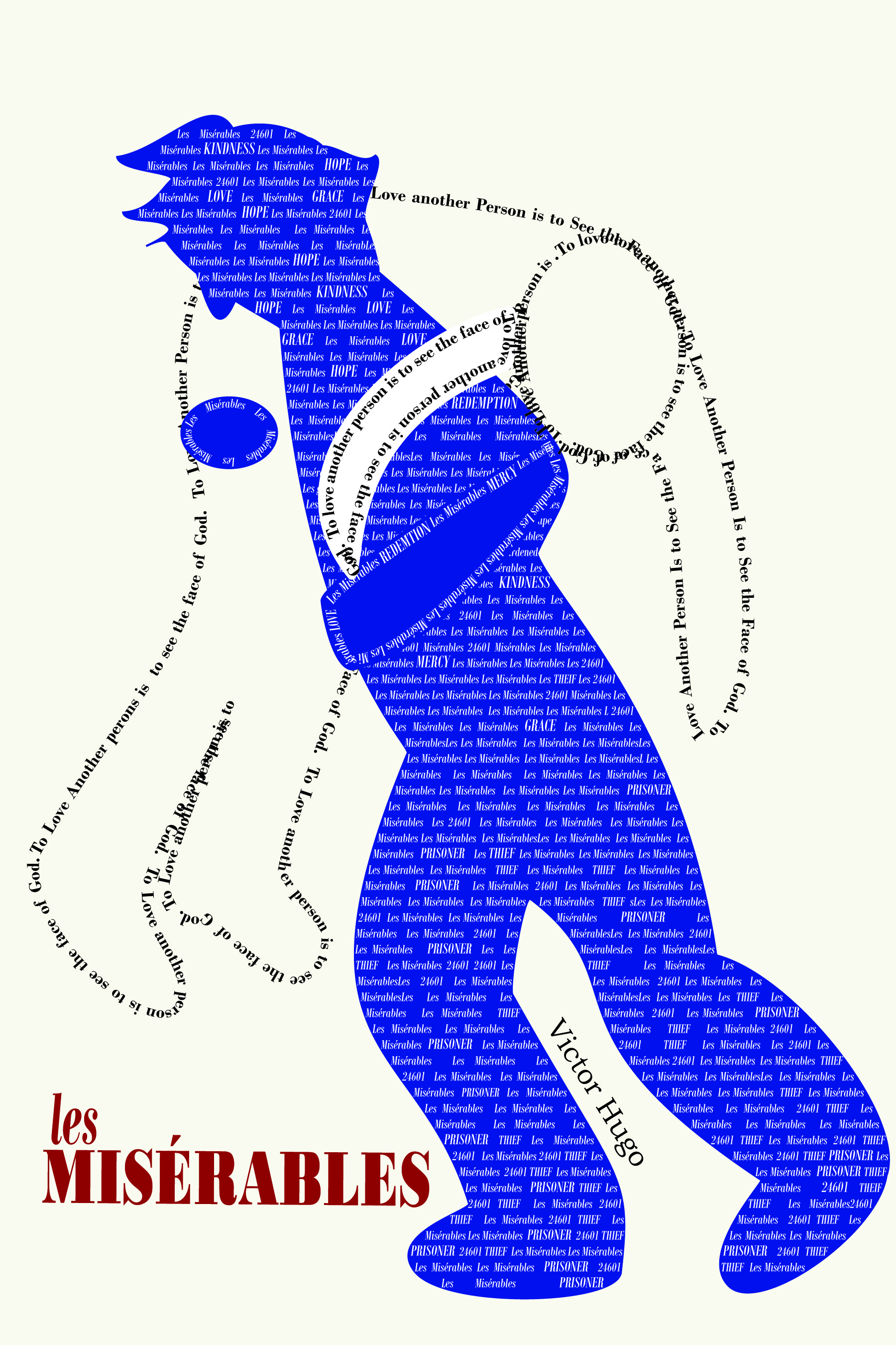
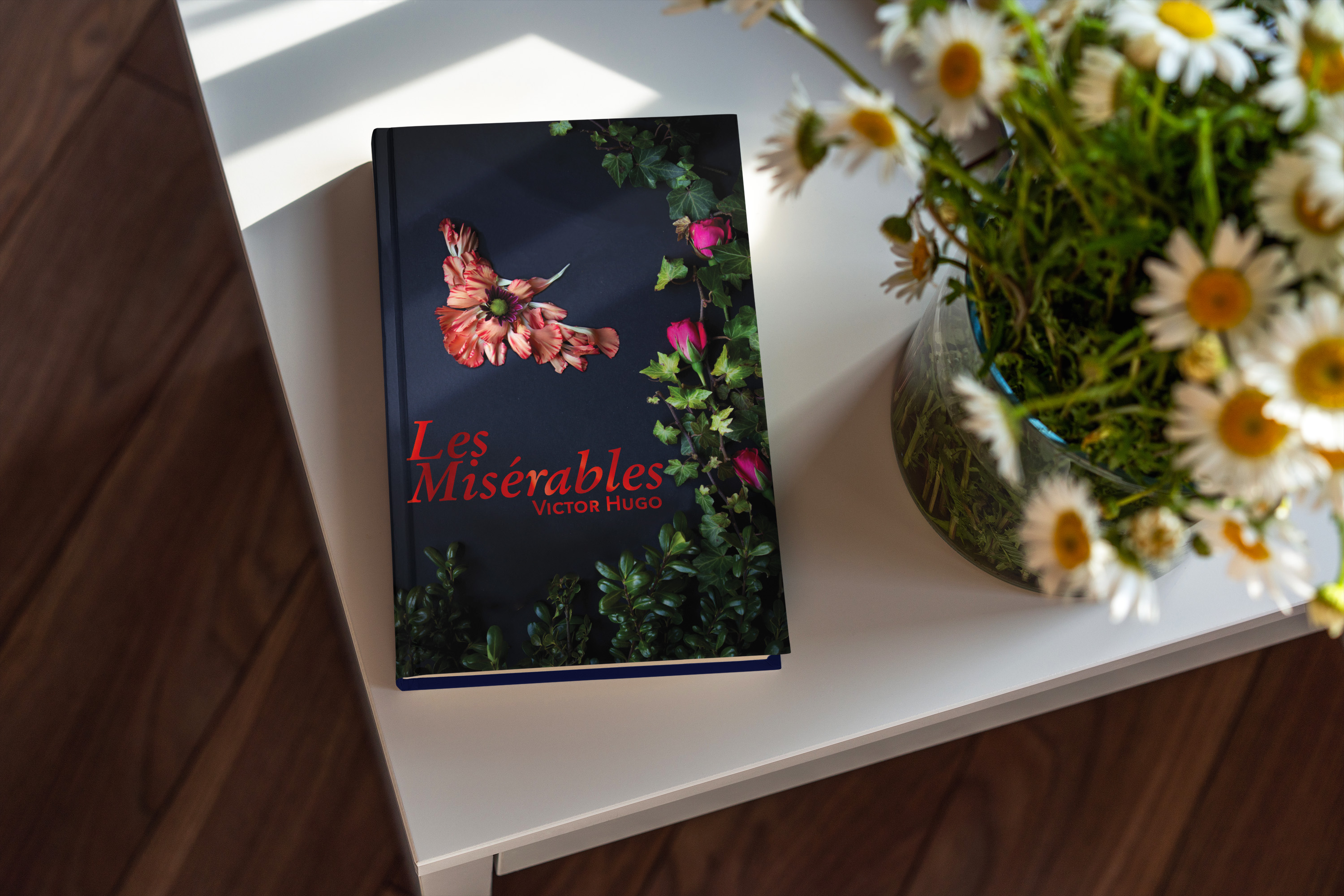
One of my favorite books that was on our list was Les Misérables. After some additional research into the themes of the book, I found several that could be explored for covers. I especially liked Hugo’s use of birds to describe some characters and I wanted to include that motif.
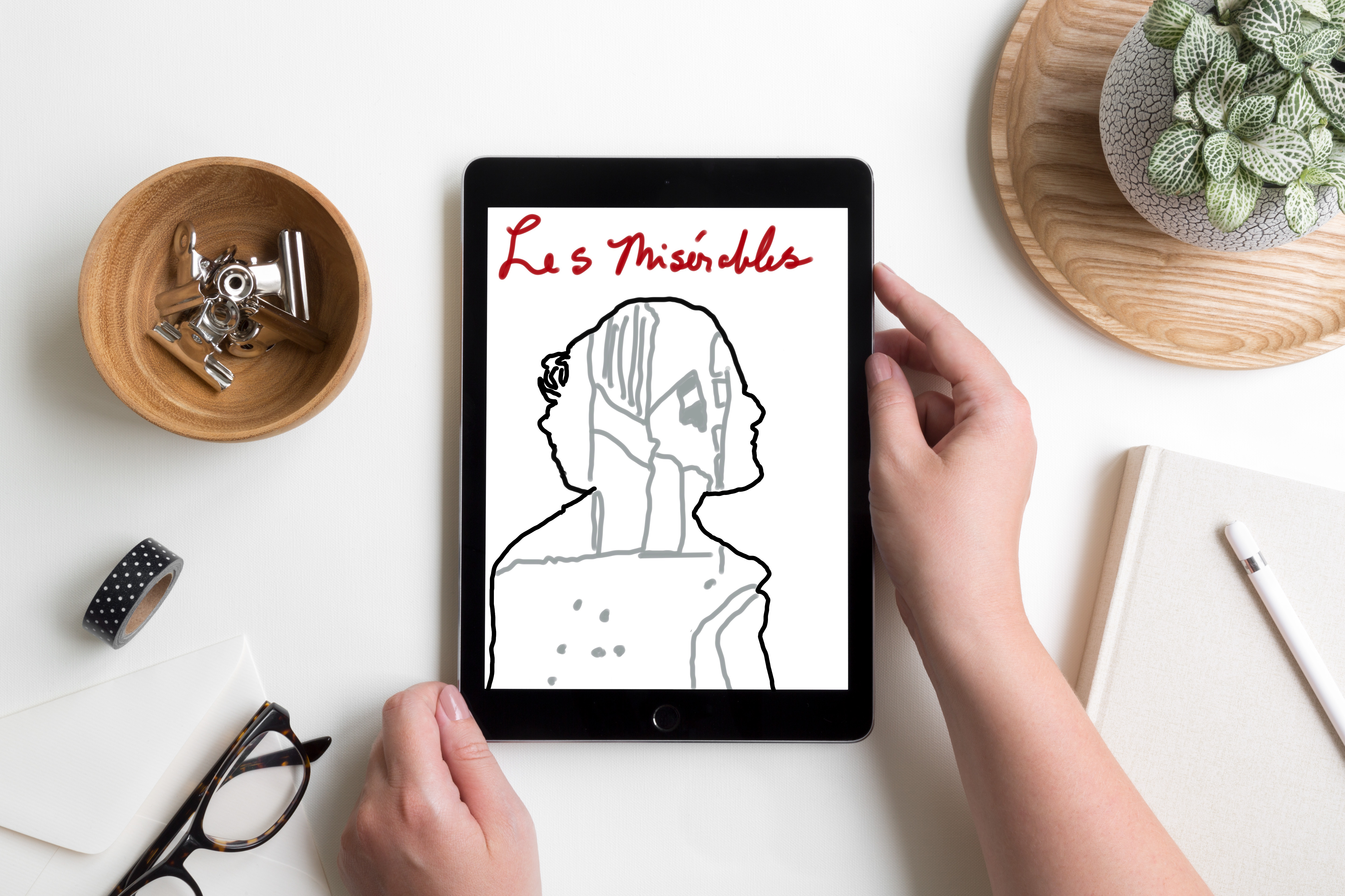
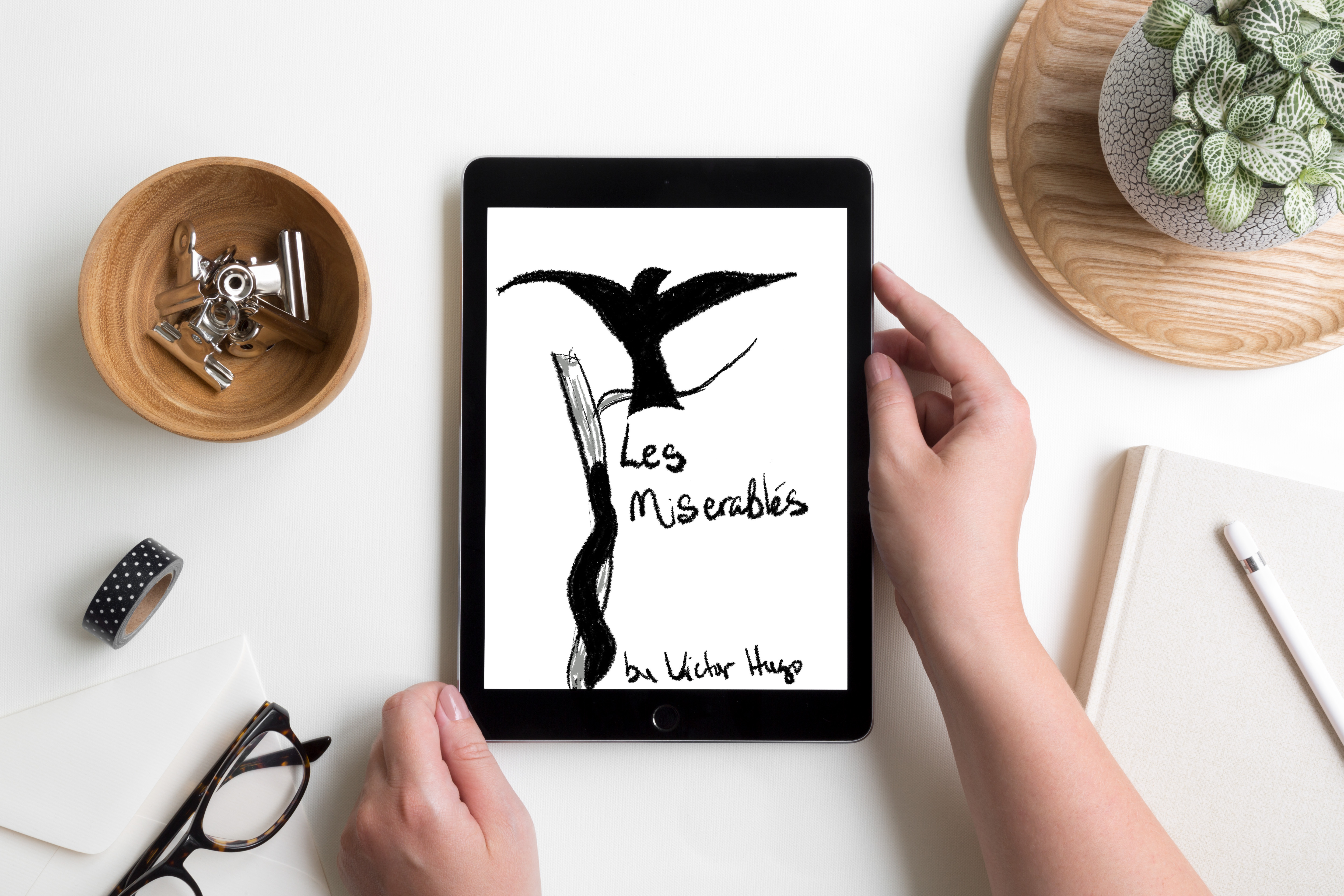
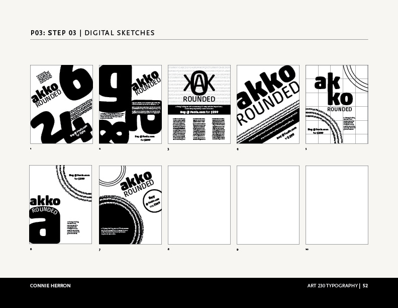
Physical & Digital Sketches
My initial sketches were rough, but I had ideas about where I wanted to go with each one. Once I had sketched out some thoughts I moved on to playing with digital sketches. There were several iterations as I tweaked and refined each cover.
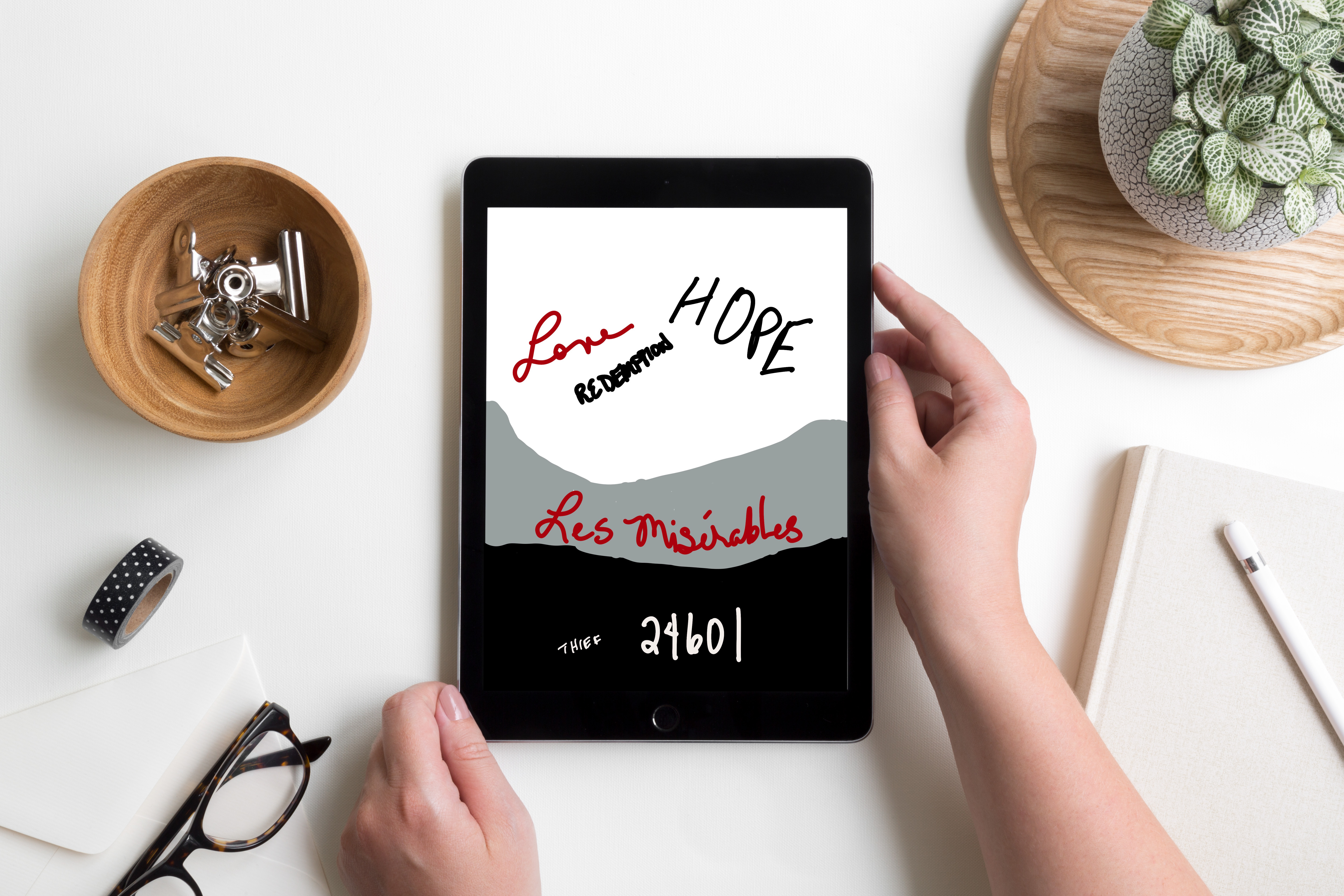
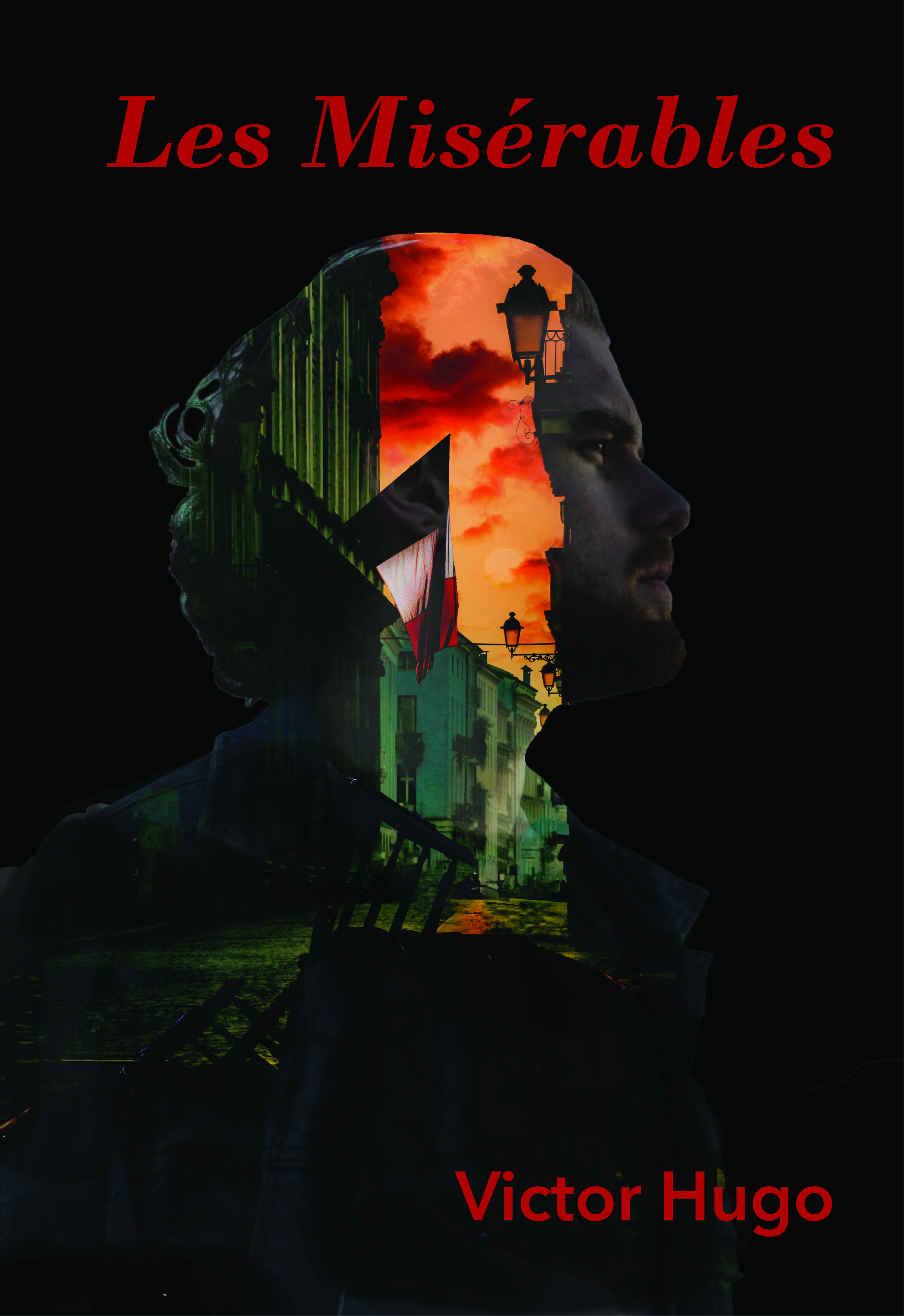
Final Designs
For this first cover, I found two quotes about Cossette by Hugo. In the first one, he describes her as a Lark. I found it interesting that a Lark can’t fully sing until it flies. Then, at another point, Hugo says, “Cosette was not very timid by nature. There flowed in her veins some of the bohemian and the adventuress who runs barefoot. It will be remembered that she was more of a lark than a dove. There was a foundation of wildness and bravery in her.” I used elements from my garden to create the border as well as the bird. I took macro shots of some of the flowers then used them as background for the letters of the font of the title and the author’s name.
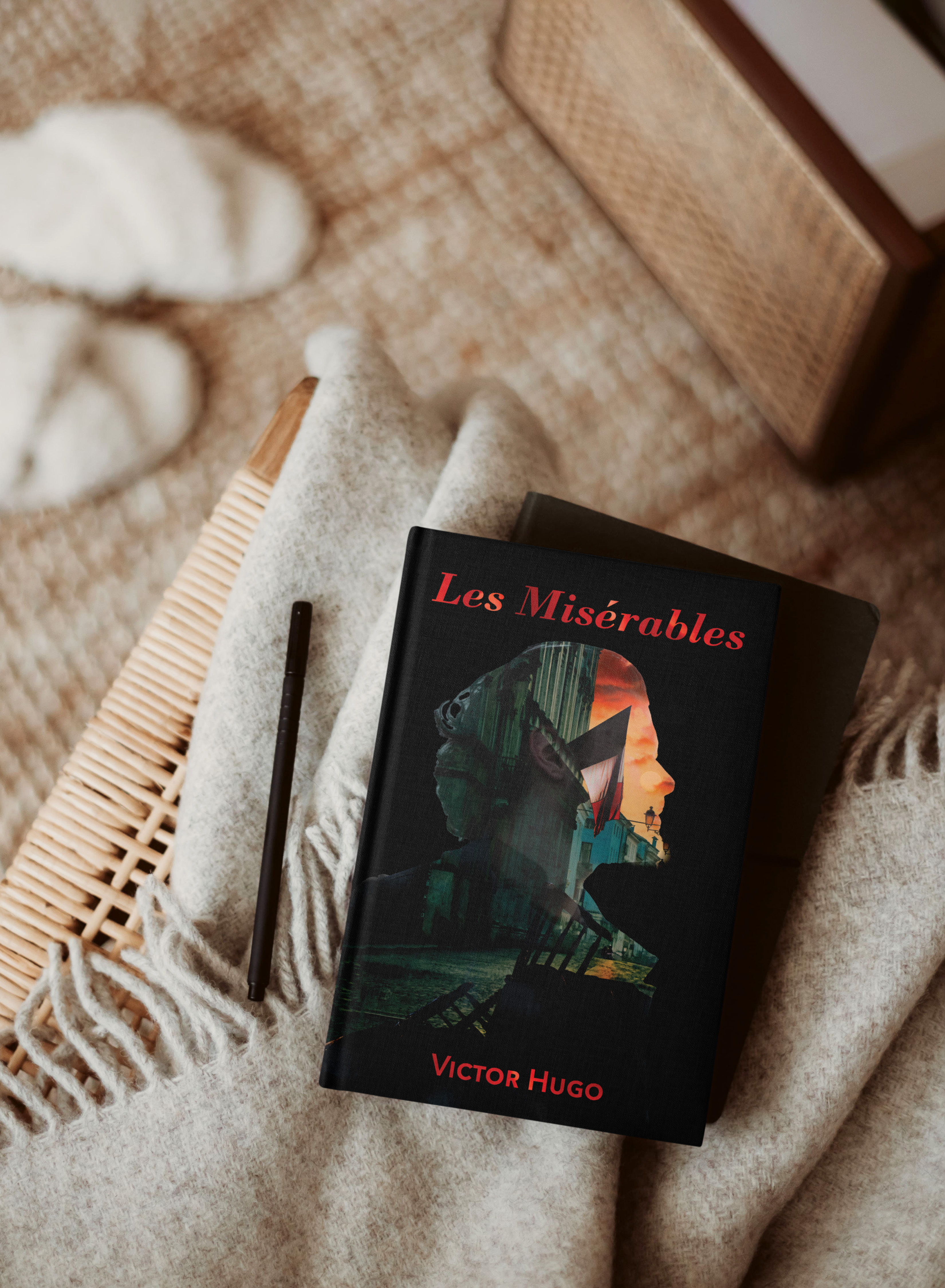
This cover is more traditional and reflects the soldiers at the barricade. They have a vision; a reason they feel they need to go to battle. I needed to create the barricade for this cover and used Photoshop to build it then layered it with the scene behind it. Then I created the double exposure using layer masks.
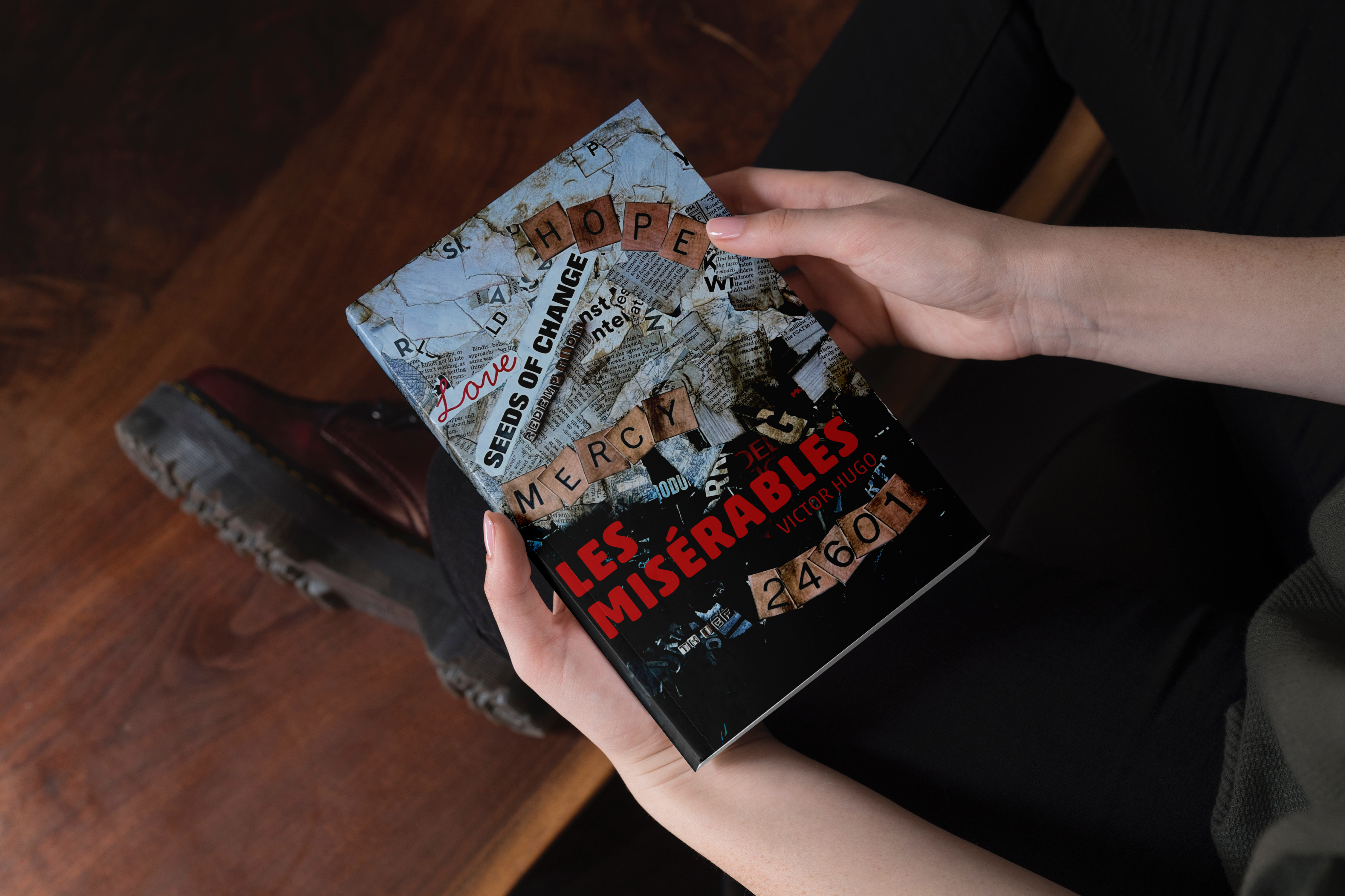
For my typographic cover, I wanted to represent the theme of transformational change that permeates the book, particularly that of Jean Val Jean’s. He begins as a prisoner, a thief, believing that is all he will ever be. He is one of the, “Les Misérables.” Mercy and Love lead to change and hope. In my initial efforts for this cover, I felt my message was getting lost. So, I changed directions completely. I feel the collage captured my intent much more completely.
This project really helped me stretch. I appreciated the critiques I received. They were insightful and helped me improve my designs in my efforts to capture the themes related Les Misérables.
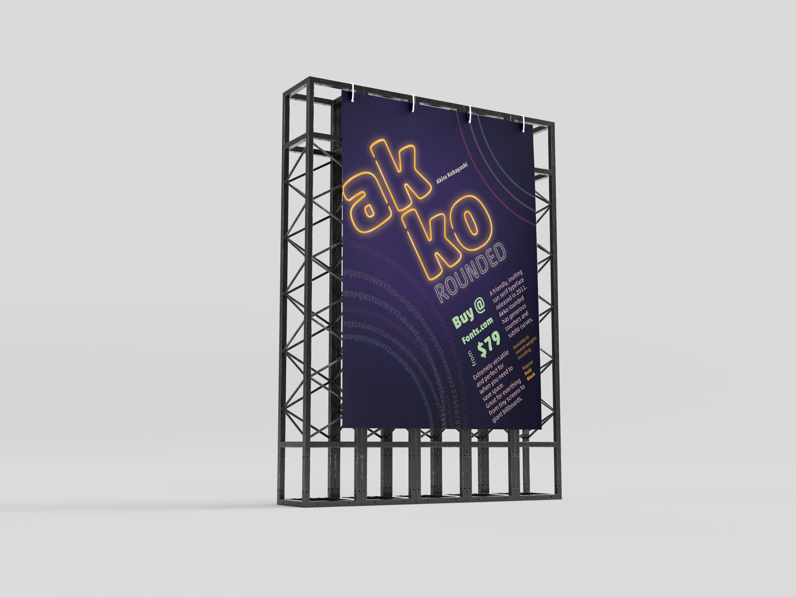
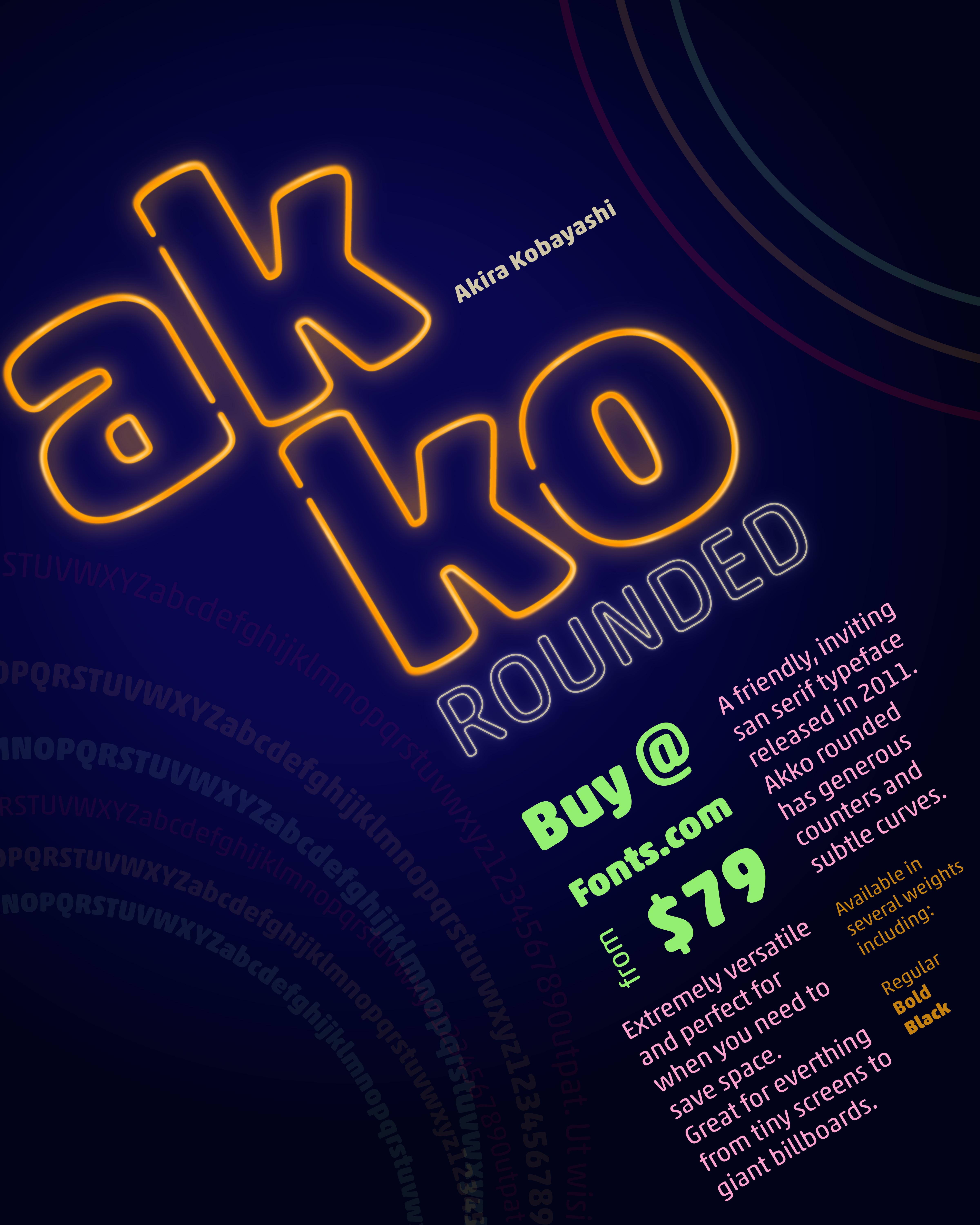
In one of my classes, we were given the task to create a promotional print poster for a typeface for fonts.com. I was assigned Akko Rounded. Akira Kobayashi wanted to design a font that exhibited a “fun, friendly” nature. I wanted to highlight that feeling and the curves of the style of the font in my poster.
Beginning Ideas
As I first started working on ideas, I played with several different ways information could be placed on the poster. I needed to have the name of the font, the designer, cost to purchase it, where to purchase it, the font, and historical background. Focusing on negative space, alignment and overlapping seemed to work the best for as I tried to visualize this. The longer I worked with Akko Rounded the more I felt like I was moving towards designing a poster from the Eighties. So, why not take it that direction as much as possible?
Final Version
I chose a neon pallet for the poster and created a neon effect on the name, “Akko Rounded”. I wanted the rings to feel like they were flashing in the background. I gave the information about where to buy it and the amount the next level in the hierarchy, with its color and placement. The sizes and other details are next in the grid surrounding that information. Then, I placed all of that on the diagonal instead of keeping it vertical to give it visual interest. This is what allowed me to add movement to the circles in the corners. I also used the circles to create some asymmetrical balance by having one be the font weights.
I enjoyed working on this project and with Akko Rounded. It is, as described, a fun and friendly typeface.
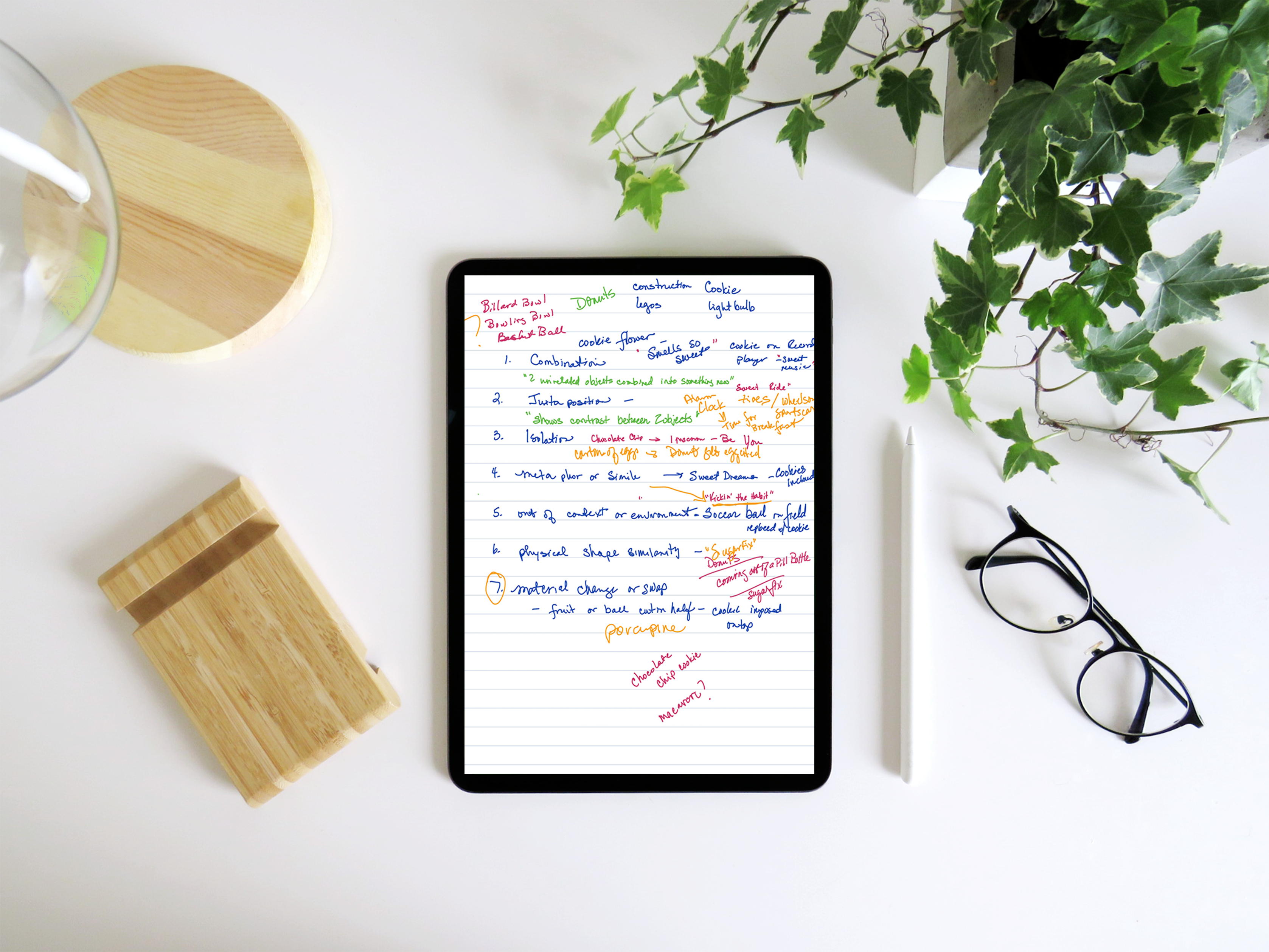
For this project I was to select one everyday easily recognizable object and combine it in ways that illustrated the Seven Creative Strategies:
Combination
Juxtaposition
Isolation
Metaphor or Simile
Out of Context or Environment
Physical Shape Similarity
Material Change or Swap
. The first stop in my process was to determine what object I was going to use.
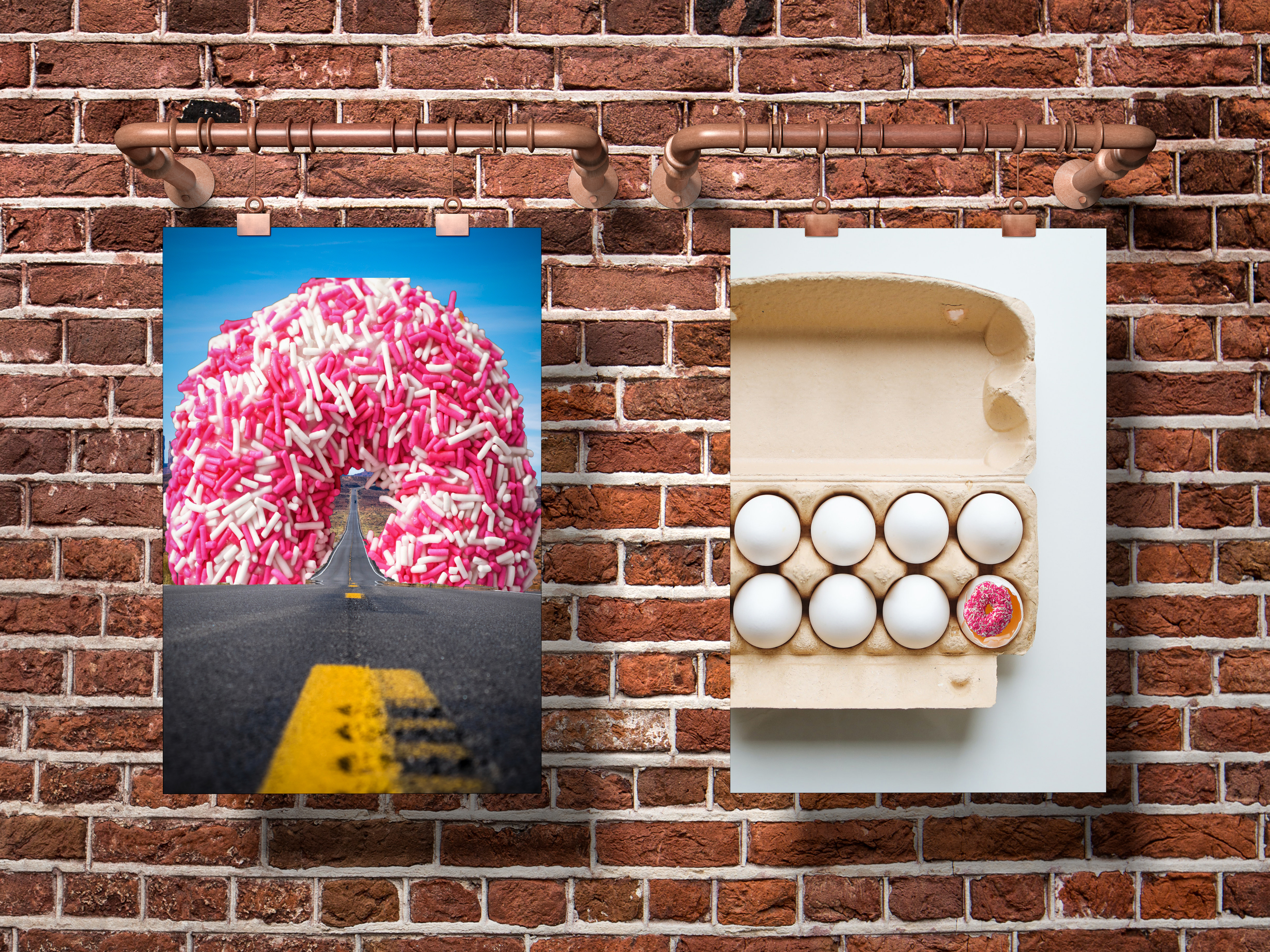
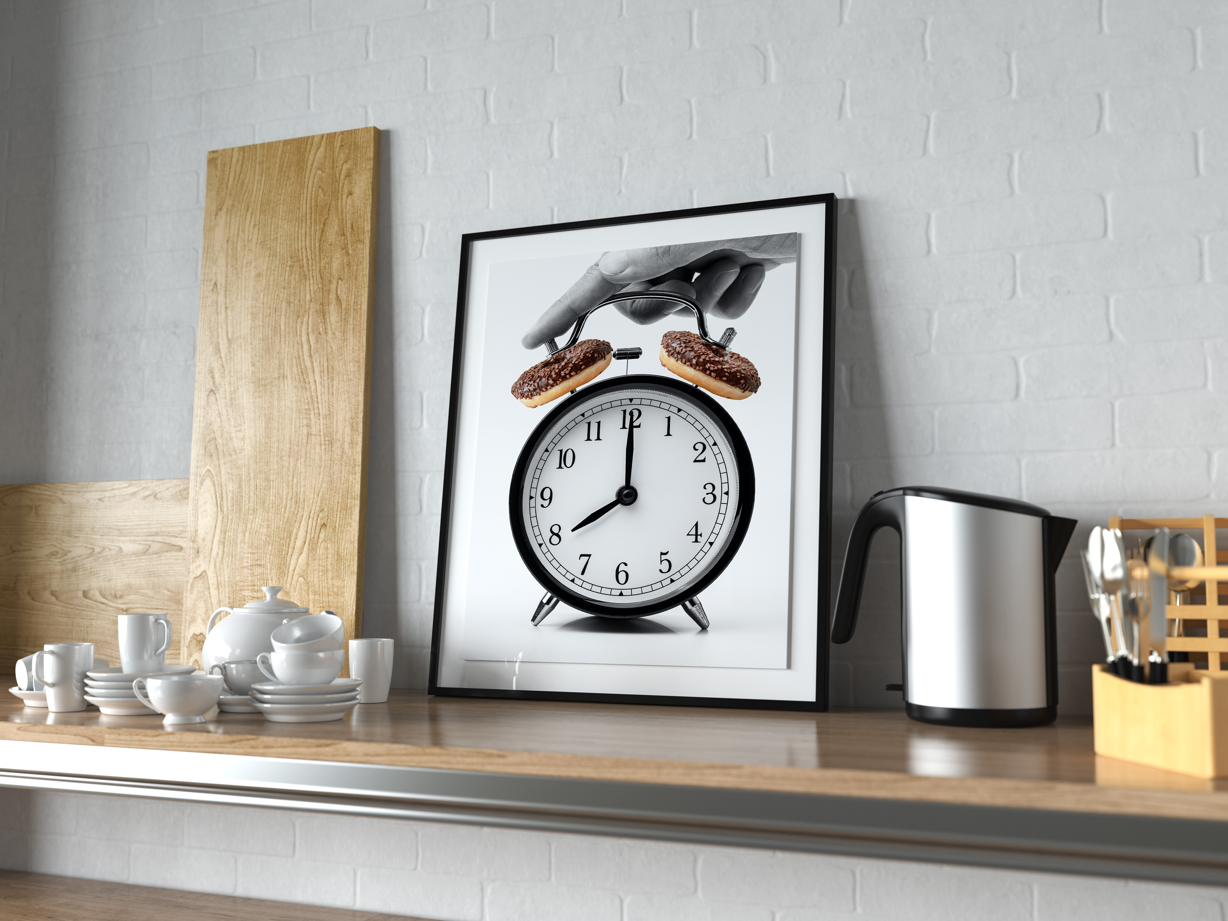
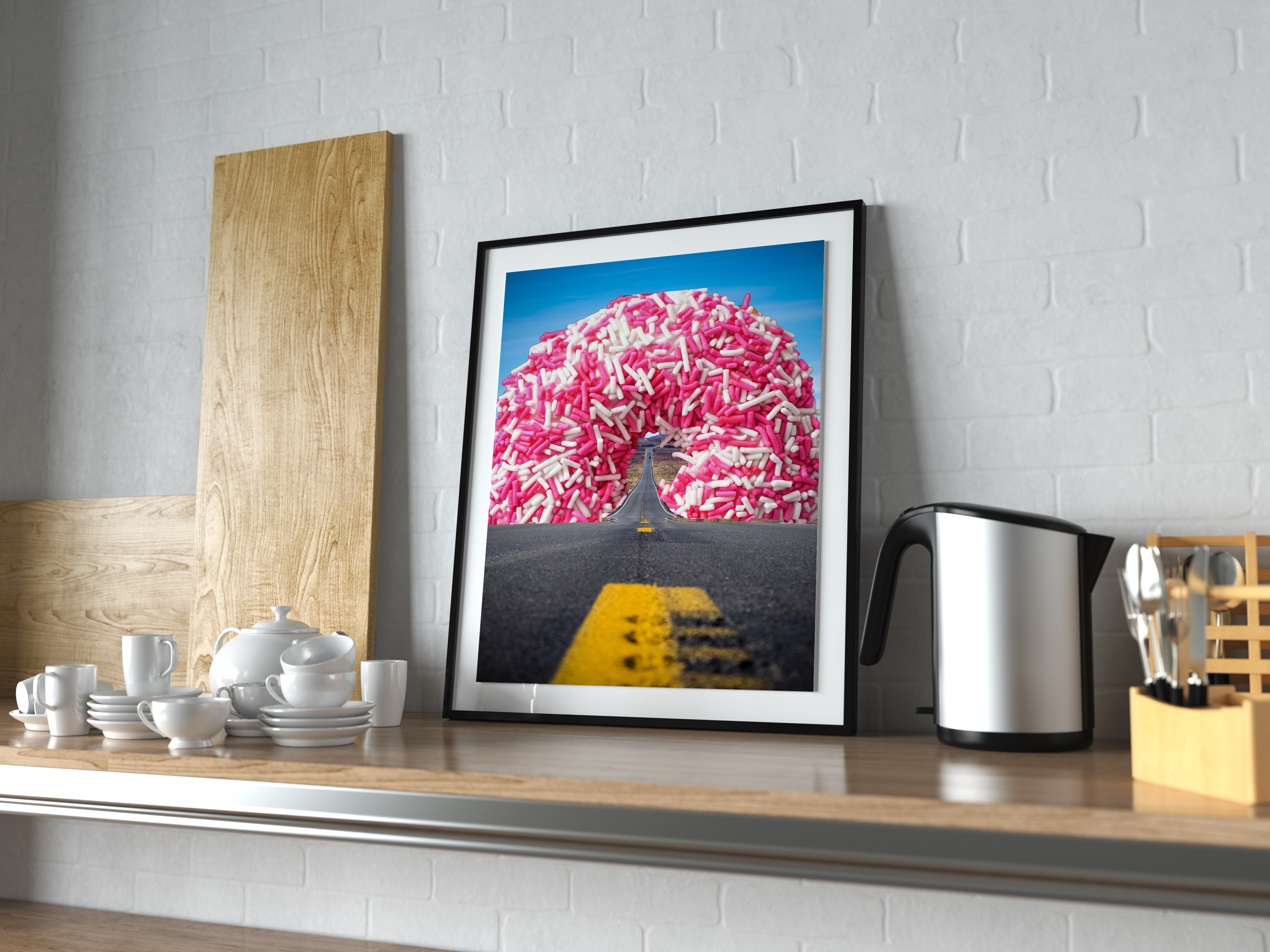
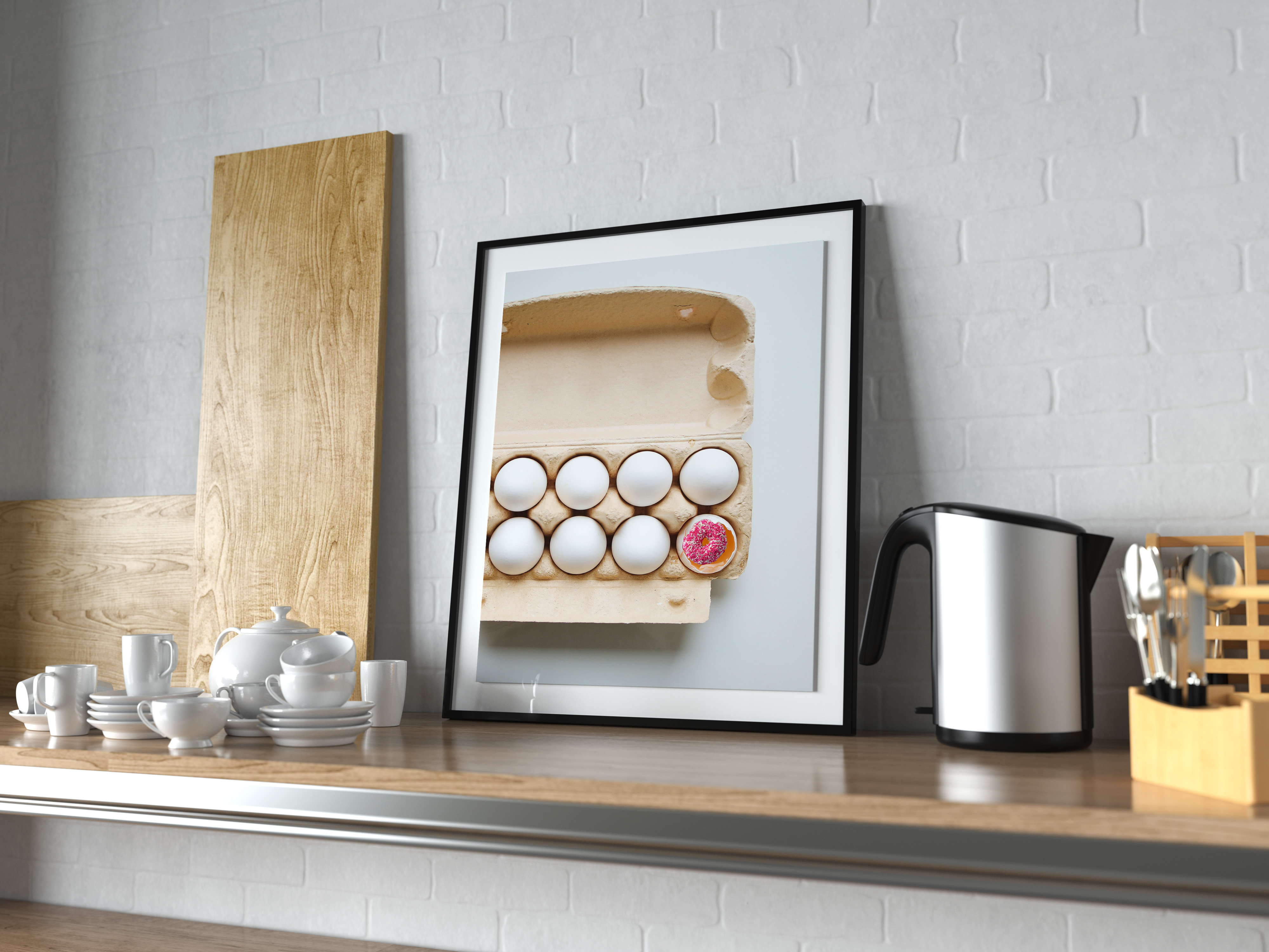
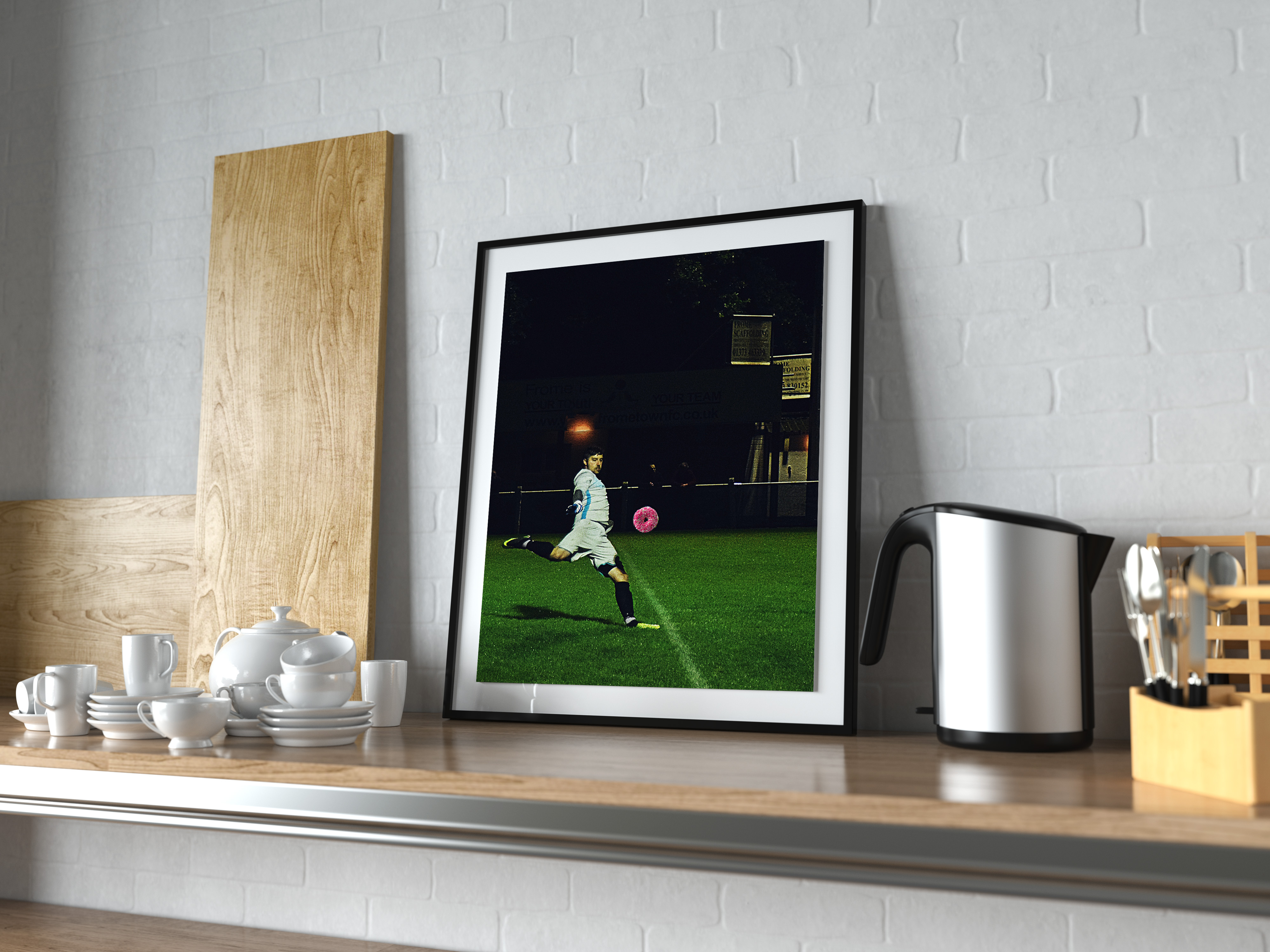
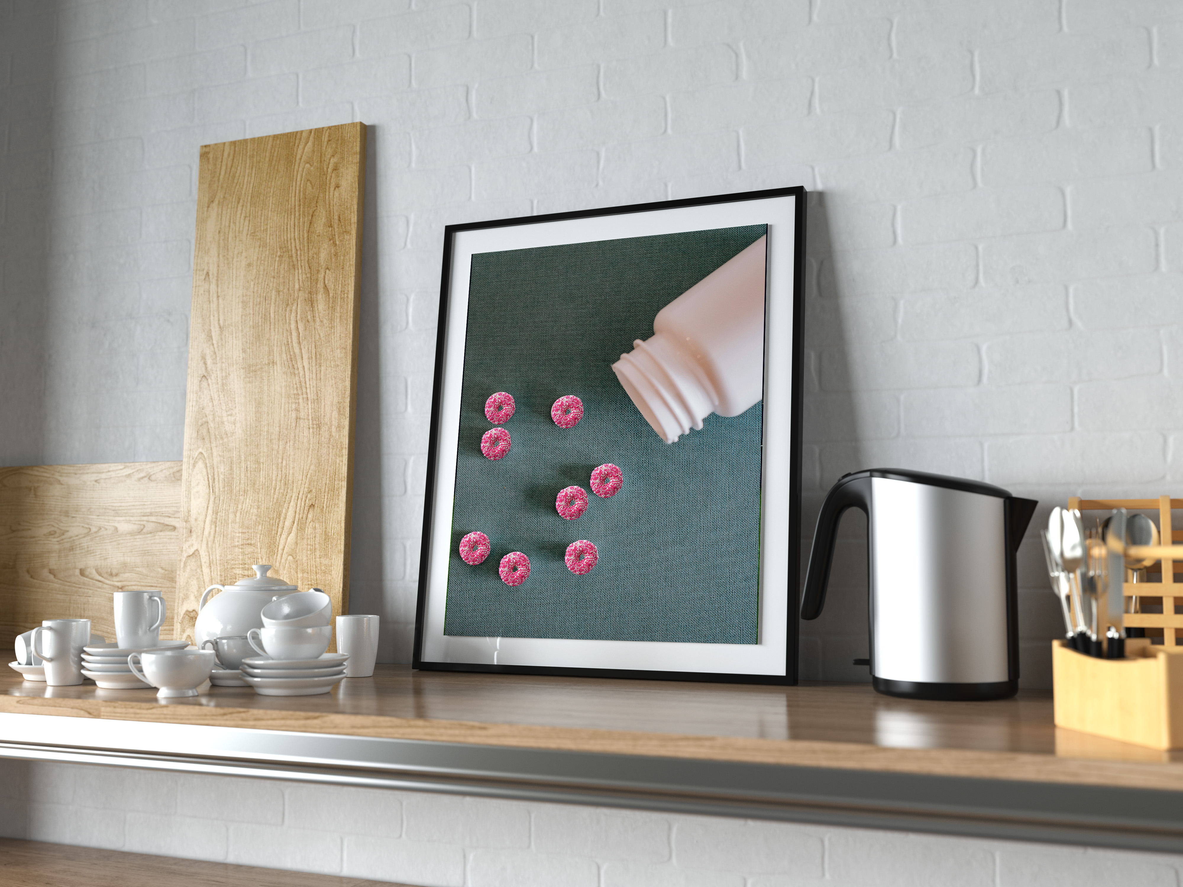
One of the requirements was the each final piece would have to have a title. As I worked through choosing an object for each of the strategies, if I couldn’t think of a title, I discarded the idea and moved on to another. This allowed me to work through and determine which one felt like the ultimate best match for me, DONUTS! I didn’t anticipate the consequences that would arise from this decision.
The Results
Once I had my object I set about finding images available free for commercial use. This time I used pexals.com and set about to work.
Combination – Two unrelated objects combined into something new
“Time for Donuts”
Juxtaposition – The combination of to unexpected objects
“All Roads Lead to Donuts”
Isolation – One element is given focus by visually isolating it from other elements in the design
“Donut get Eggcited” – Credit to my brother for the Title.
Metaphor / Simile – Elements are combined within the design to emphasize meaning
“Kickin the Habit”
Out of Context – Takes and object out of usual context or environment
“Sugar Fix”
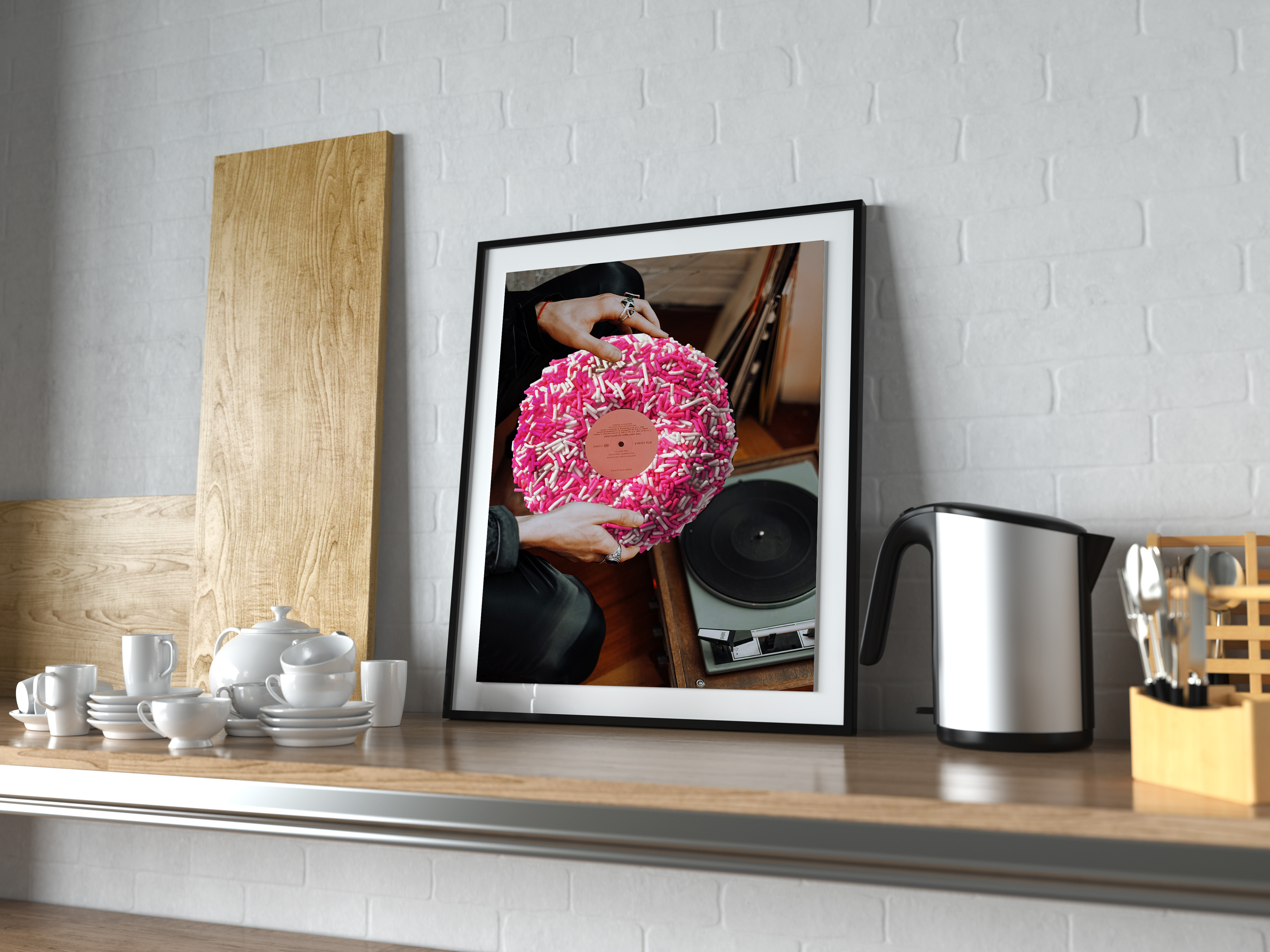
Physical Shape or Similarity – Replaces an object with something the same shape. Typically emphasizes elements that don’t connect.
“Sweet Tunes”
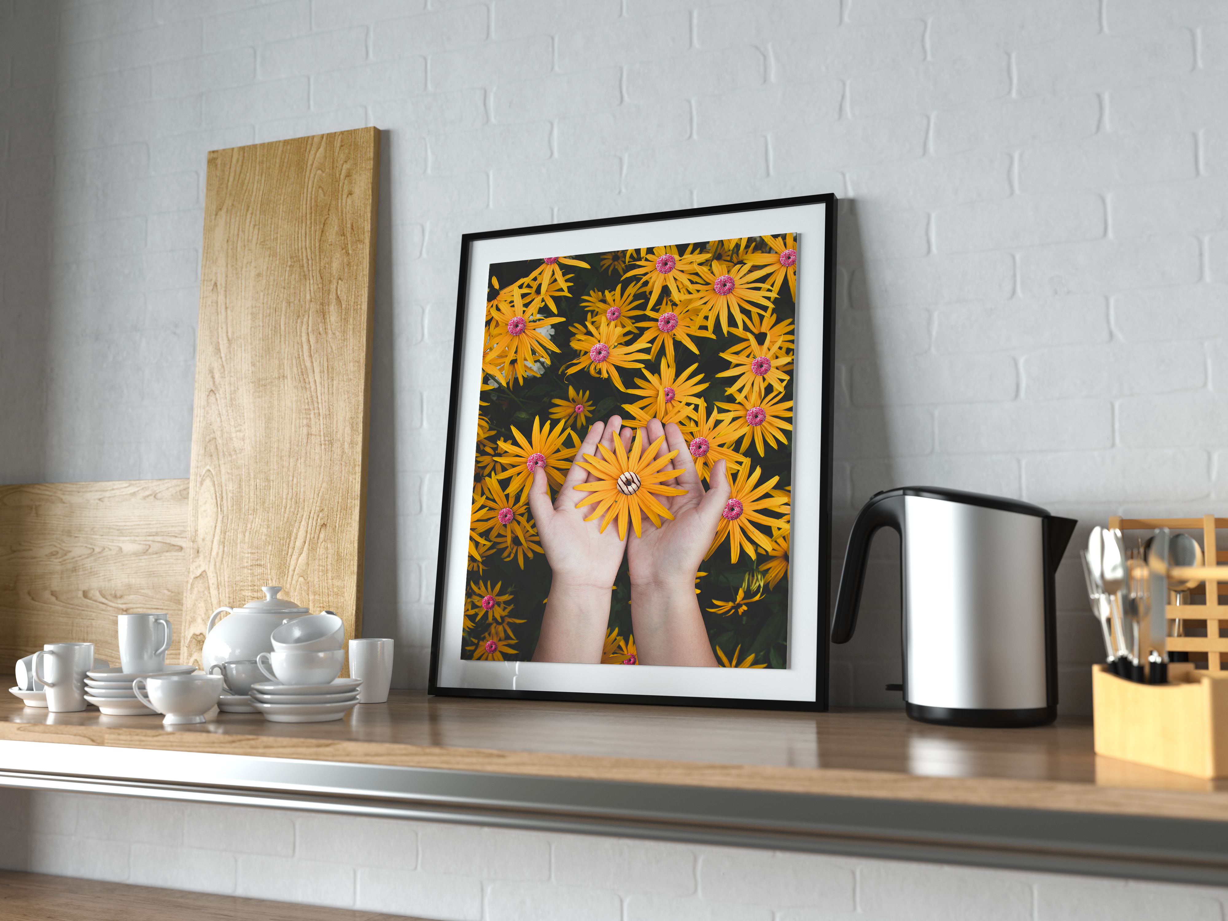
Material Change, Swap or Focus – Swaps a property from one object or material to another
“A Donut by Any Other Name”
I enjoyed this project, however, I didn’t realize that I would crave donuts EVEN MORE than I usually do. Hindsight is 20/20!
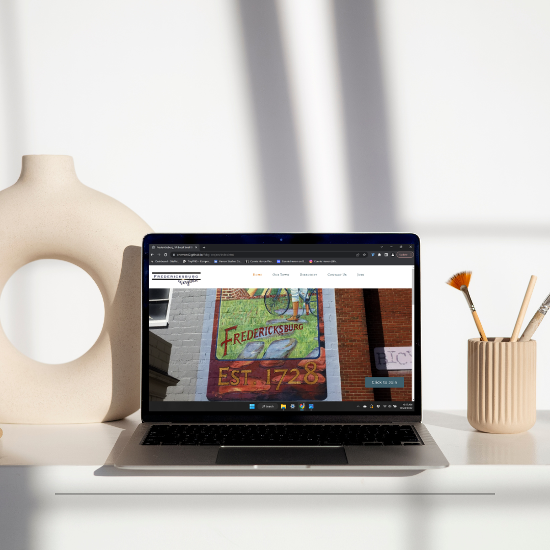
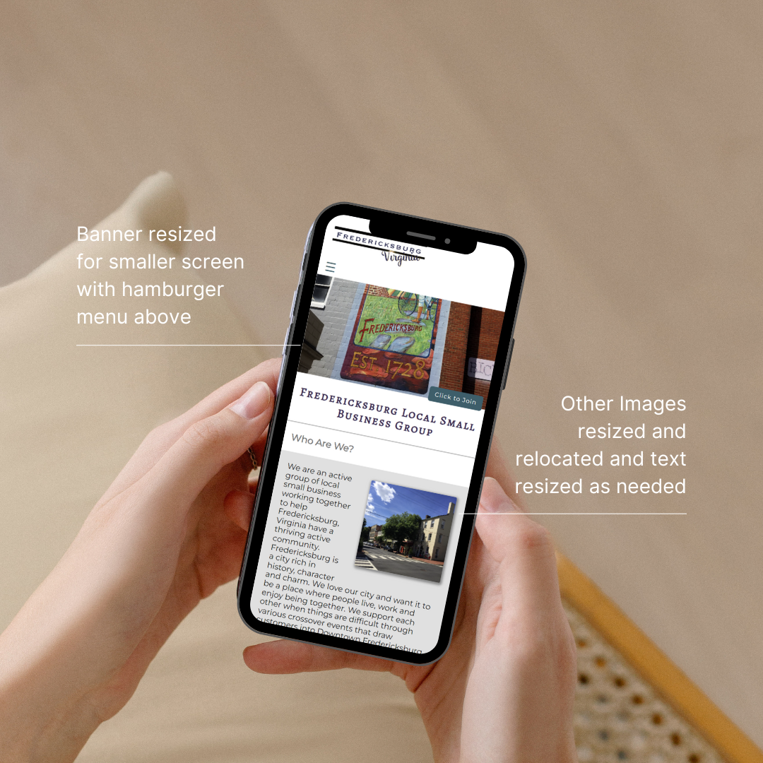
For one recent assignment it was necessary to create a site for a fictitious local city small business group. I chose to use my own photography and graphics for this project. Additional features include:
Fully Responsive Design
Banner Header photo on each page with Button Call to action
Featured Business List with Cards and Hover Over Lift and Shading
Hover Over Underline Decoration on the Navigation Menu
The ability to pull from a database for a frontpage Calendar Information Area
Local weather on the screen
Current Date as well as Date Last Modified
Page showing the member organizations (Links aren’t active as it is Mock Site)
A Form to Join the organization as well as a contact form
Placeholders for social media links
I really love where I live which helped make this a fun project to do.
Here are a couple of screenshots from the site:
You can check out the full finished site at the link below.
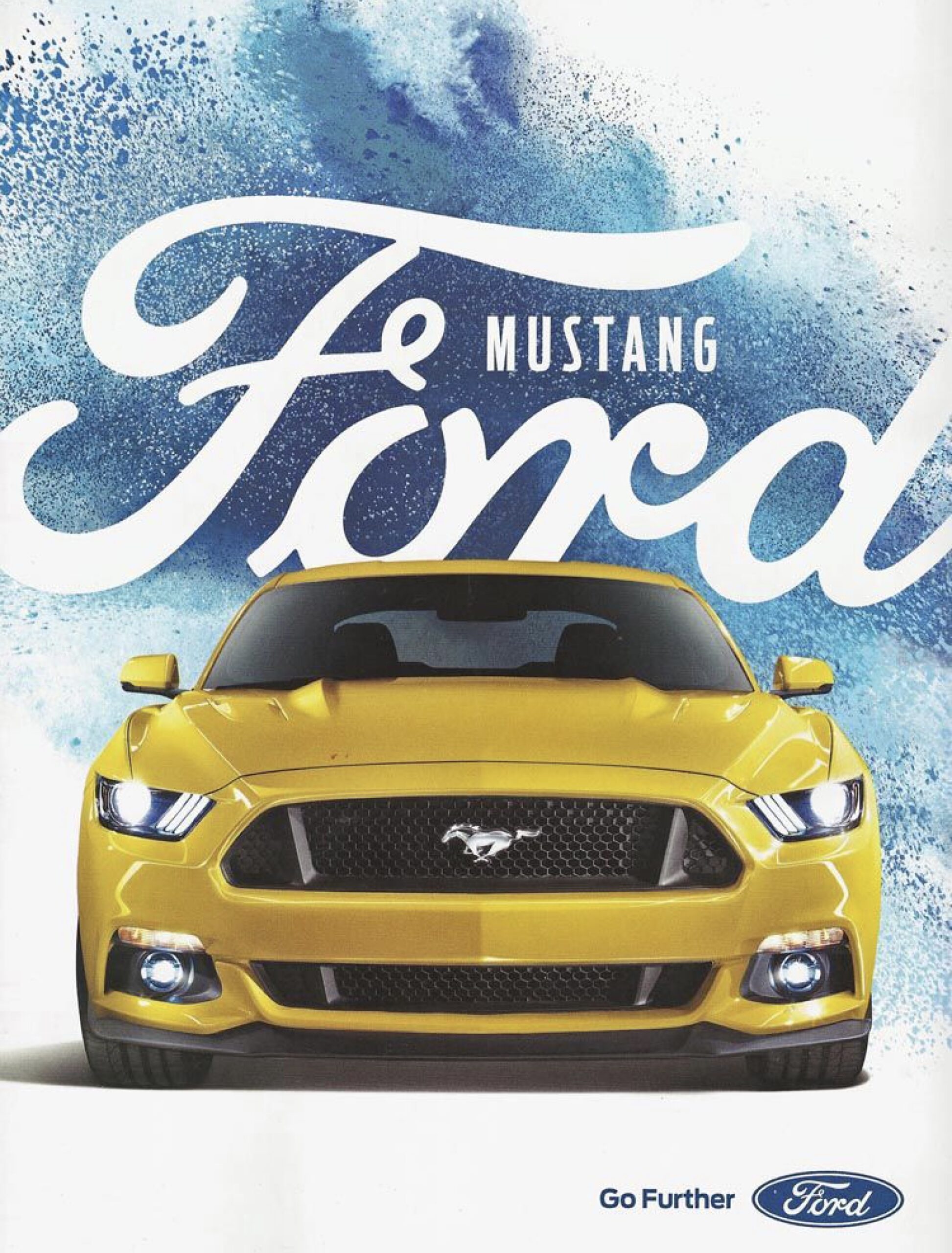
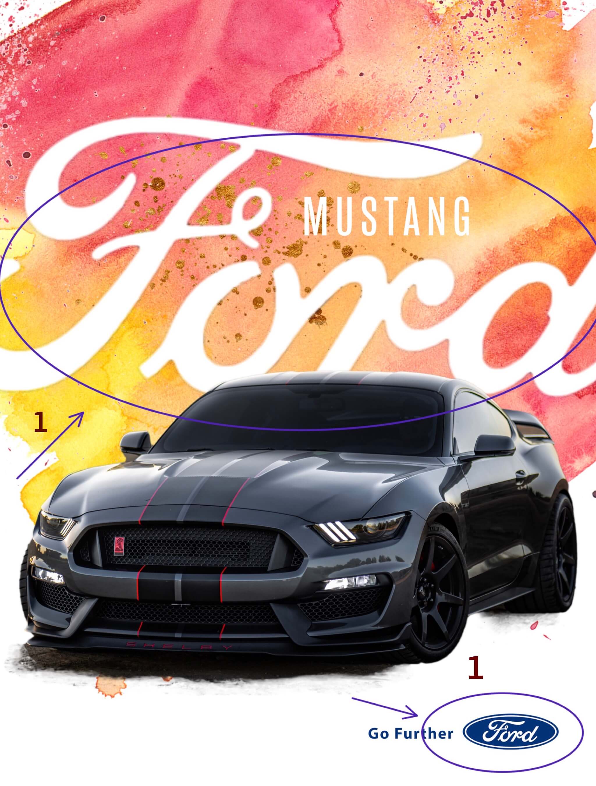
Ford created some ad campaigns several years ago at the same time they were set to release a redesign of one of it’s most popular cars several years ago. This was one of those campaigns. It featured a bold splash of color as the background and the car, in this case the Ford Mustang, prominently featured on the page or billboard. Very little else was actually stated in the ad other than the words, “Go Further”, somewhere on the page. The idea being to accent the car itself in a bold way. While I was able to find this ad, as well as others within this campaign, in use by car dealerships, I wasn’t able to find a link to the original ad or information about the designer. This ad, in it’s simplicity has to speak to a certain audience. So, how does it do that?
Repetition & Typography
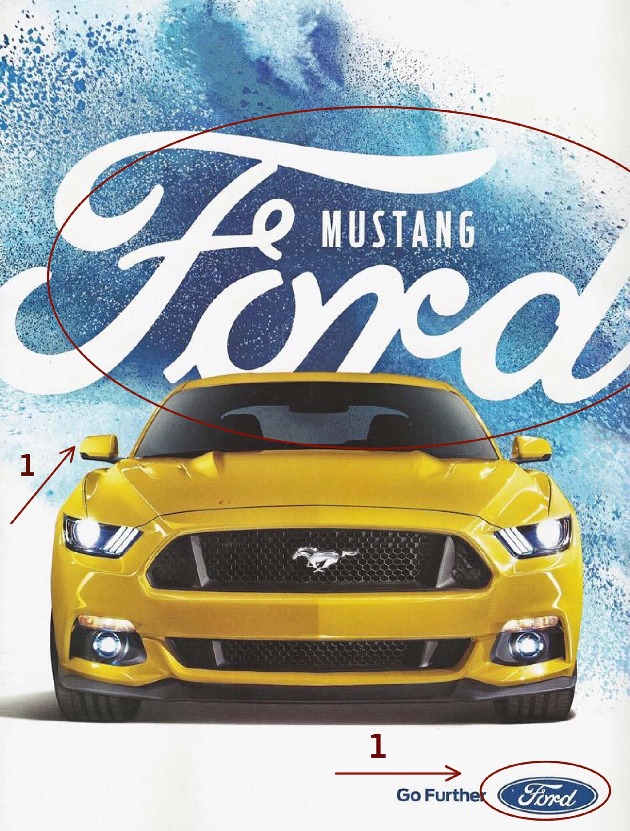
There are two things you notice first in the ad. One is the car. It is the subject of the ad and the star. Right behind the car is the Ford name. The actual logo has been repeated so that it is instantly recognizable. The word, “Mustang,” is there next to the Ford logo. The san serif font helps it stand out as well as not compete with the Ford logo. Down in the bottom corner the words, “Go Further,” are in proximity to the Ford logo implying you can go further with Ford.
Proximity
How else do they use proximity? Again the large Ford logo comes into play. It is placed directly behind and touching the car. The idea is to think of Ford when you think of cars.
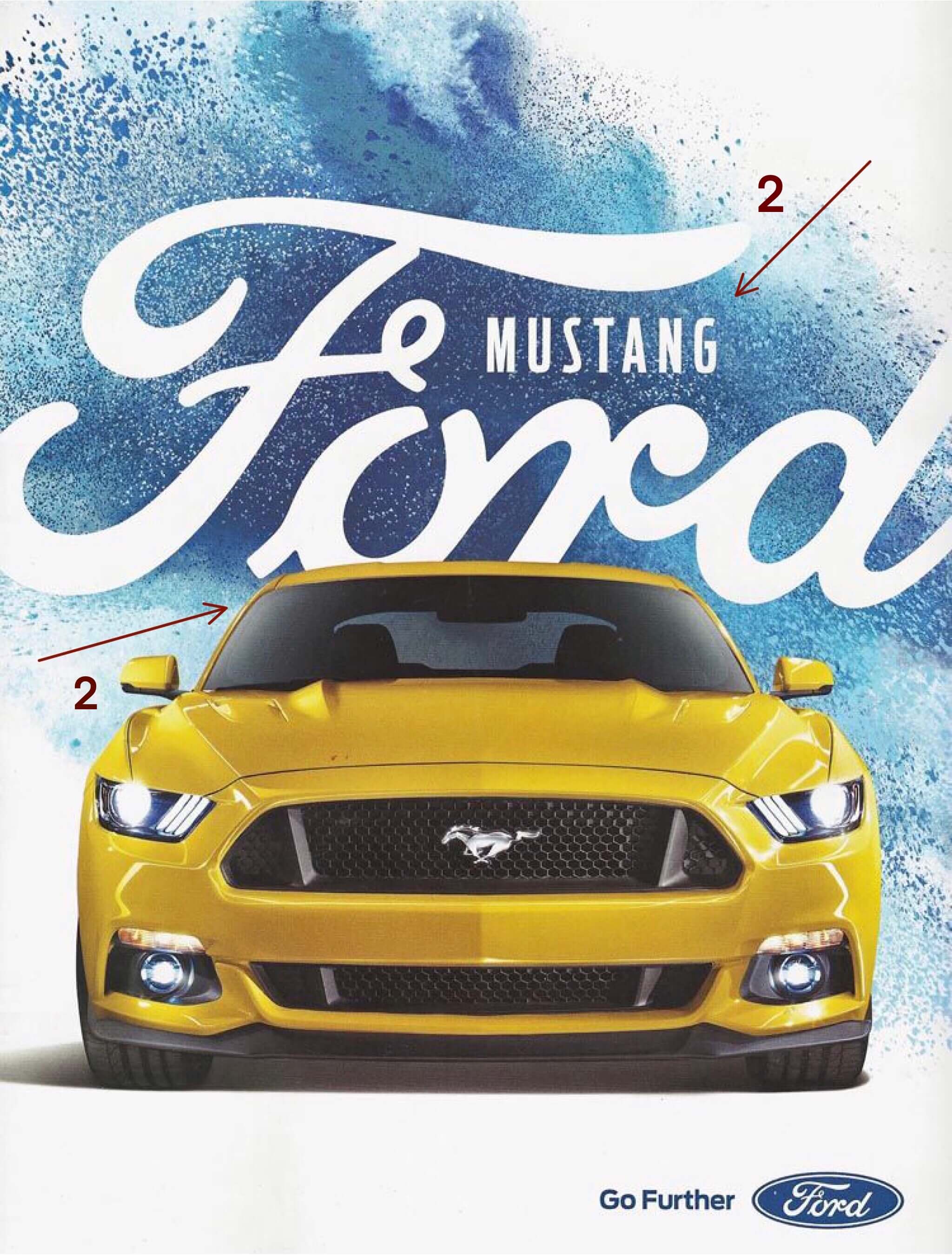
Alignment
Alignment is used a couple of ways in the ad, but this is one of my favorites. By aligning the bottom of the letters of the word, “Mustang” with with the curl in the line of the, “F” and the mid-line of the grill (which is also where the Mustang logo is) they divide the ad into thirds. It’s a subtle use of the “Rule of Thirds”.
Contrast & Color
The blue splash background creates contrast in the ad. The Ford logo is in white against the the blue background. Additionally, the yellow car is a complimentary color of the blue background creating some drama in the ad.
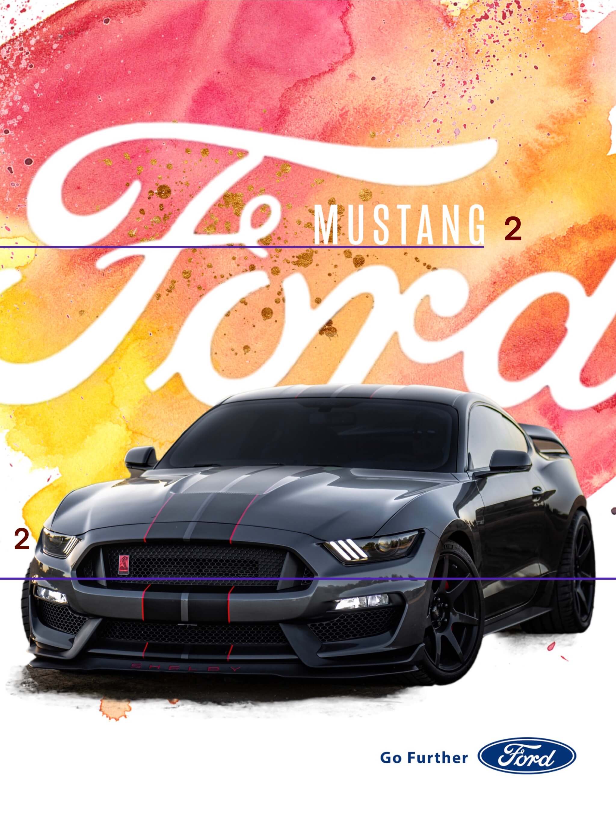
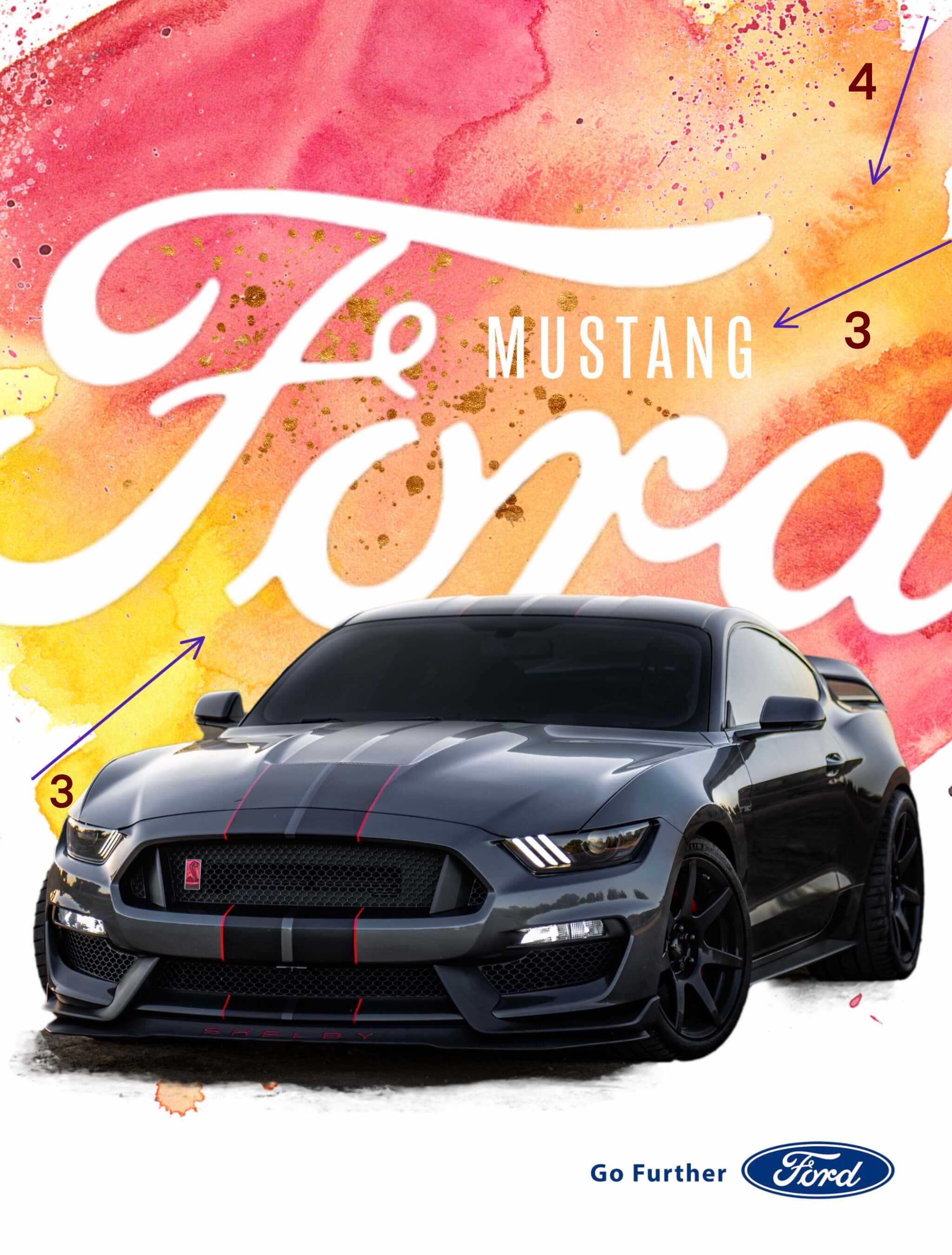
My Campaign Addition
My assignment was to create an ad that would fit into the campaign. I chose to do a similar ad for the Ford Mustang Shelby edition. I kept the same repetition of the of the typography and the Ford Logo.
I also wanted to maintain the same alignment within the ad and use that to draw attention to the name of the vehicle as well as the car.
Lastly, I wanted to keep the overall feel of the ad campaign, so, I kept the contrast of a large splash of color as the background. Because the vehicle was a different color however, I chose to mimic the colors of the sunset in this ad to create drama against the black car. I also kept the proximity of the large Ford logo to the car to draw attention to the Ford name in connection with the car.
The overall feel of the campaign is a car poster ad. It’s meant to feature the car and little else. In this case, it’s a Mustang. It’s iconic.
Just as with ads, how an article is designed conveys a message and draws the eye of the reader. The use of typography, the type of photos as well as their placement create a mood and communicate ideas.
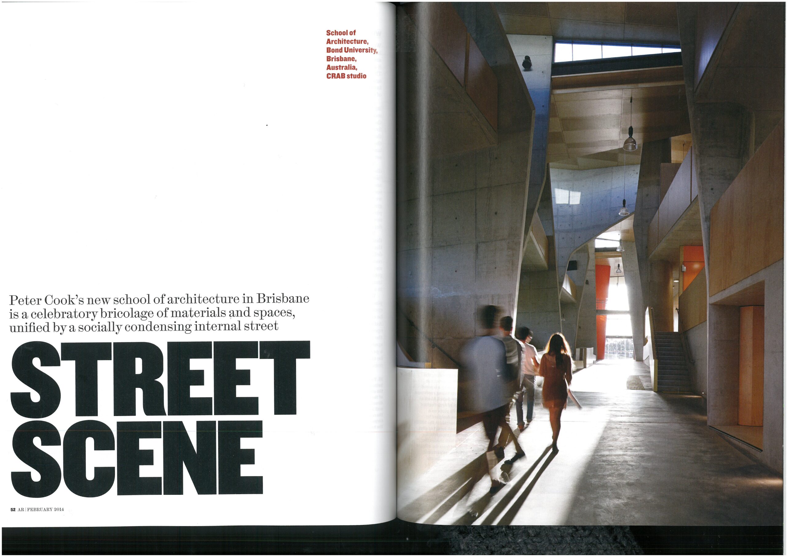
Typography
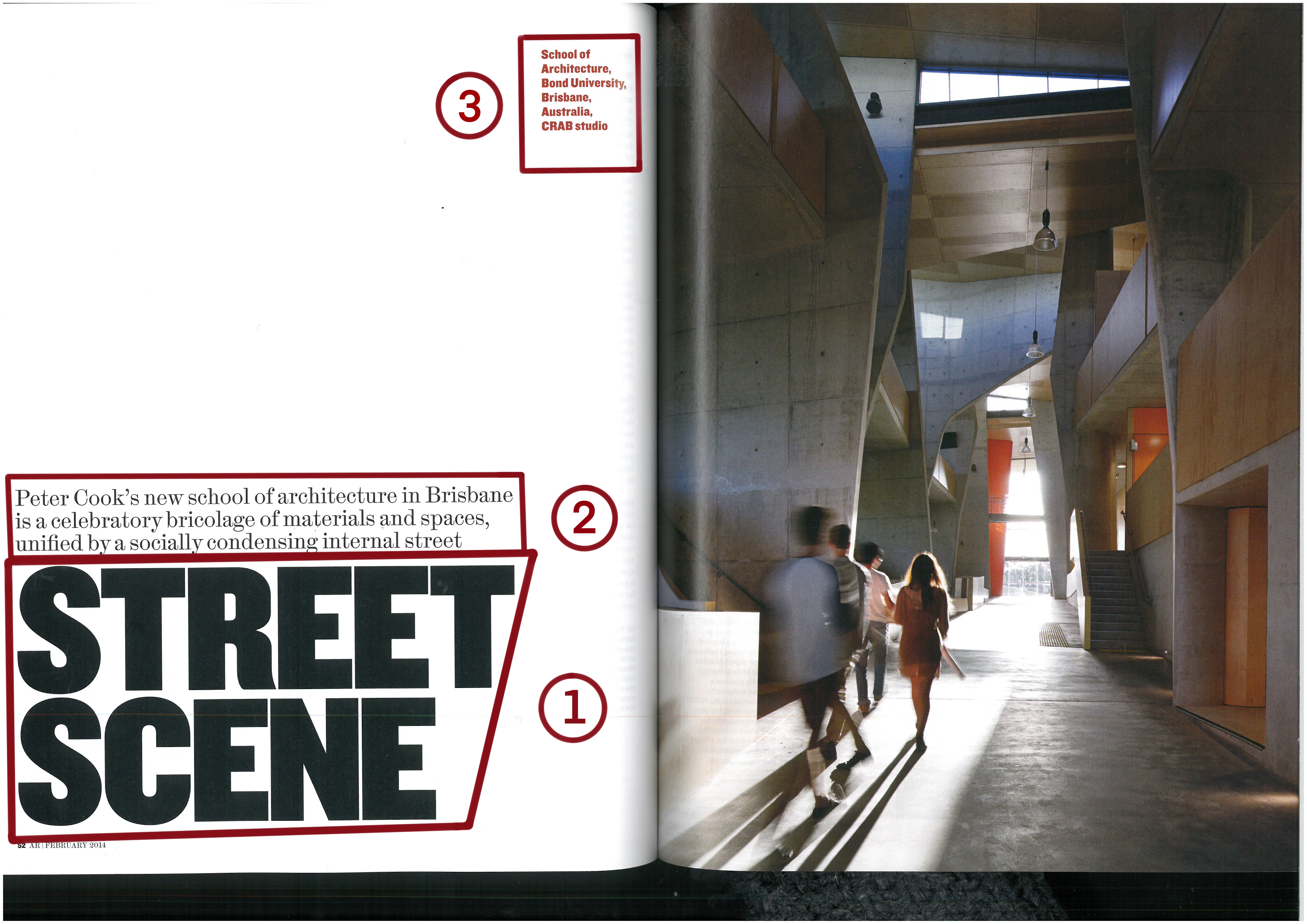
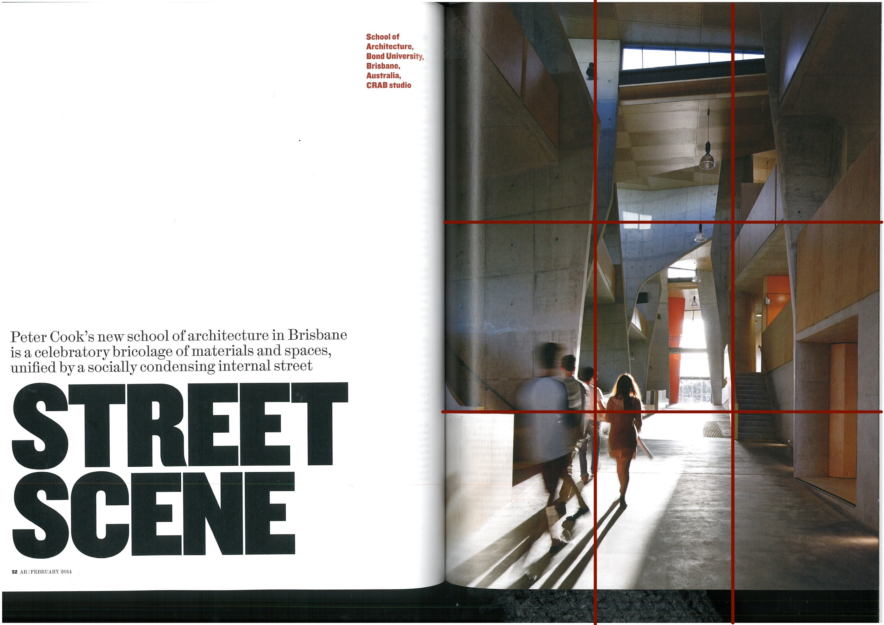
Typography
The above double page spread utilizes typography in three different ways. The first is the the most noticeable. The title, done in a bold sans serif all caps font. In fact, except for some extremely slight deviation in the letter “R”, every letter in the title is without decoration and it is presented in black. It creates a strong statement taking up almost the entire third of the page opposite the photograph. The choices for the sub-heading are the second choice . In this case it is set above the main title, the text is smaller than the title and a serif font is used. The third option on the page is in the caption. They use a san serif font. The font size is a little smaller than the sub-heading, but it is a red color instead of black, helping it to stand out on the page.
The Photo
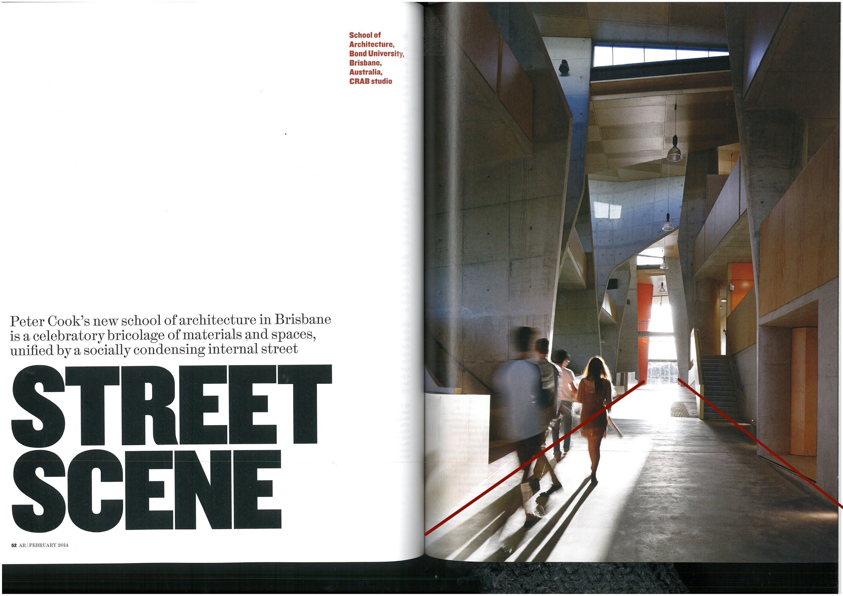
The photo in the article uses a couple photography methods to draw the eye.
The students in the photo are placed at the cross-juncture in the bottom third of the photo. Their age is inferred in the photo and having them at that point alludes to the possible subject of the article, even though they are blurry and you can’t see their faces.
The leading lines of the street draw the eye forward. In this case the lines draw your eye toward the other focal point of the photo, the light.
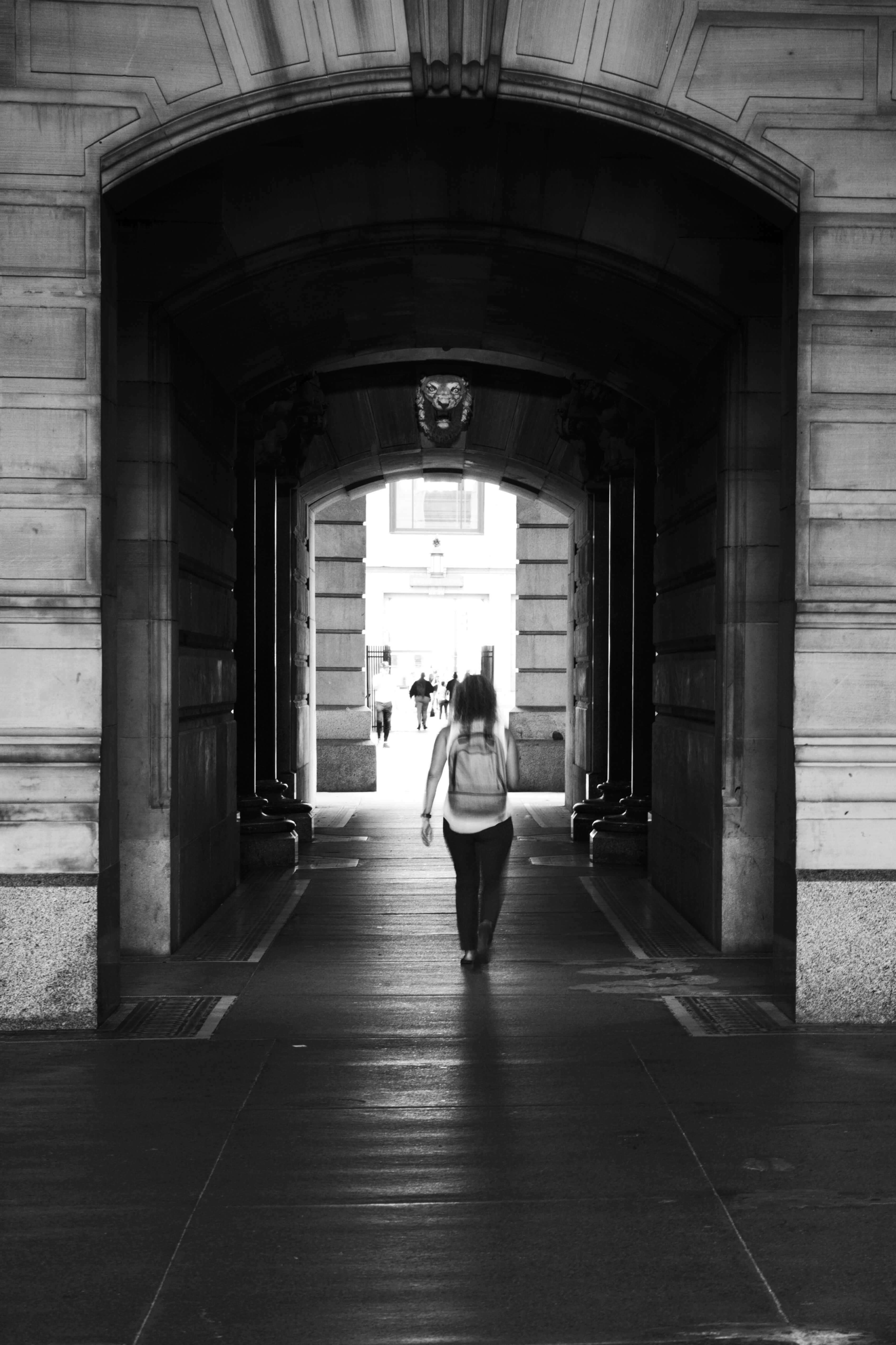
Alternate Photos
The top photo closely recreates the same general feeling for this article. It has the same leading lines created with being in a tunnel. There is a difference with the placement of the subject of the photo in a different location being centered in the photo. However, the overall feeling is closely matched.
The second photo is also a “street scene” and has the same leading lines but a different subject. The leading lines of the buildings on the side draw the reader to the subject in the center.
The last street scene has leading lines from the median down the center of the street and the buildings on the side of the street.
Each of these are general enough that I think they could be swapped out of the layout, though I believe the first one is the most effective of the three.
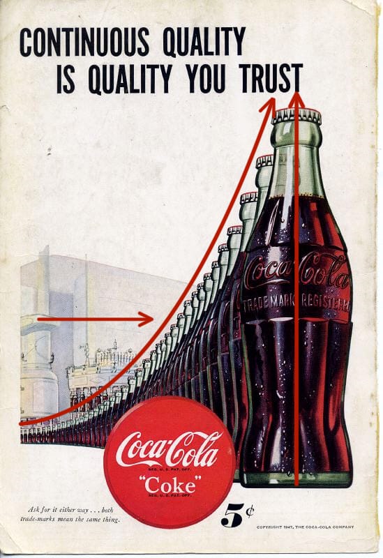
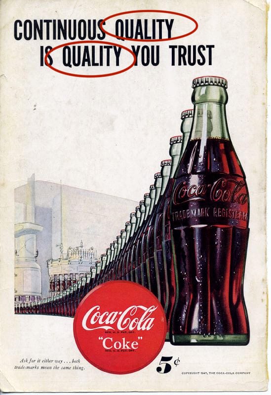
Coke has been around for a long time and so have their ads. The shape of the bottle, the swish in the type, the color of their logo are all the things they used from the beginning to set their unique brand so that you instantly knew what drink you would want even if you couldn’t read anything in the ad. In this ad from 1947 their iconic emblem is traveling from the futuristic factory right into your hand. The ad is all about communicating to you that you can trust Coke to be a quality drink all the time and you want one. So what principles are they using to do that?
Repetition, Proximity & Alignment
Anything in a design can be repeated to add emphasis. It can be a:
word
object
ruled line
color
etc.
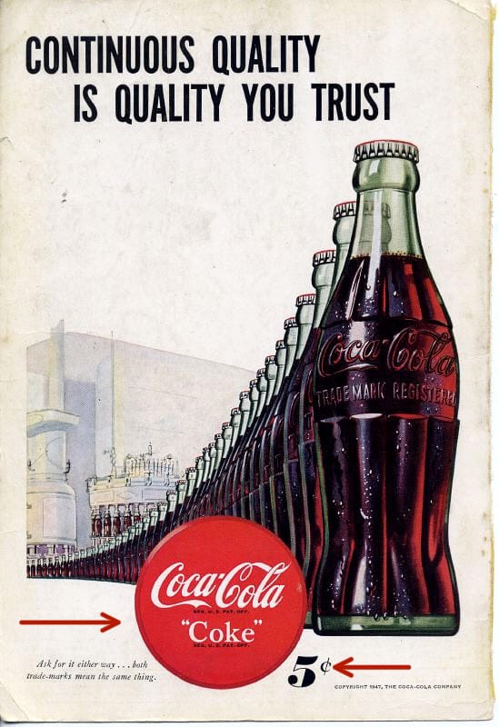
In this ad the bottle is the main element repeated. At the time it was the iconic shape associated with their drink and they wanted it instantly recognizable. Other design elements are used with the repeating bottle. They’ve used proximity to make the bottle travel from a futuristic looking factory to you, the customer in way that you could take it right off the page. There are water droplets glistening on the bottle to insinuate that it would be a cold drink on a hot day. The bottles are also aligned so they point at the ward “trust” emphasizing and drawing your eye to the caption.
Proximity is when related items are grouped together.
The bottles are grouped together. The creators also repeated the word “quality” and placed them in close proximity, to one another to emphasize it’s importance. They want you to associate quality and trust with the drink and believe that is what you will get every time you buy it. There is one more example of proximity on the page.
The price.
They wanted you to know instantly looking at the page how much it would cost to go get a cold bottle of Coke. The Coke sign, something everyone would have looked for at the time to find where Coke was sold, is right next to the price which is right next to the bottles. All communicating what to look for, how much it would cost and what they want you to want.
Color & Contrast
Color and Contrast are the final elements used in the ad. Coke has maintained a brand identity almost from the beginning. The red color with that particular font and swish are part of their trademark look. People also knew look for the green bottle. You can still find it on the shelves.
Contrast is used with the futuristic factory in the background. During this time mass production was still relatively new and considered the wave of the future. It was during WWII and there was a focus on moving toward a brighter time. The futuristic factory alludes to Coke being a part of that future.
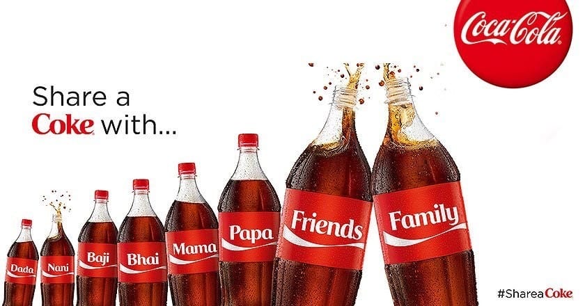
Bringing it Forward
Coke HAS been around for a long time. In more recent ads they looked to remind people of that. They invoke the feeling of some of their vintage ads, they still have the red color, that swish of the font, and the shape of the bottle is still there. Things like repetition, proximity, color, alignment and contrast can be used not just in a single ad, but across the years to invoke a feeling and create a brand that people instantly recognize.