How does the phrase go? “We’ve come a long way, baby!” Gone are the days when grainy postage stamp photos were provided by phones. We now live in an era where anyone can take a clear, creative photo showing depth of field and accurate colors. They still don’t replace a camera and a good lens, but I will always say, “The best camera is the one you carry.” If that’s your phone, you might consider the following tips.
Focus on different details of the same scene. Sometimes, we focus on the people in front of us and forget to capture the details happening either in the foreground or behind. Shift the phone a little, and a different picture will appear. Or turn it upside down, and the perspective of the photo changes.
Don’t stand in one place. Stepping to the left or the right can sometimes create a photo we wouldn’t have seen if we stayed standing in one spot.
Tap the screen on the phone and shift the focus to a different subject. This can create a different story entirely.
It can take a little practice, but as you try the things mentioned above, you’ll begin to see how you can use them to tell your story.
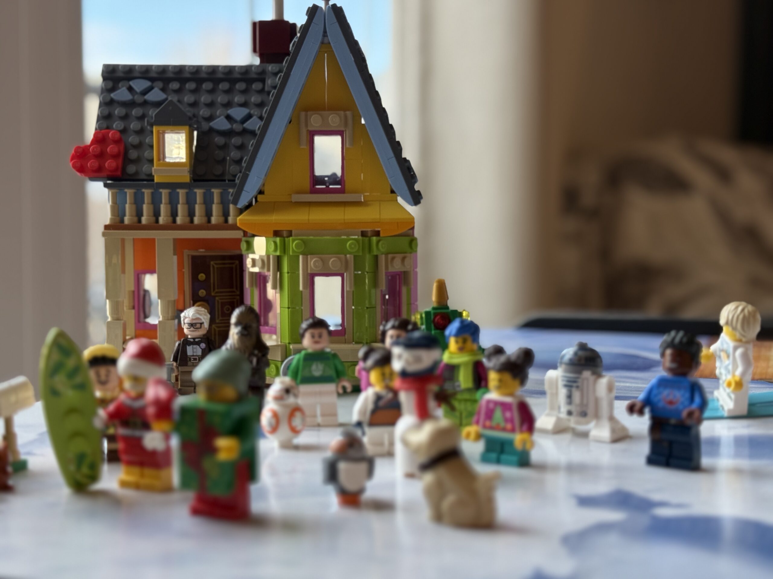
When I mention that one of the types of photography I enjoy producing is Lego photography, the reactions range from bemused to awesome. It’s a part of my hobby that has helped me in unexpected ways, so I thought I would expand on some of the reasons why.
How it started
In 2015 I wanted to improve my photography and participated in a monthly challenge. It was March, but our Christmas tree was still up (don’t ask). I was up late on night looking for a solution for the photo prompt and suddenly had an idea. After digging through some boxes, this was the result and my first Lego photo. I would love to say I jumped and kept at it then, but I’m stubborn.
Jump forward to 2022 and I took a photography class. I was going through some things personally and photography has always been a great outlet. We had been working in black and white, but had our first assignments to focus on color and I wanted something fun. Lego sounded colorful and fun. This time, there was something extra as well. Every time I worked with them, it made me laugh and I felt better. When I built, it gave my brain somewhere else to focus. It turns out, I’m not that unique.
Aside from the mental health reasons, Lego minifigures are 1.5 inches tall. I am constantly working to build my storytelling skills and increase my ability. I can take the minifigures anywhere and this allows me to be able to practice anywhere. My overall photography skills have improved simply because I’m constantly practicing.
I’m not sure why it surprised me that I still enjoy building and playing with Lego, but it did. However, I’m glad they found me when I needed them. If you’re in need of a pic-me-up or want to focus on a different kind of puzzle for a while, this is a type of play I can recommend.
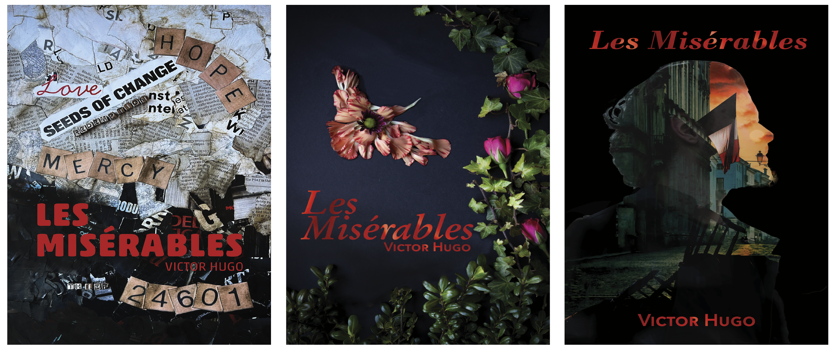
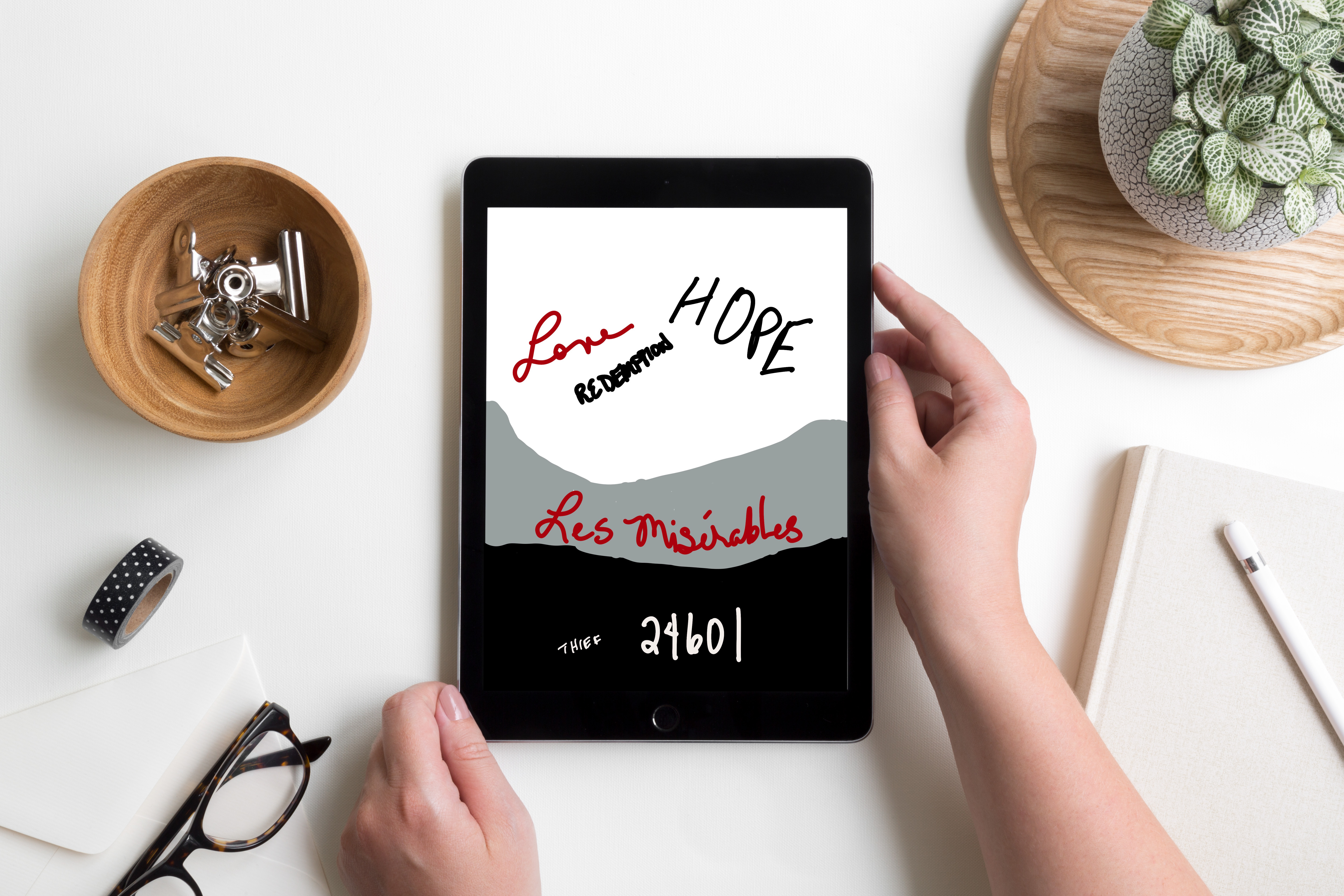
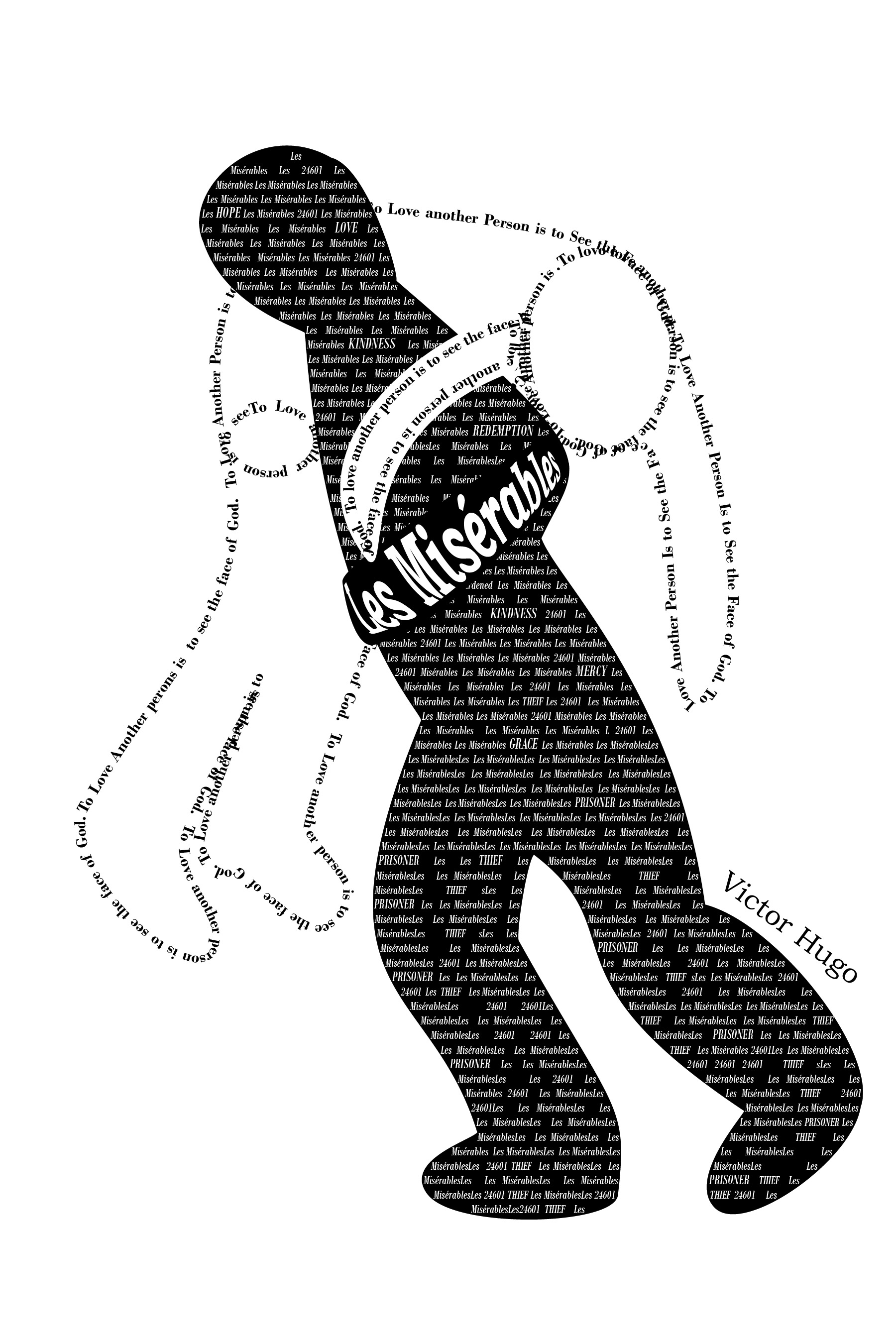
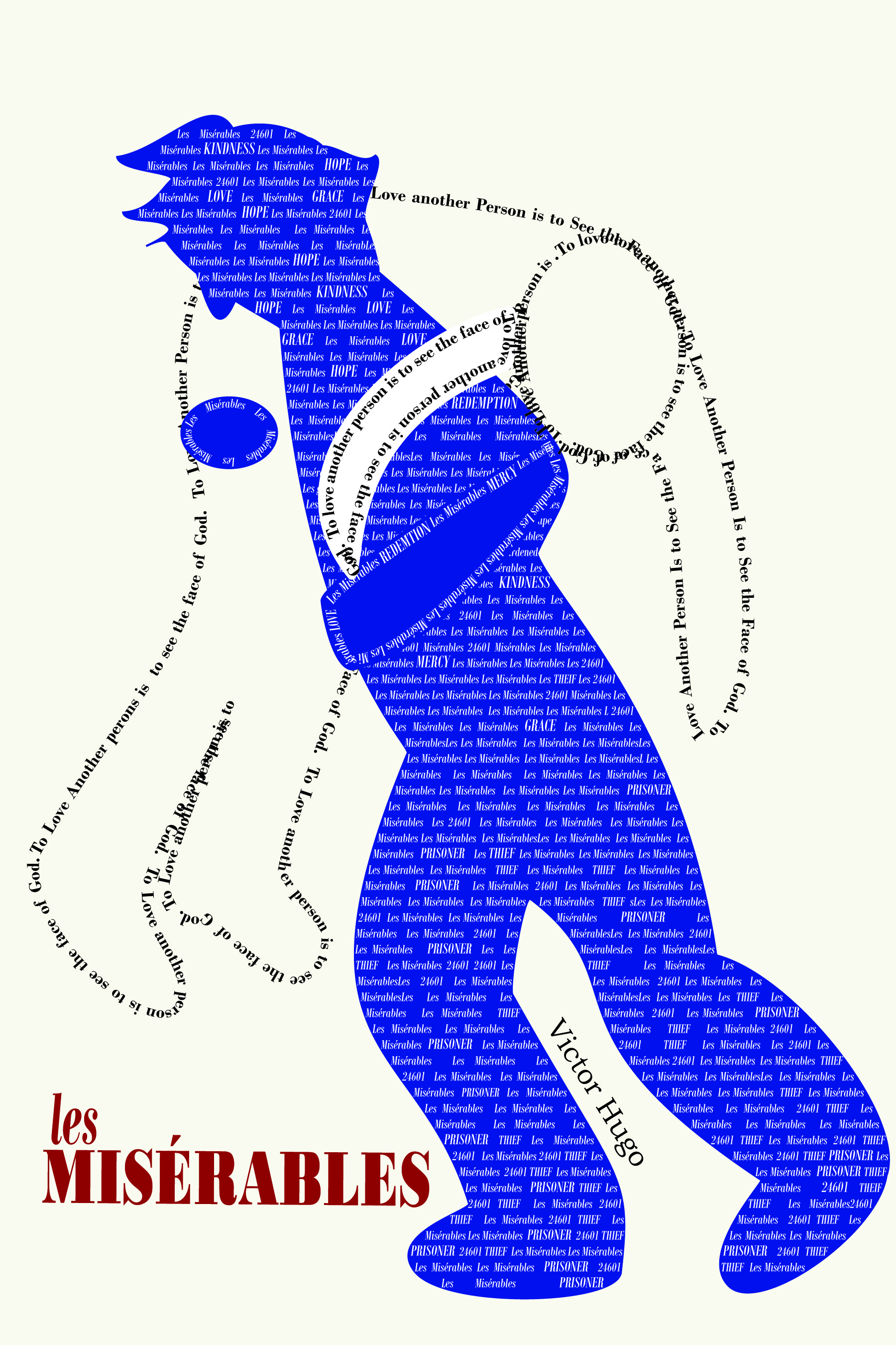
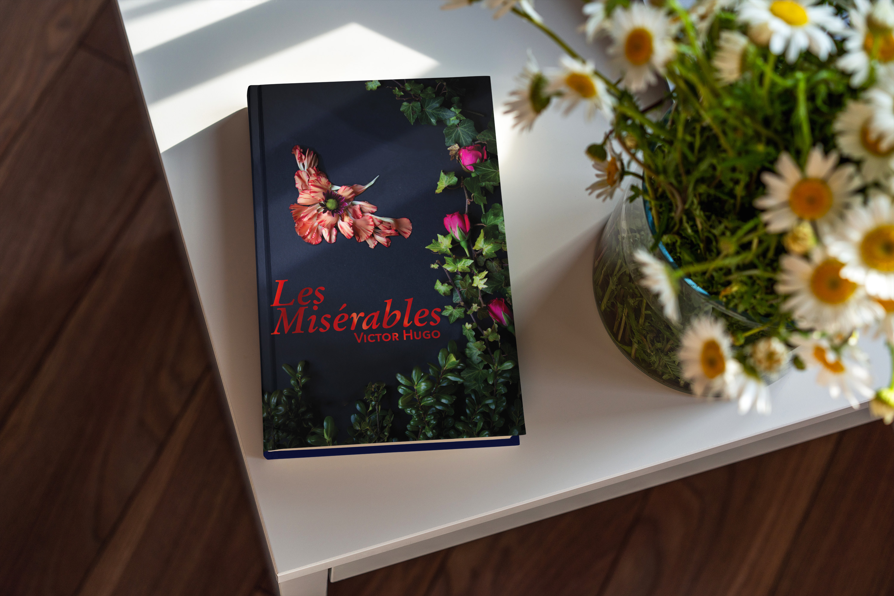
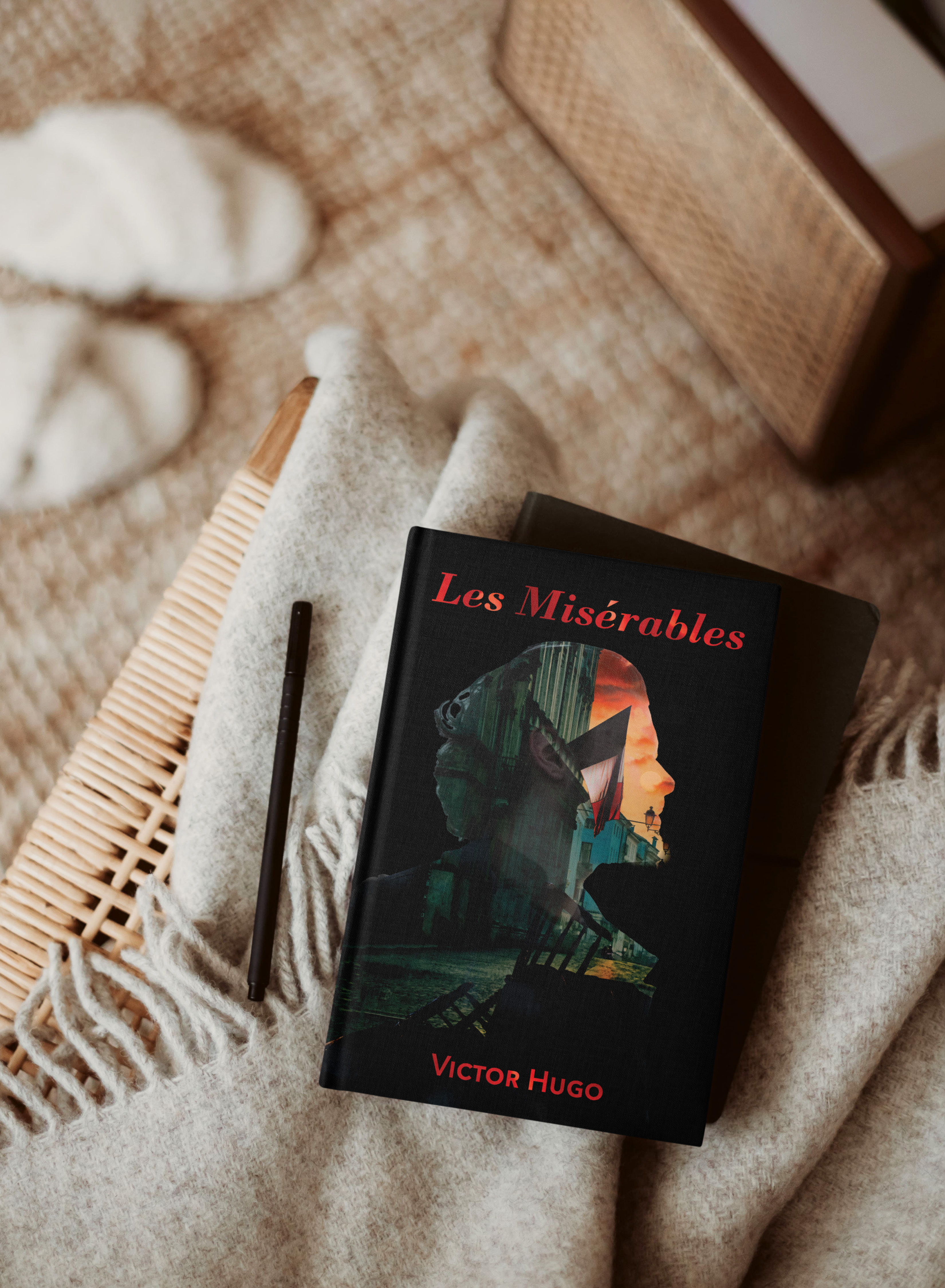
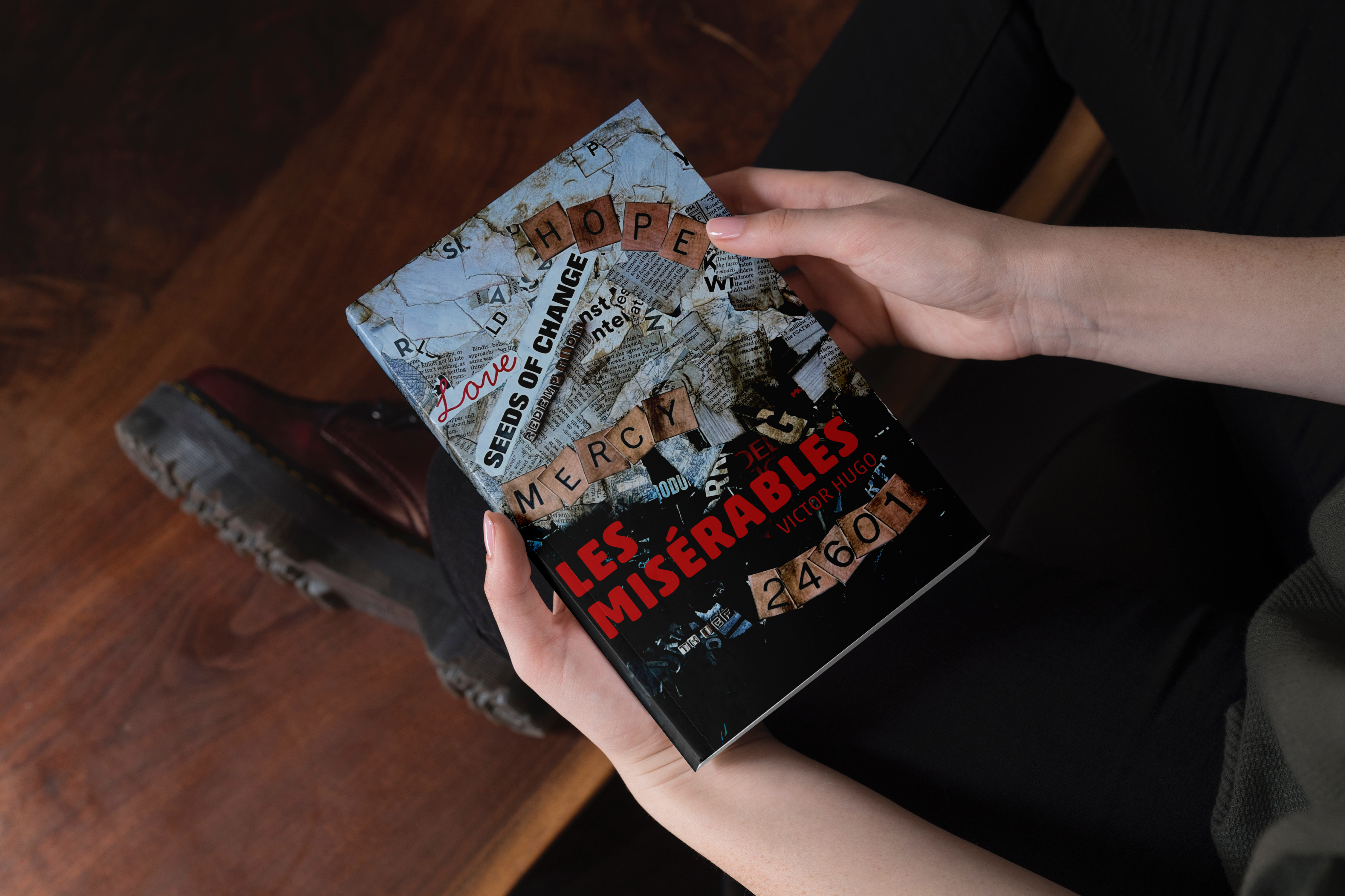
Another school project completed in April 2023 was a redesign the cover from a classic novel. We were to create three unique covers focusing on aspects of the book using different design techniques. Additionally, we were to work to find deeper meanings within the book, rather than the traditionally popular themes.
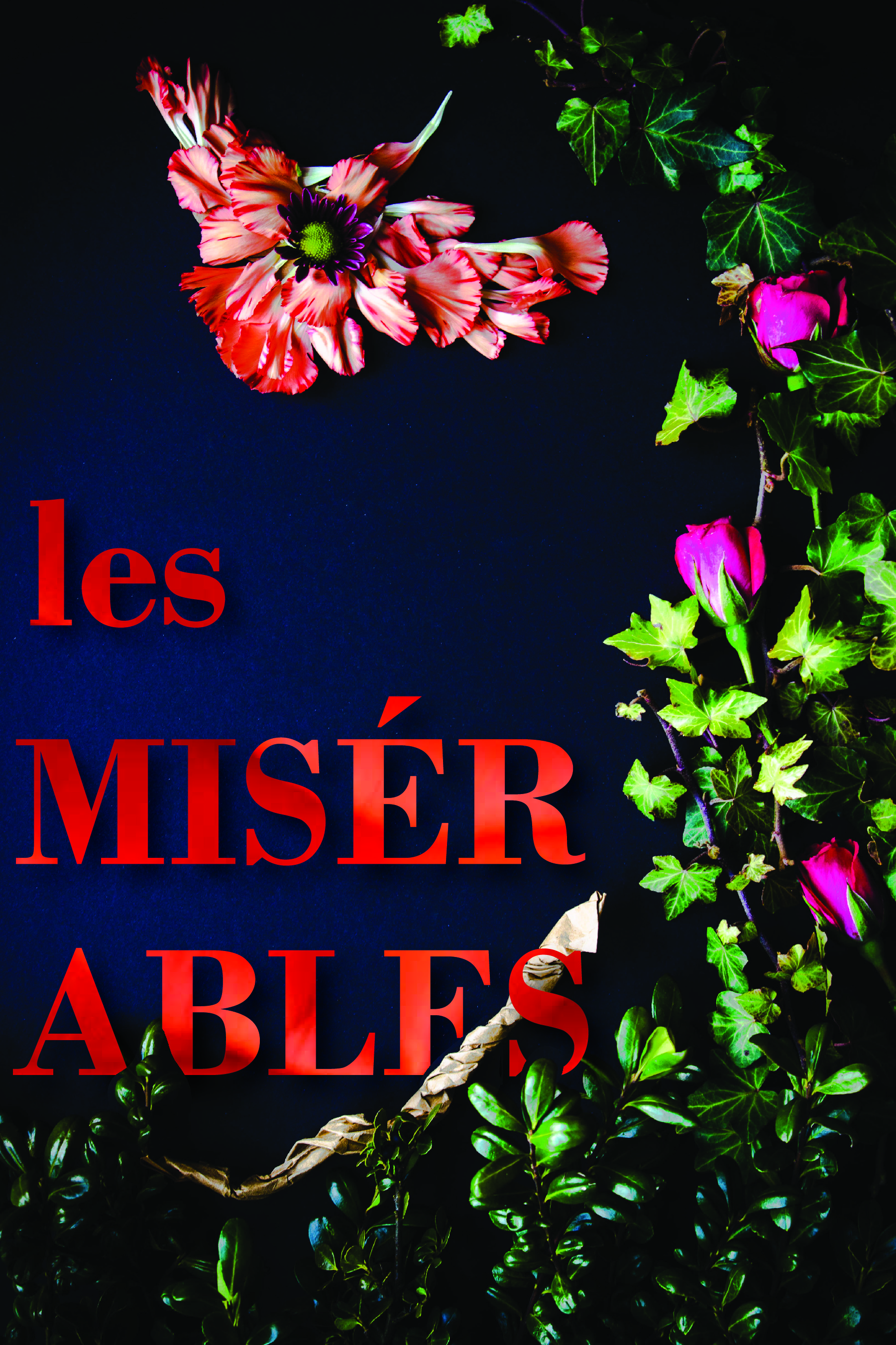
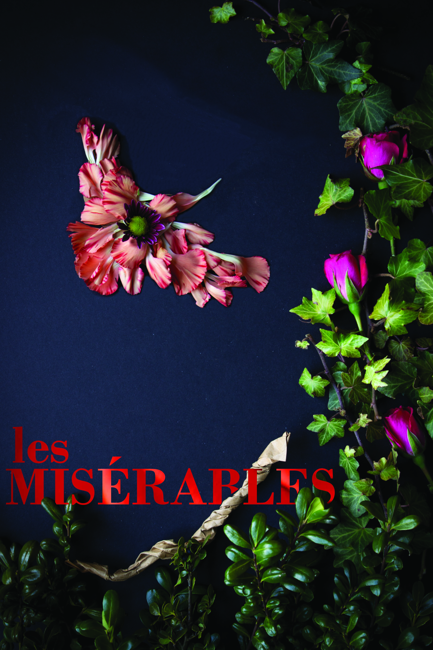
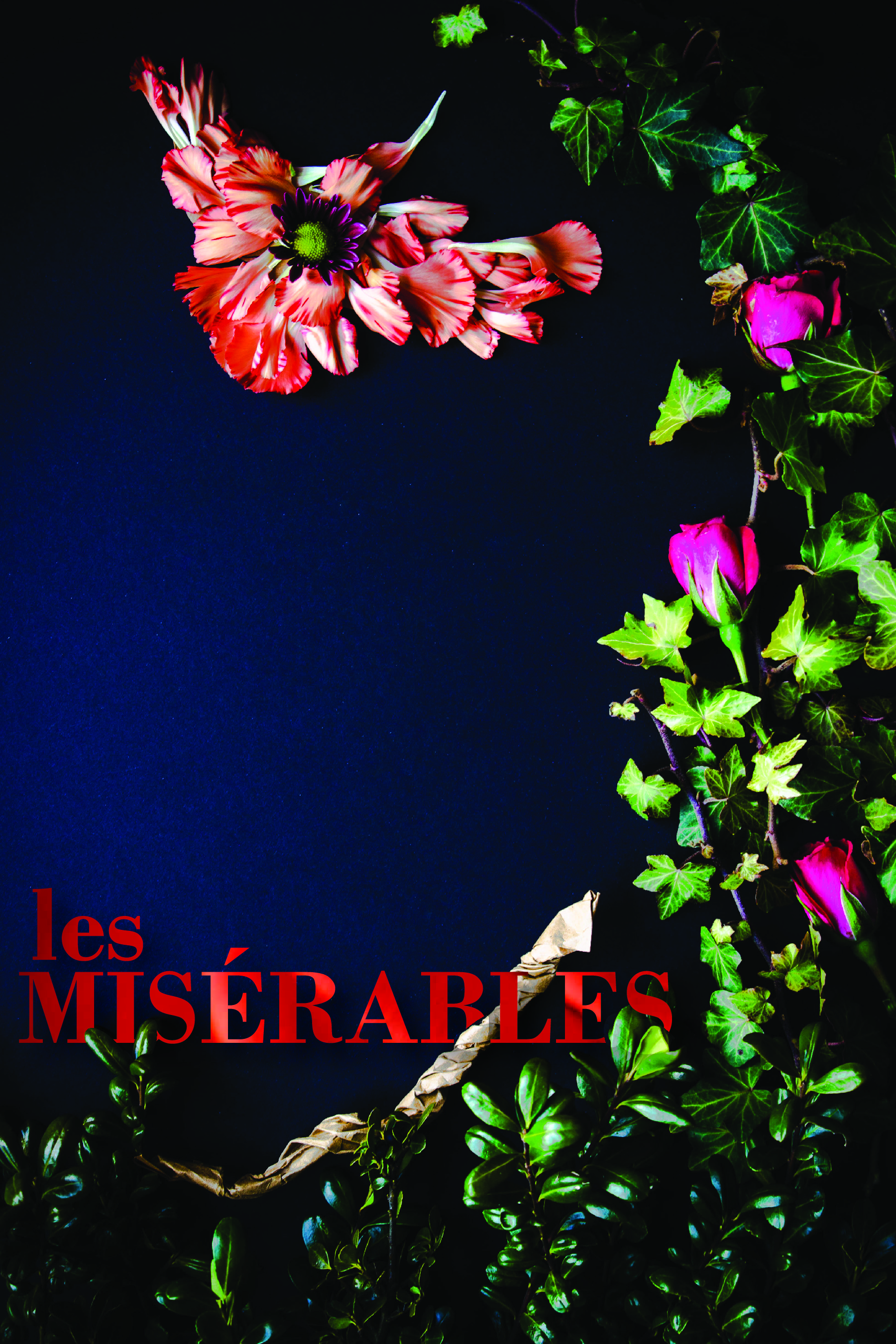
One of my favorite books that was on our list was Les Misérables. After some additional research into the themes of the book, I found several that could be explored for covers. I especially liked Hugo’s use of birds to describe some characters and I wanted to include that motif.
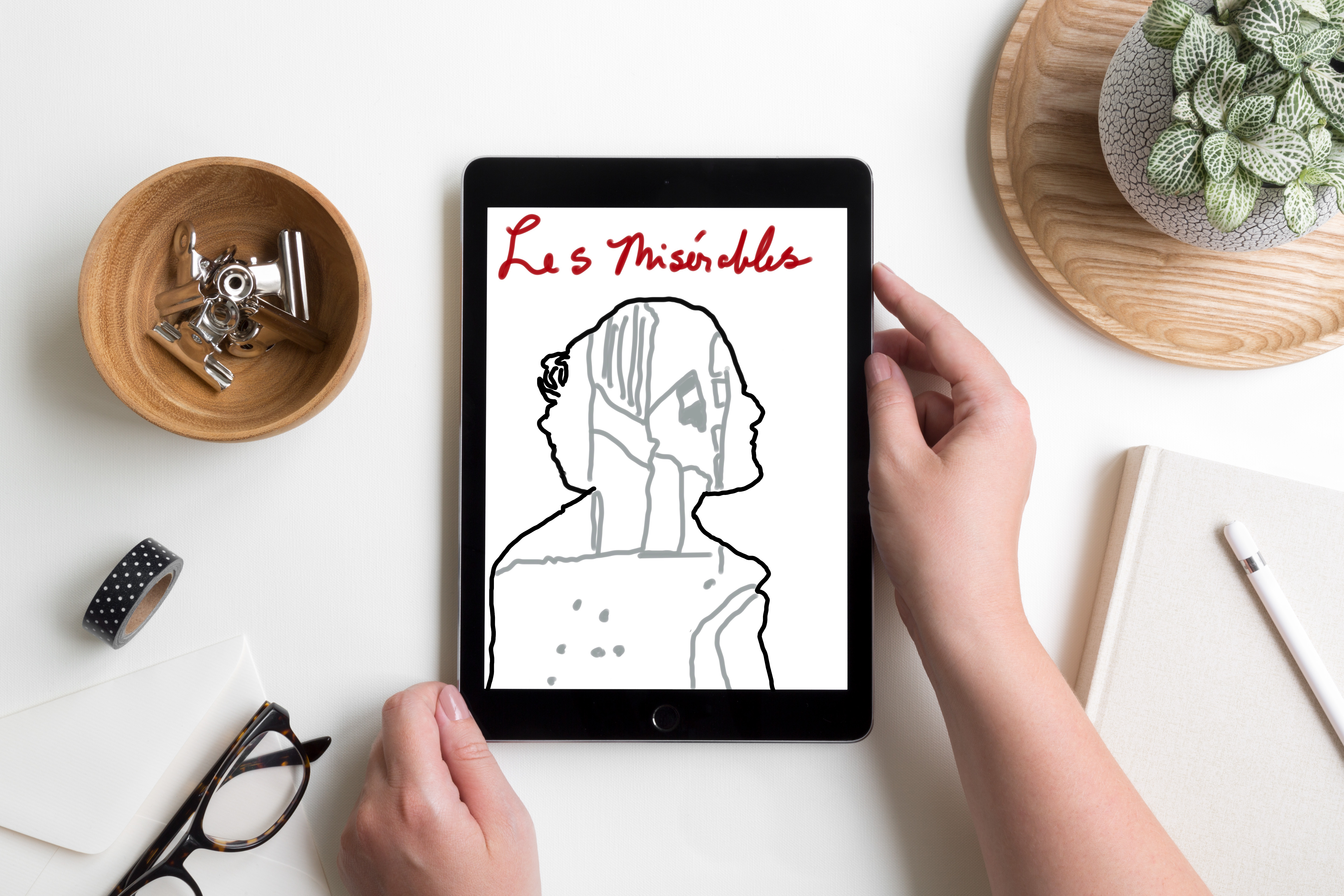
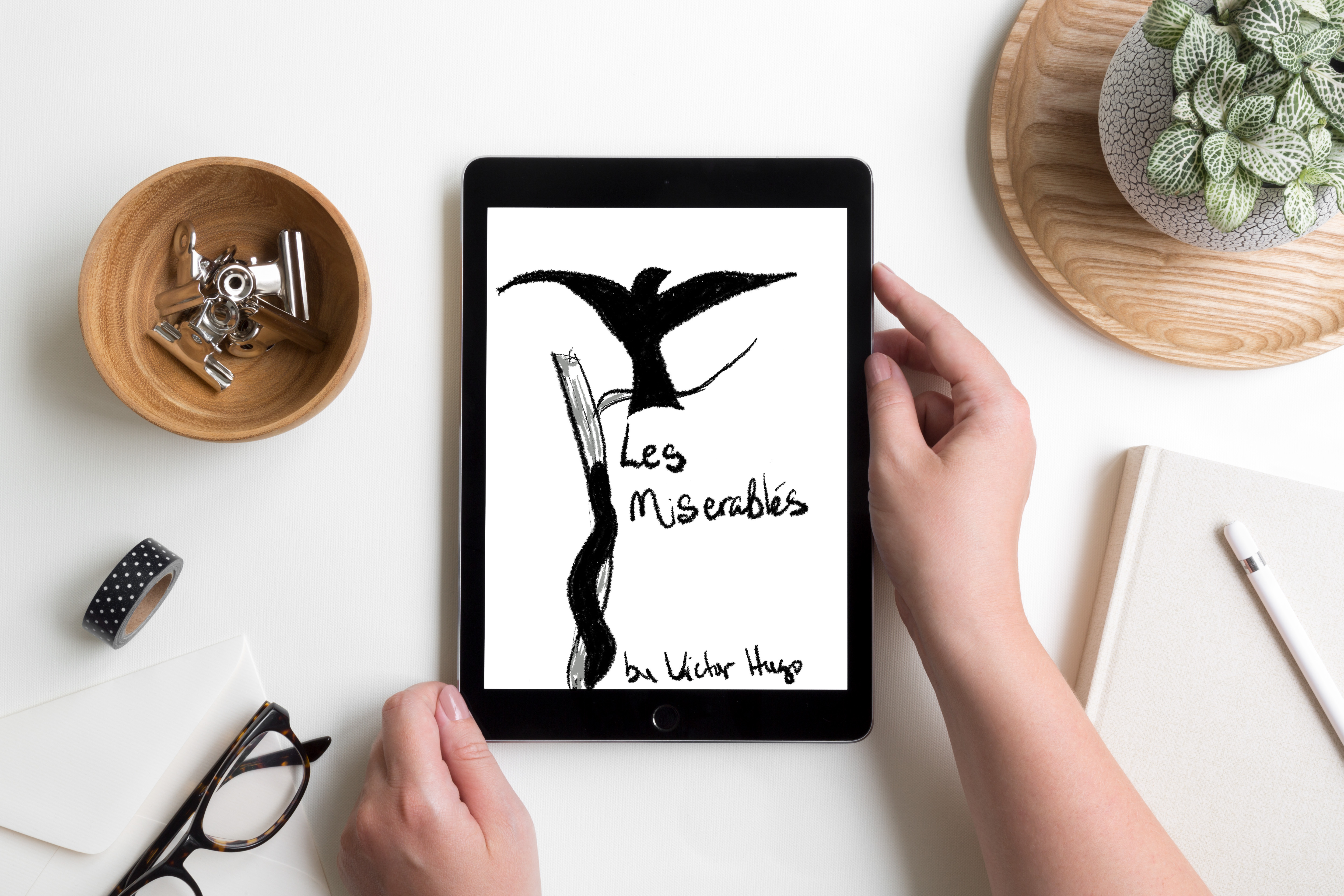
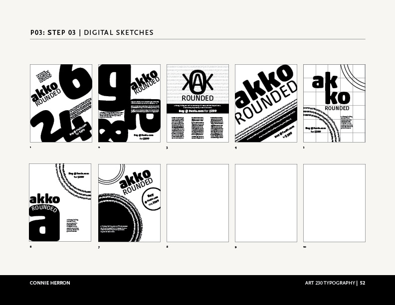
Physical & Digital Sketches
My initial sketches were rough, but I had ideas about where I wanted to go with each one. Once I had sketched out some thoughts I moved on to playing with digital sketches. There were several iterations as I tweaked and refined each cover.
Final Designs
For this first cover, I found two quotes about Cossette by Hugo. In the first one, he describes her as a Lark. I found it interesting that a Lark can’t fully sing until it flies. Then, at another point, Hugo says, “Cosette was not very timid by nature. There flowed in her veins some of the bohemian and the adventuress who runs barefoot. It will be remembered that she was more of a lark than a dove. There was a foundation of wildness and bravery in her.” I used elements from my garden to create the border as well as the bird. I took macro shots of some of the flowers then used them as background for the letters of the font of the title and the author’s name.
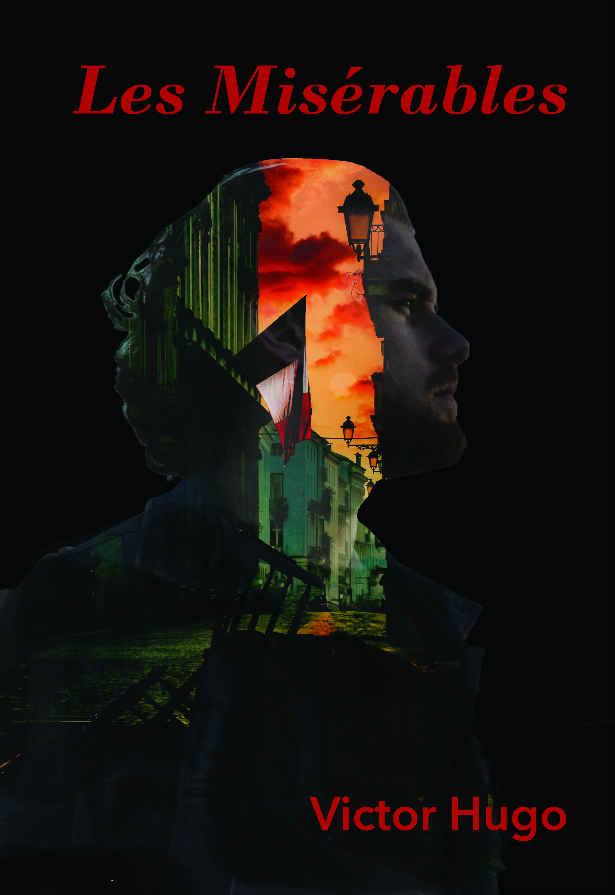
This cover is more traditional and reflects the soldiers at the barricade. They have a vision; a reason they feel they need to go to battle. I needed to create the barricade for this cover and used Photoshop to build it then layered it with the scene behind it. Then I created the double exposure using layer masks.
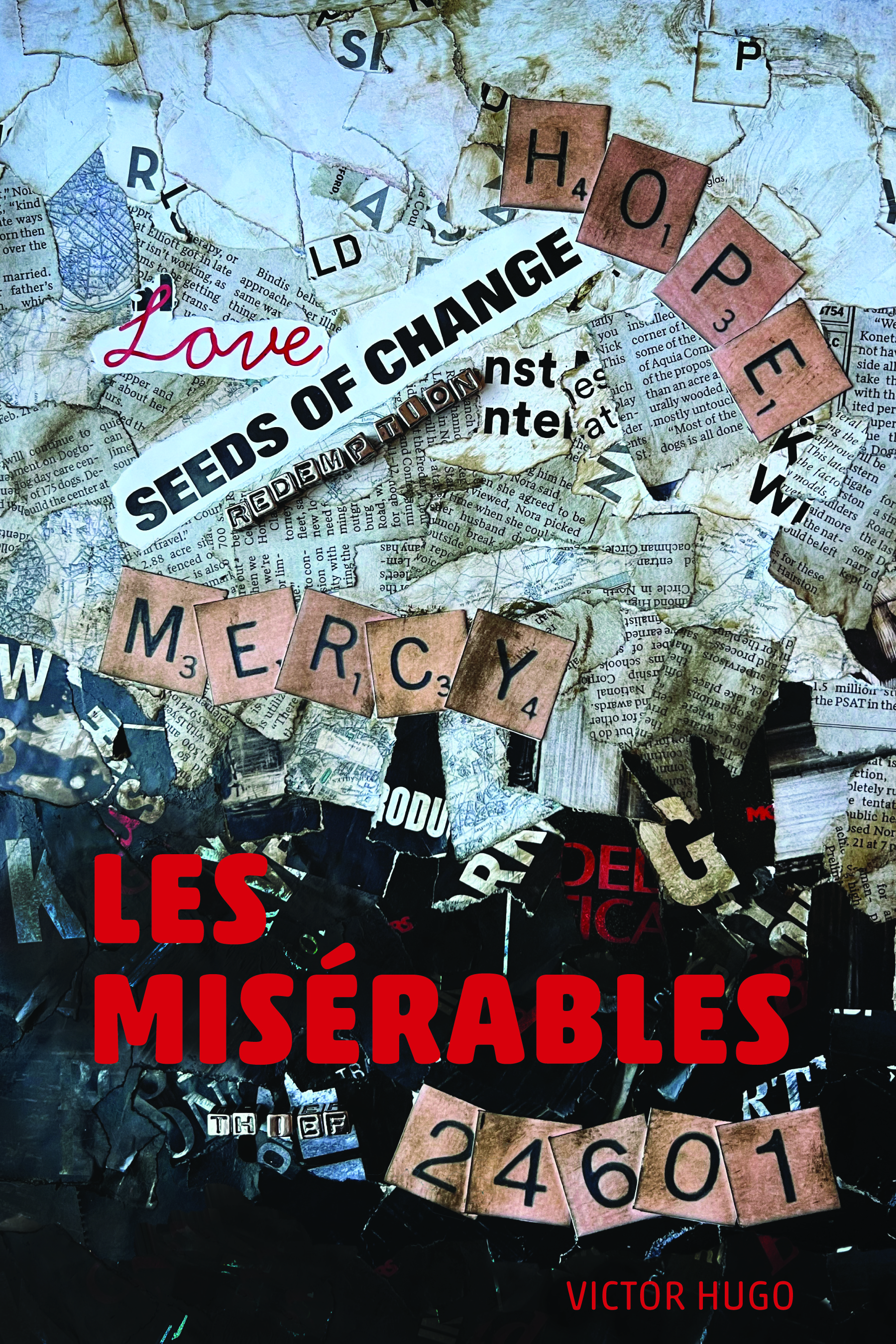
For my typographic cover, I wanted to represent the theme of transformational change that permeates the book, particularly that of Jean Val Jean’s. He begins as a prisoner, a thief, believing that is all he will ever be. He is one of the, “Les Misérables.” Mercy and Love lead to change and hope. In my initial efforts for this cover, I felt my message was getting lost. So, I changed directions completely. I feel the collage captured my intent much more completely.
This project really helped me stretch. I appreciated the critiques I received. They were insightful and helped me improve my designs in my efforts to capture the themes related Les Misérables.
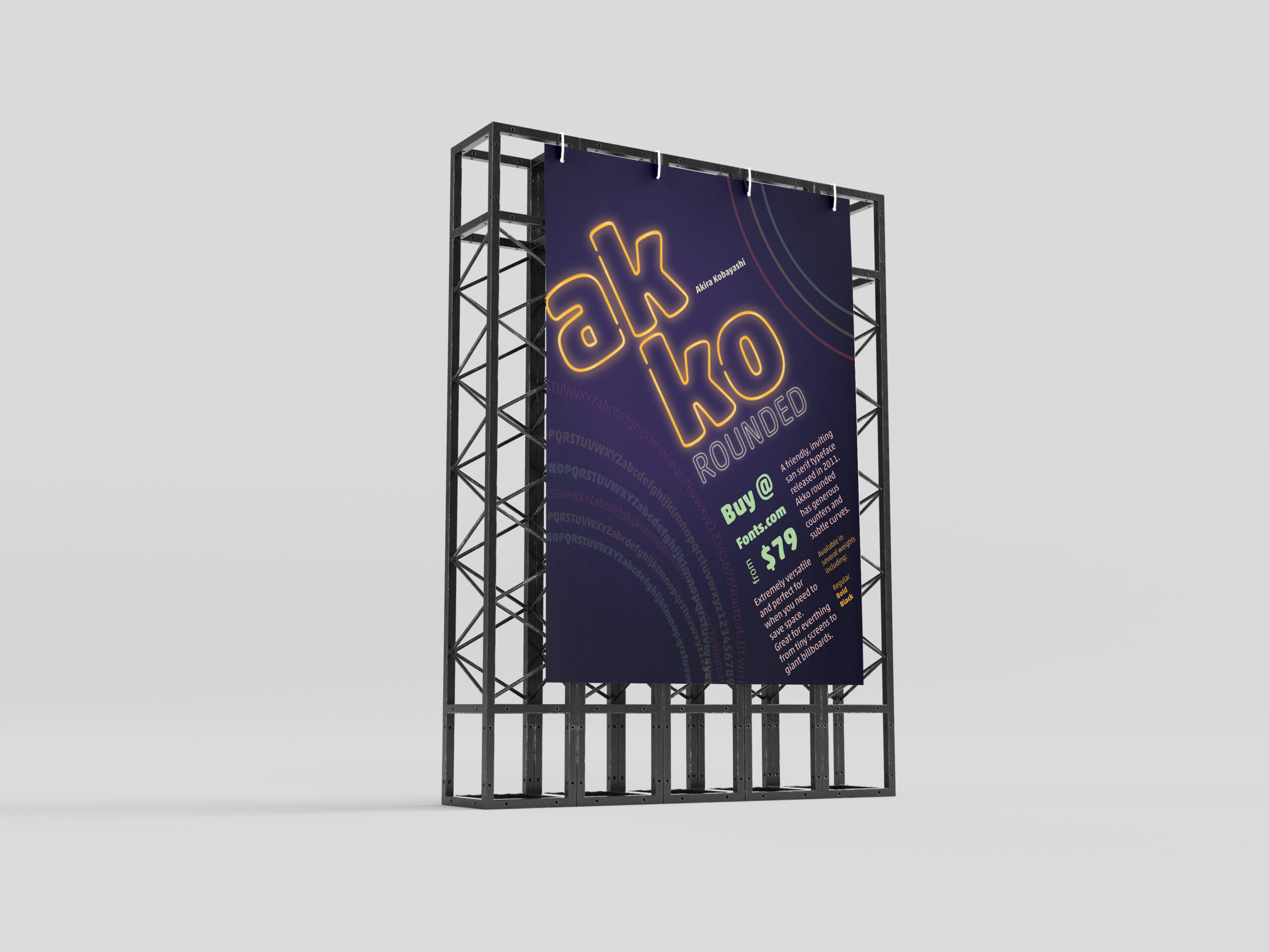
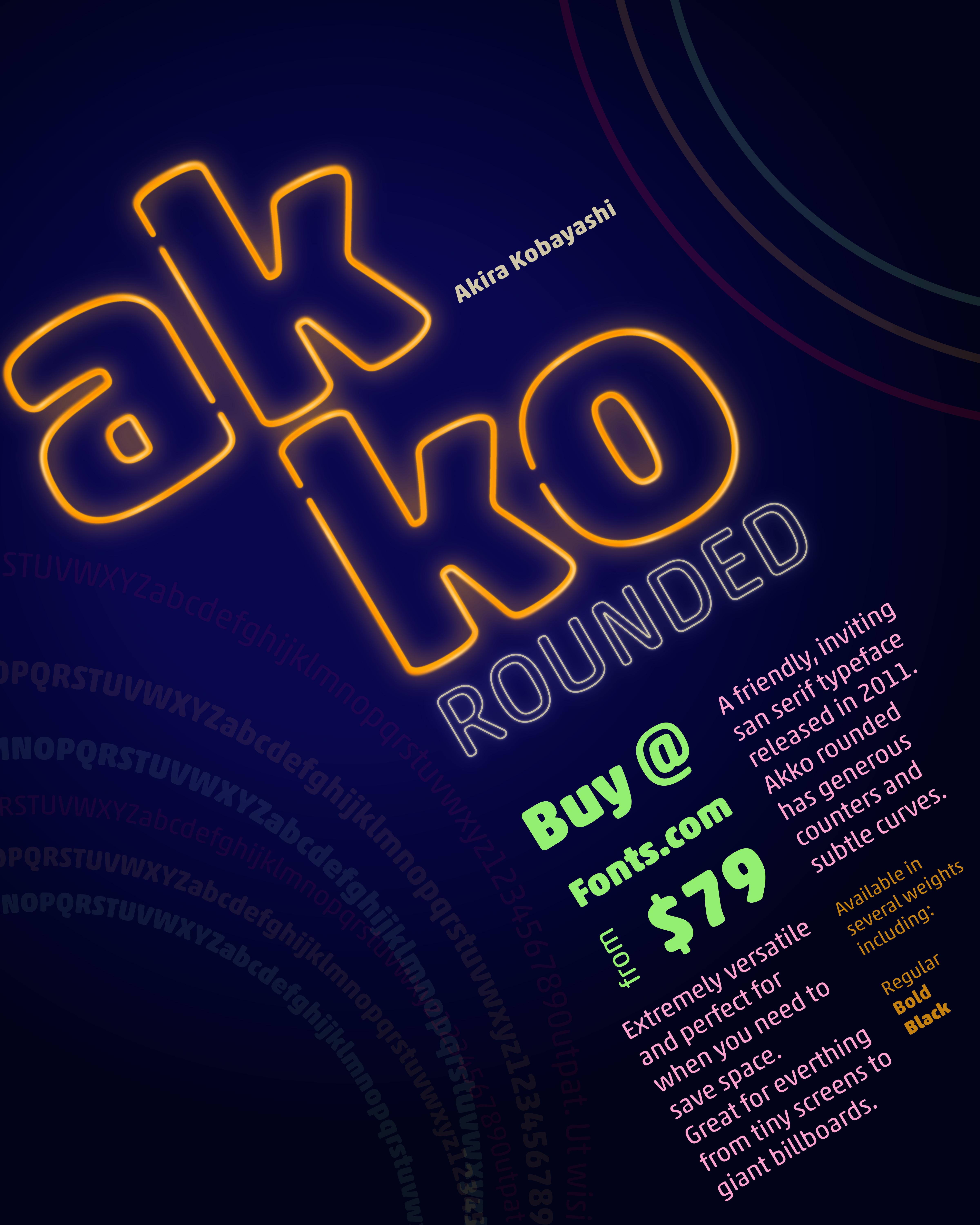
In one of my classes, we were given the task to create a promotional print poster for a typeface for fonts.com. I was assigned Akko Rounded. Akira Kobayashi wanted to design a font that exhibited a “fun, friendly” nature. I wanted to highlight that feeling and the curves of the style of the font in my poster.
Beginning Ideas
As I first started working on ideas, I played with several different ways information could be placed on the poster. I needed to have the name of the font, the designer, cost to purchase it, where to purchase it, the font, and historical background. Focusing on negative space, alignment and overlapping seemed to work the best for as I tried to visualize this. The longer I worked with Akko Rounded the more I felt like I was moving towards designing a poster from the Eighties. So, why not take it that direction as much as possible?
Final Version
I chose a neon pallet for the poster and created a neon effect on the name, “Akko Rounded”. I wanted the rings to feel like they were flashing in the background. I gave the information about where to buy it and the amount the next level in the hierarchy, with its color and placement. The sizes and other details are next in the grid surrounding that information. Then, I placed all of that on the diagonal instead of keeping it vertical to give it visual interest. This is what allowed me to add movement to the circles in the corners. I also used the circles to create some asymmetrical balance by having one be the font weights.
I enjoyed working on this project and with Akko Rounded. It is, as described, a fun and friendly typeface.
My big camera is Canon and I love my Tamron 24-70 lens, but sometimes, the best camera is one you can easily carry with you everywhere all the time. The camera on phones have improved in quality so much over the last several years they’re great for making sure you document your everyday story. There are some basic things you can do to help those photos be even better.
1.) Move your body!
Move Your Body
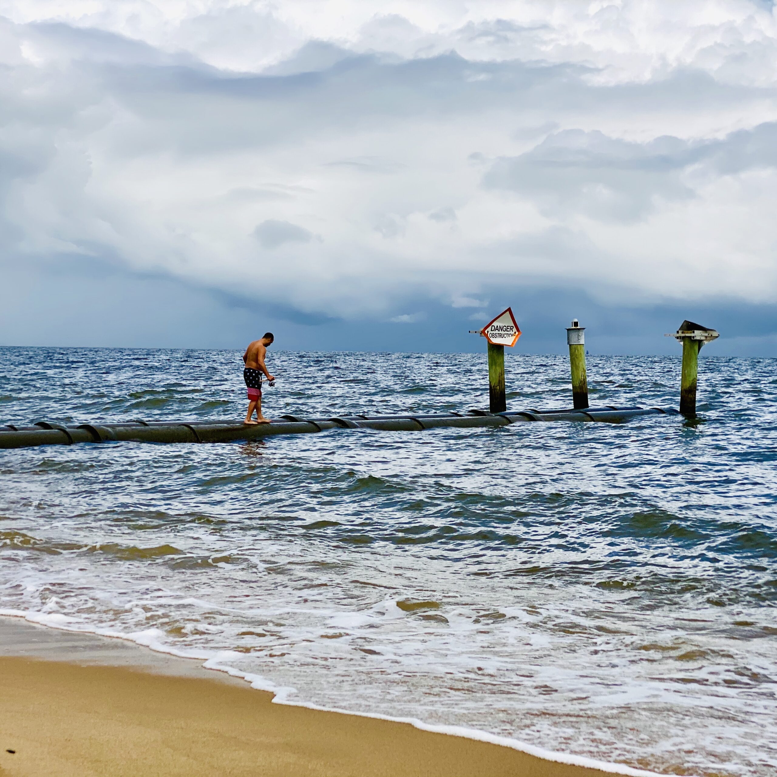
My number one time is don’t be afraid to move your body. Move in close, get down on the ground, look up, look down, turn around (try not to get dizzy). The world looks different from different angles. Hint: don’t think you can get down on the ground? Turn your phone upside down and see how that changes the view!
Watch the Lighting
Watch the lighting
Daytime, cloudy, light from behind (backlit), or nighttime are all different. When the light changes, so does the world and how it looks.
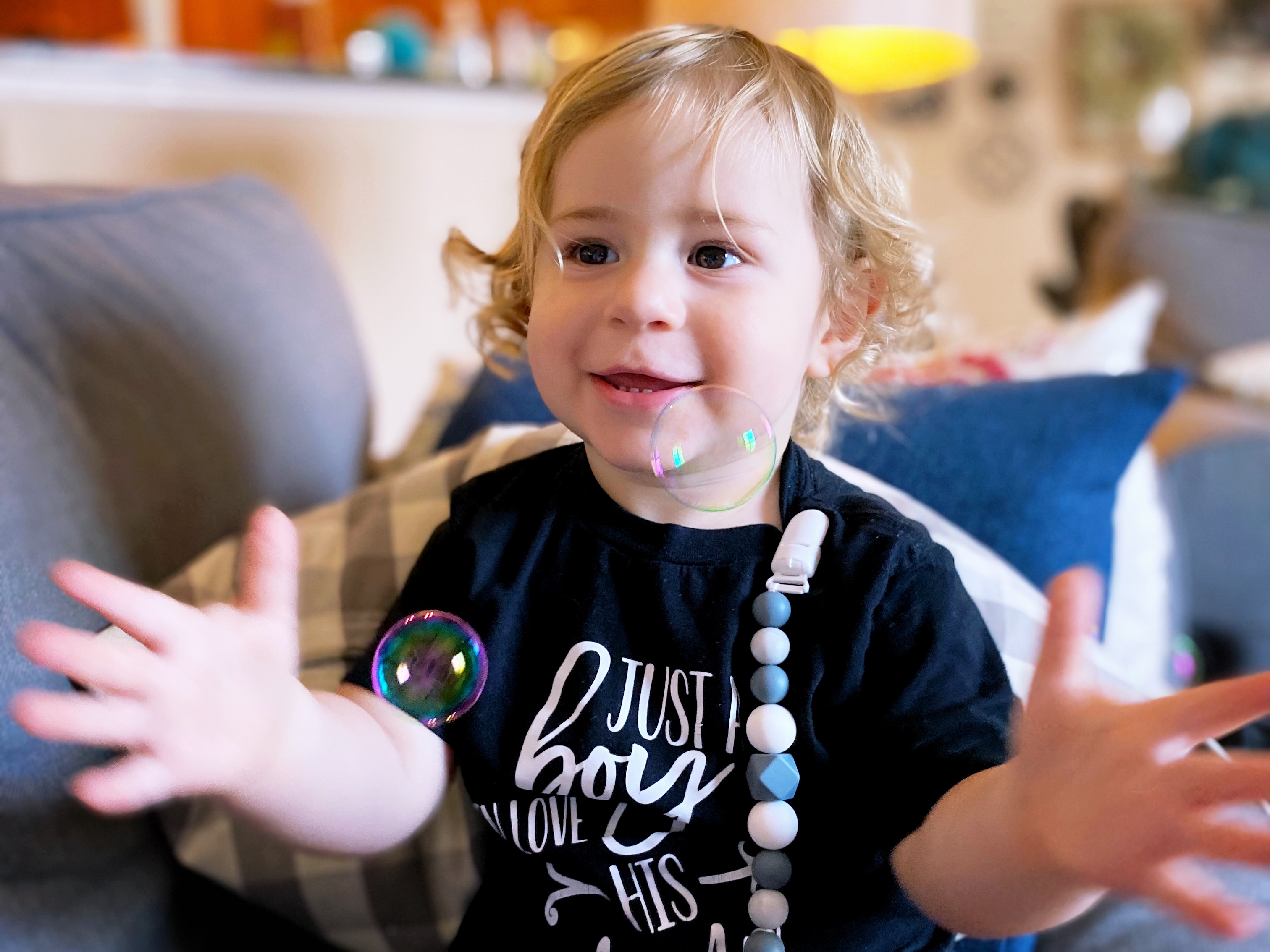
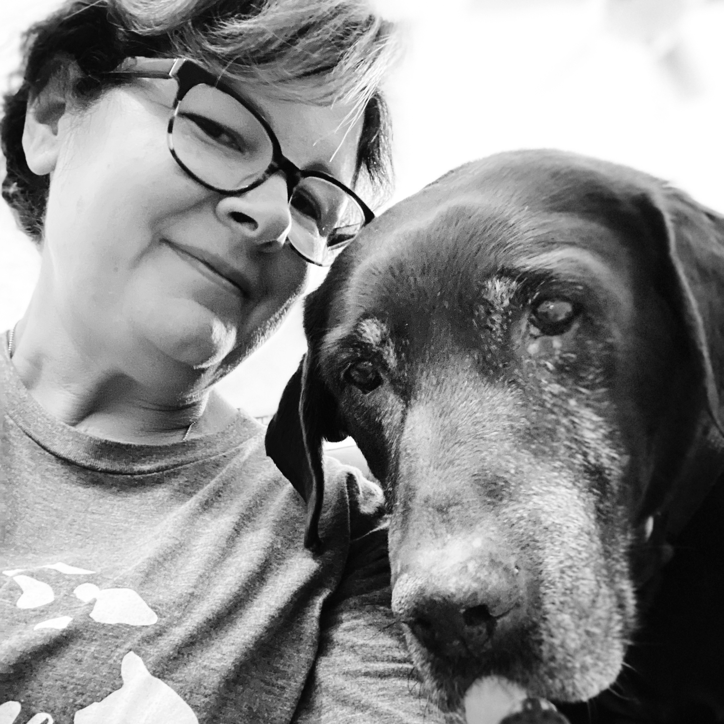
Get in the Photos
Get in the Photos
Lastly, get in the photos. It’s just as important to show you as part of your story as it is to document those around you. We have ups and downs. Don’t stop documenting your story, no matter what. It’s your story and important to document what you’re feeling and what’s happening.
These are just some of the basics. I’ll post other tips in the future.
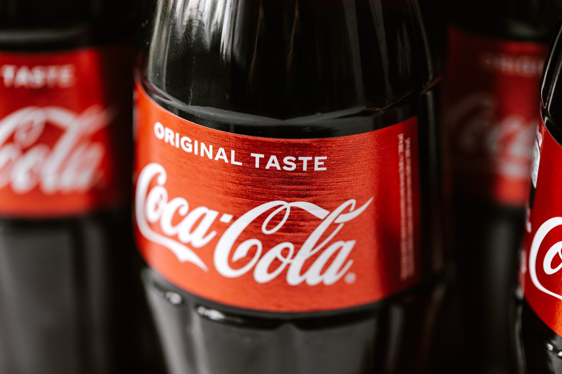
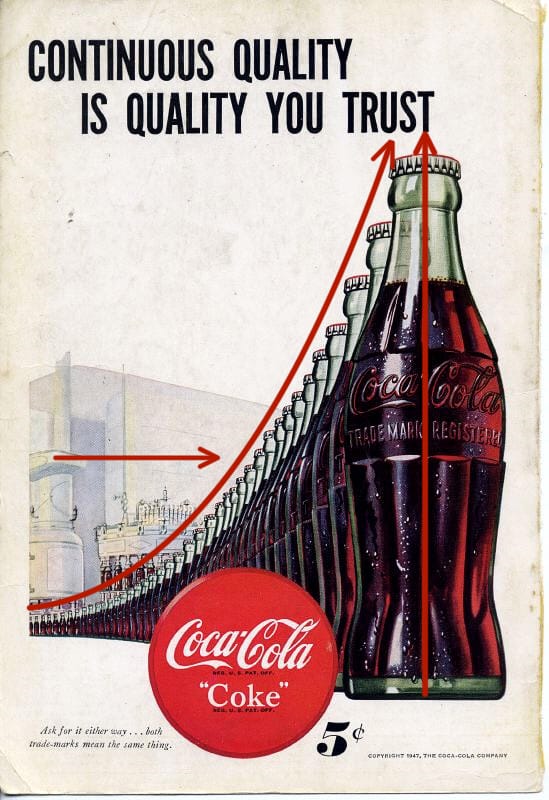
Coke has been around for a long time and so have their ads. The shape of the bottle, the swish in the type, the color of their logo are all the things they used from the beginning to set their unique brand so that you instantly knew what drink you would want even if you couldn’t read anything in the ad. In this ad from 1947 their iconic emblem is traveling from the futuristic factory right into your hand. The ad is all about communicating to you that you can trust Coke to be a quality drink all the time and you want one. So what principles are they using to do that?
Repetition, Proximity & Alignment
Anything in a design can be repeated to add emphasis. It can be a:
word
object
ruled line
color
etc.
In this ad the bottle is the main element repeated. At the time it was the iconic shape associated with their drink and they wanted it instantly recognizable. Other design elements are used with the repeating bottle. They’ve used proximity to make the bottle travel from a futuristic looking factory to you, the customer in way that you could take it right off the page. There are water droplets glistening on the bottle to insinuate that it would be a cold drink on a hot day. The bottles are also aligned so they point at the ward “trust” emphasizing and drawing your eye to the caption.
Proximity is when related items are grouped together.
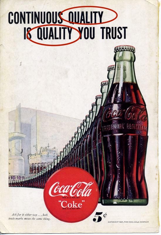
The bottles are grouped together. The creators also repeated the word “quality” and placed them in close proximity, to one another to emphasize it’s importance. They want you to associate quality and trust with the drink and believe that is what you will get every time you buy it. There is one more example of proximity on the page.
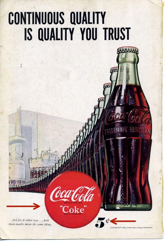
The price.
They wanted you to know instantly looking at the page how much it would cost to go get a cold bottle of Coke. The Coke sign, something everyone would have looked for at the time to find where Coke was sold, is right next to the price which is right next to the bottles. All communicating what to look for, how much it would cost and what they want you to want.
Color & Contrast
Color and Contrast are the final elements used in the ad. Coke has maintained a brand identity almost from the beginning. The red color with that particular font and swish are part of their trademark look. People also knew look for the green bottle. You can still find it on the shelves.
Contrast is used with the futuristic factory in the background. During this time mass production was still relatively new and considered the wave of the future. It was during WWII and there was a focus on moving toward a brighter time. The futuristic factory alludes to Coke being a part of that future.
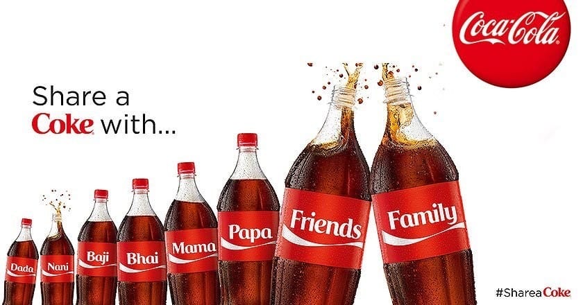
Bringing it Forward
Coke HAS been around for a long time. In more recent ads they looked to remind people of that. They invoke the feeling of some of their vintage ads, they still have the red color, that swish of the font, and the shape of the bottle is still there. Things like repetition, proximity, color, alignment and contrast can be used not just in a single ad, but across the years to invoke a feeling and create a brand that people instantly recognize.