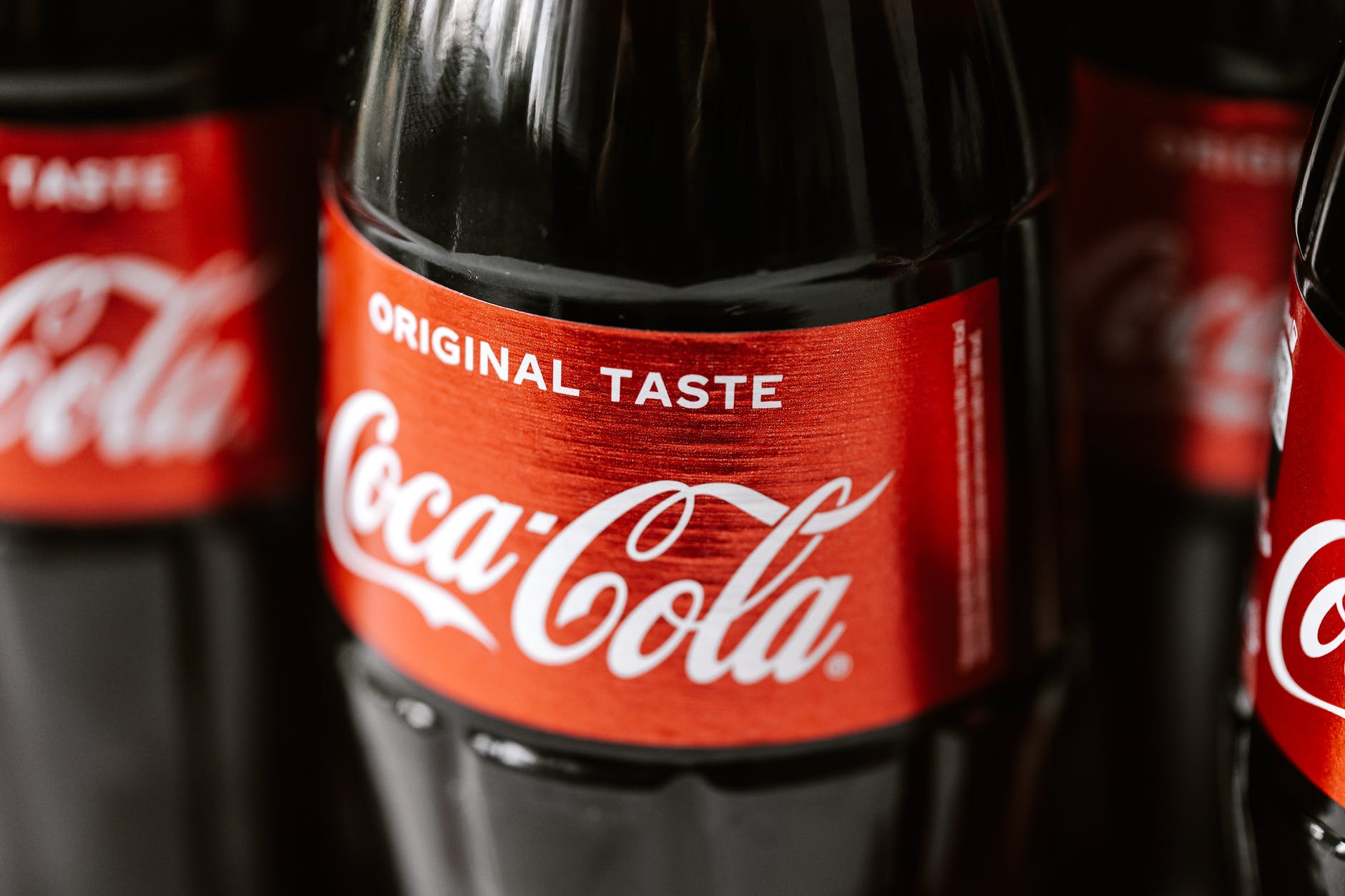
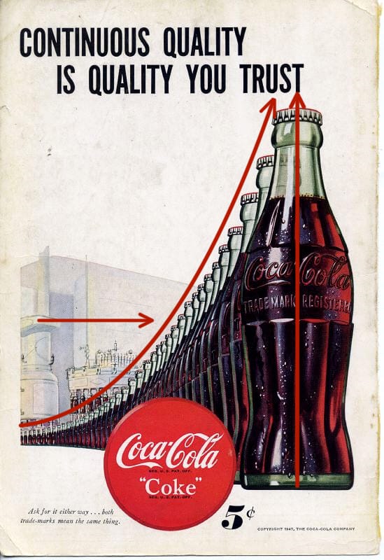
Coke has been around for a long time and so have their ads. The shape of the bottle, the swish in the type, the color of their logo are all the things they used from the beginning to set their unique brand so that you instantly knew what drink you would want even if you couldn’t read anything in the ad. In this ad from 1947 their iconic emblem is traveling from the futuristic factory right into your hand. The ad is all about communicating to you that you can trust Coke to be a quality drink all the time and you want one. So what principles are they using to do that?
Repetition, Proximity & Alignment
Anything in a design can be repeated to add emphasis. It can be a:
- word
- object
- ruled line
- color
- etc.
In this ad the bottle is the main element repeated. At the time it was the iconic shape associated with their drink and they wanted it instantly recognizable. Other design elements are used with the repeating bottle. They’ve used proximity to make the bottle travel from a futuristic looking factory to you, the customer in way that you could take it right off the page. There are water droplets glistening on the bottle to insinuate that it would be a cold drink on a hot day. The bottles are also aligned so they point at the ward “trust” emphasizing and drawing your eye to the caption.
Proximity is when related items are grouped together.
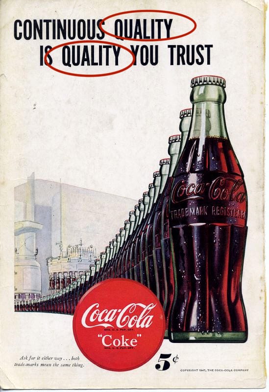
The bottles are grouped together. The creators also repeated the word “quality” and placed them in close proximity, to one another to emphasize it’s importance. They want you to associate quality and trust with the drink and believe that is what you will get every time you buy it. There is one more example of proximity on the page.
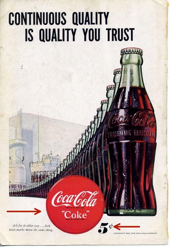
The price.
They wanted you to know instantly looking at the page how much it would cost to go get a cold bottle of Coke. The Coke sign, something everyone would have looked for at the time to find where Coke was sold, is right next to the price which is right next to the bottles. All communicating what to look for, how much it would cost and what they want you to want.
Color & Contrast
Color and Contrast are the final elements used in the ad. Coke has maintained a brand identity almost from the beginning. The red color with that particular font and swish are part of their trademark look. People also knew look for the green bottle. You can still find it on the shelves.
Contrast is used with the futuristic factory in the background. During this time mass production was still relatively new and considered the wave of the future. It was during WWII and there was a focus on moving toward a brighter time. The futuristic factory alludes to Coke being a part of that future.

Bringing it Forward
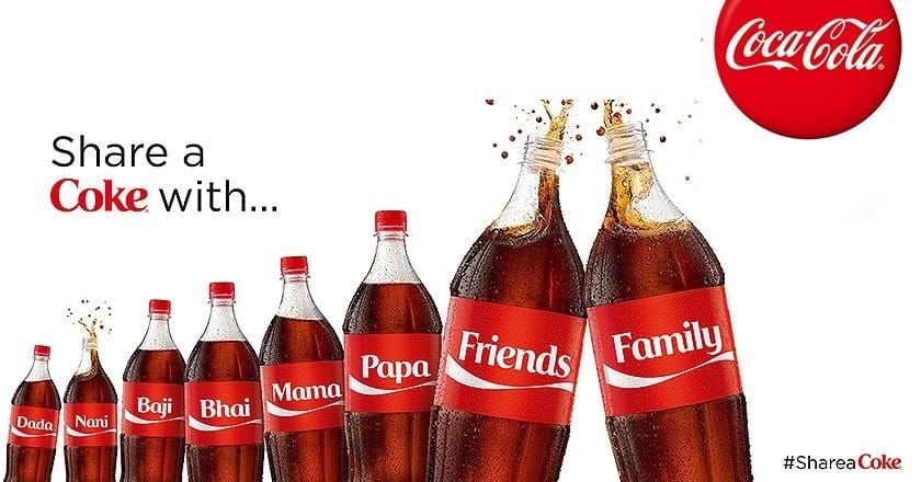
Coke HAS been around for a long time. In more recent ads they looked to remind people of that. They invoke the feeling of some of their vintage ads, they still have the red color, that swish of the font, and the shape of the bottle is still there. Things like repetition, proximity, color, alignment and contrast can be used not just in a single ad, but across the years to invoke a feeling and create a brand that people instantly recognize.
