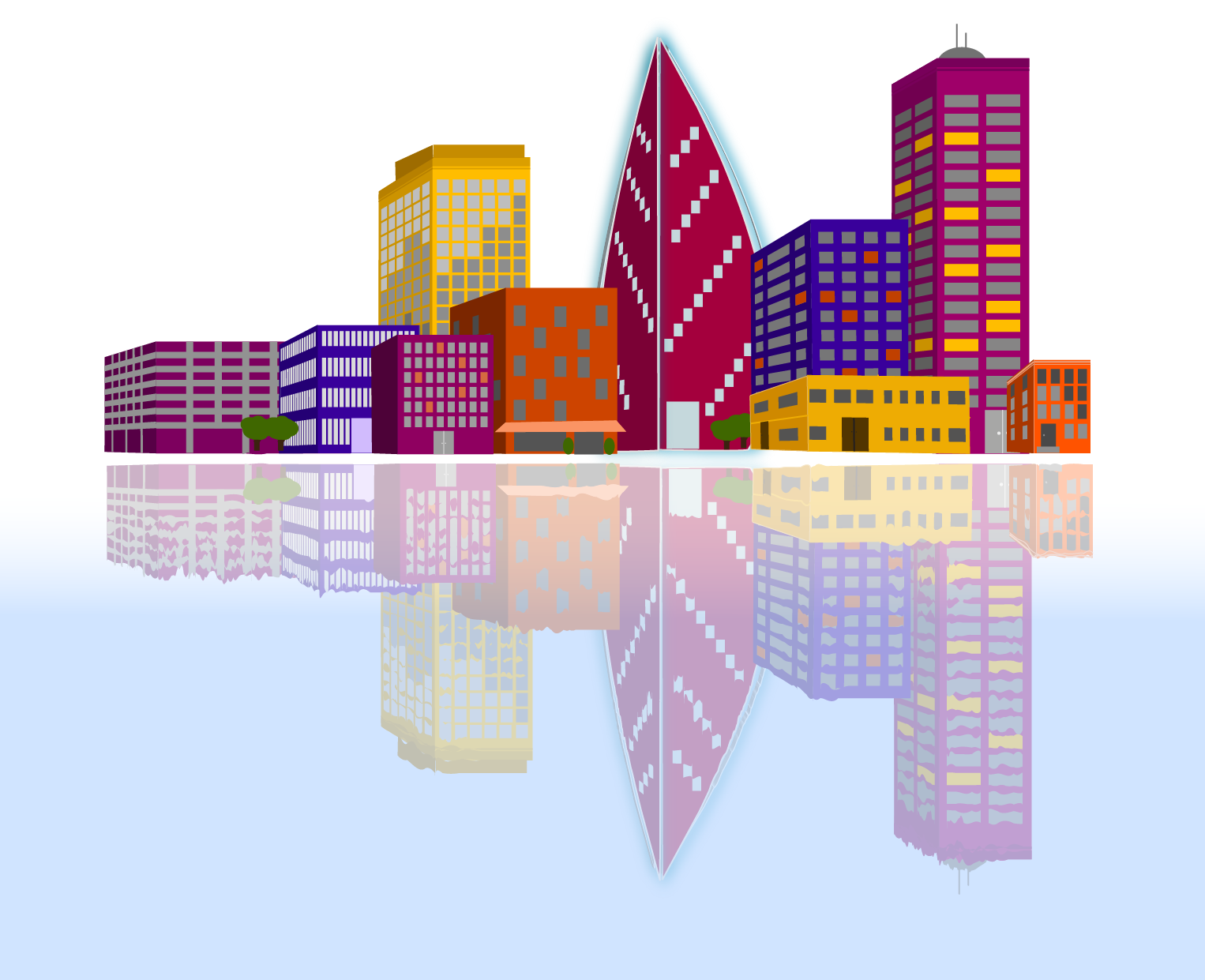
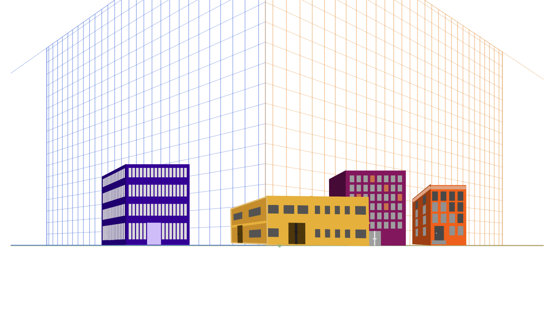
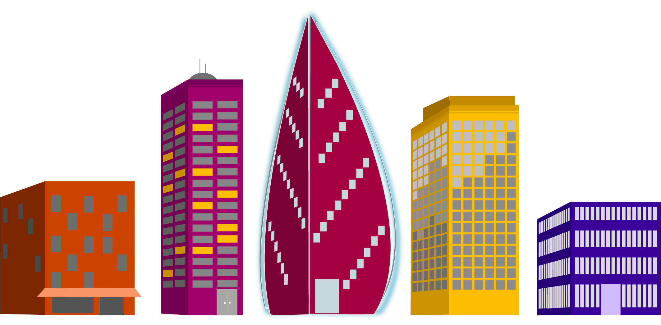
For a recent project we were given the task to create a relected city using a provided grid. My first task was to decide on my color pallet. I like to use coolers color generator for this. Once I had my colors, I began to create my buildings.
We were given a list of buildings to create. 4 small “supporting” buildings, 3 medium “generic” buildings, 2 large “interesting” buildings, and 1 skyscraper. I had decided I wanted my skyscraper to have a modern feel, and then created buildings that were a bit more modern to go with it as well. It’s a city that is working towards revitalization.
As I created the buildings I tried to think about the direction of the sun in the final scene and how it might be reflecting on the windows. I also thought about where light might be coming from lights being on inside.
The last step was to layer them together and then reflect that city. I created a gradient on a layer beneath the reflected layer, then used the warp tool to create waves in the lines of the reflected buildings.
The project itself earned the stamp of approval from my daughter and that’s good enough for me.
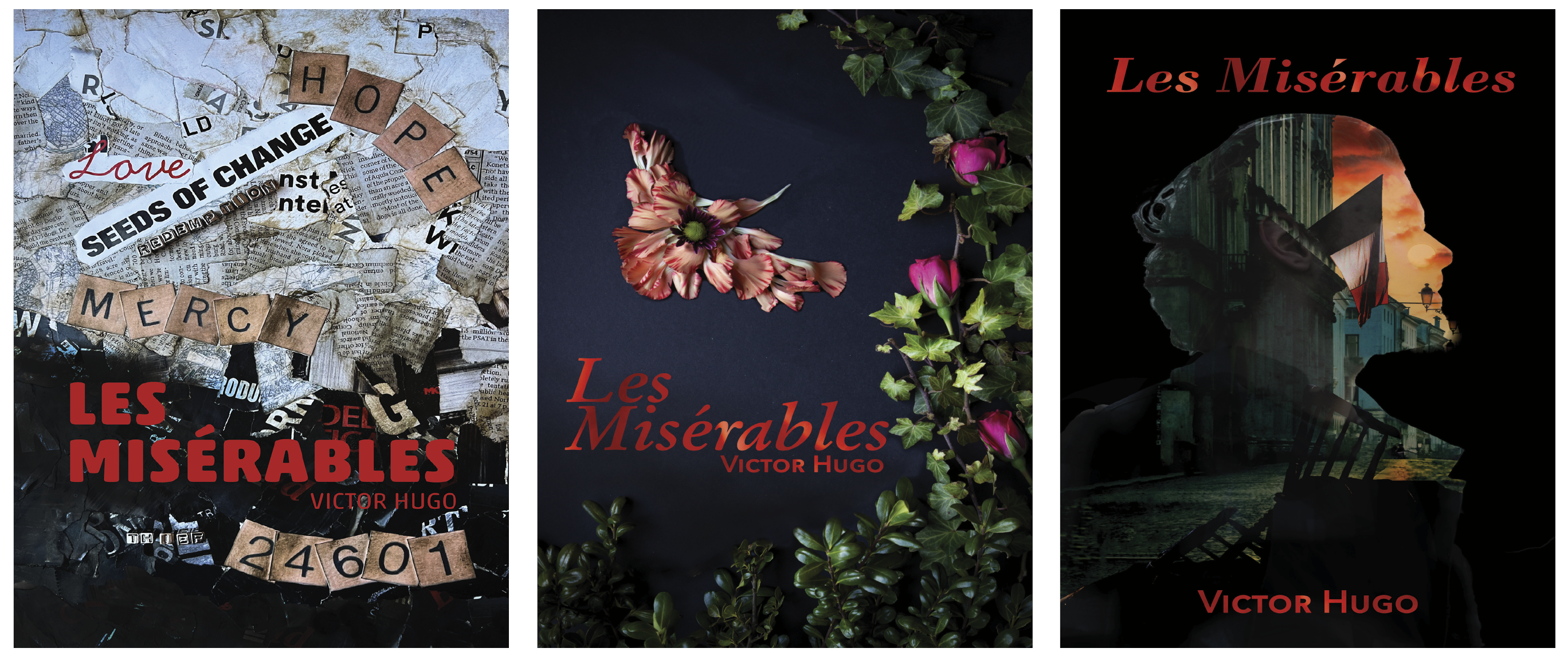
Another school project completed in April 2023 was a redesign the cover from a classic novel. We were to create three unique covers focusing on aspects of the book using different design techniques. Additionally, we were to work to find deeper meanings within the book, rather than the traditionally popular themes.
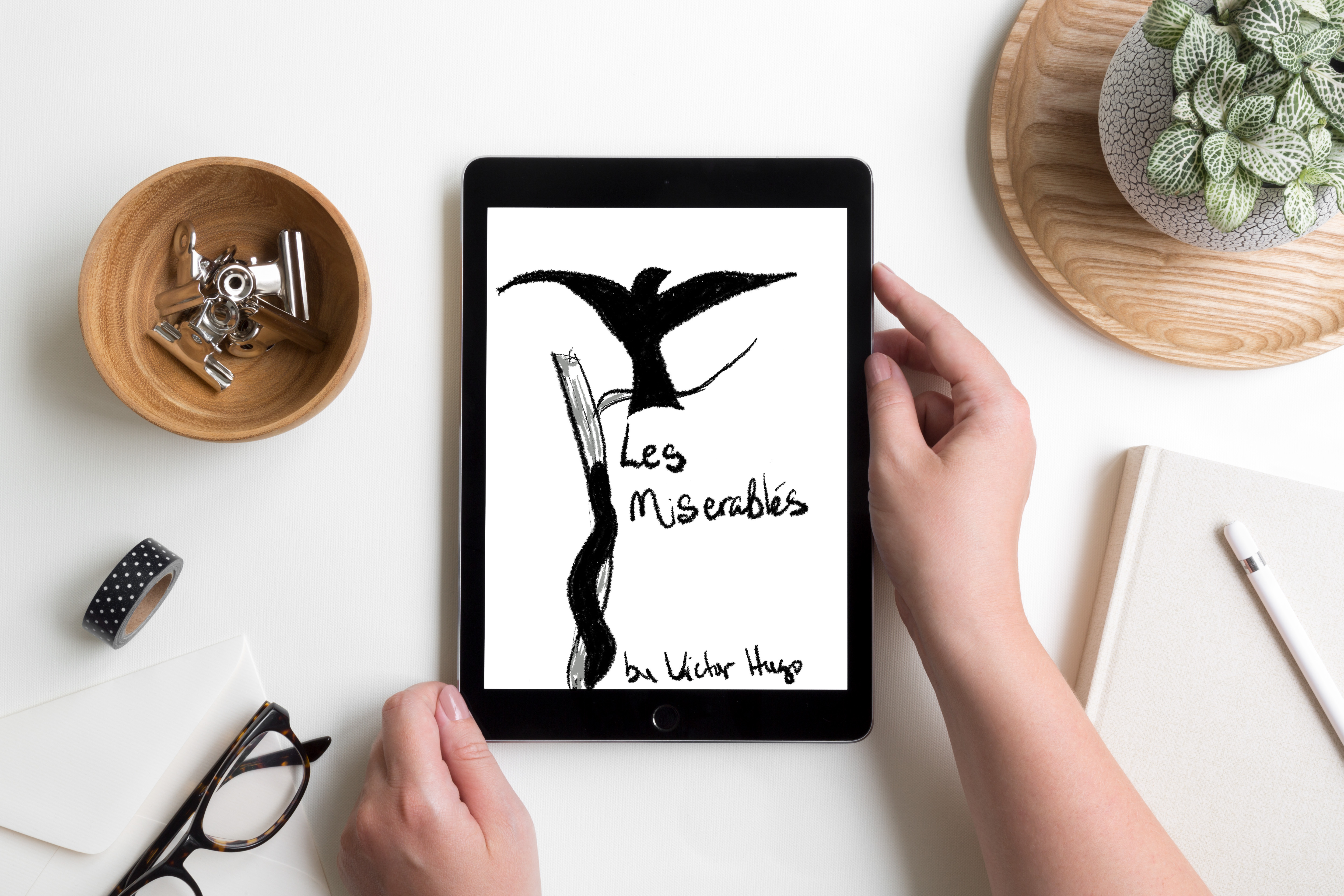
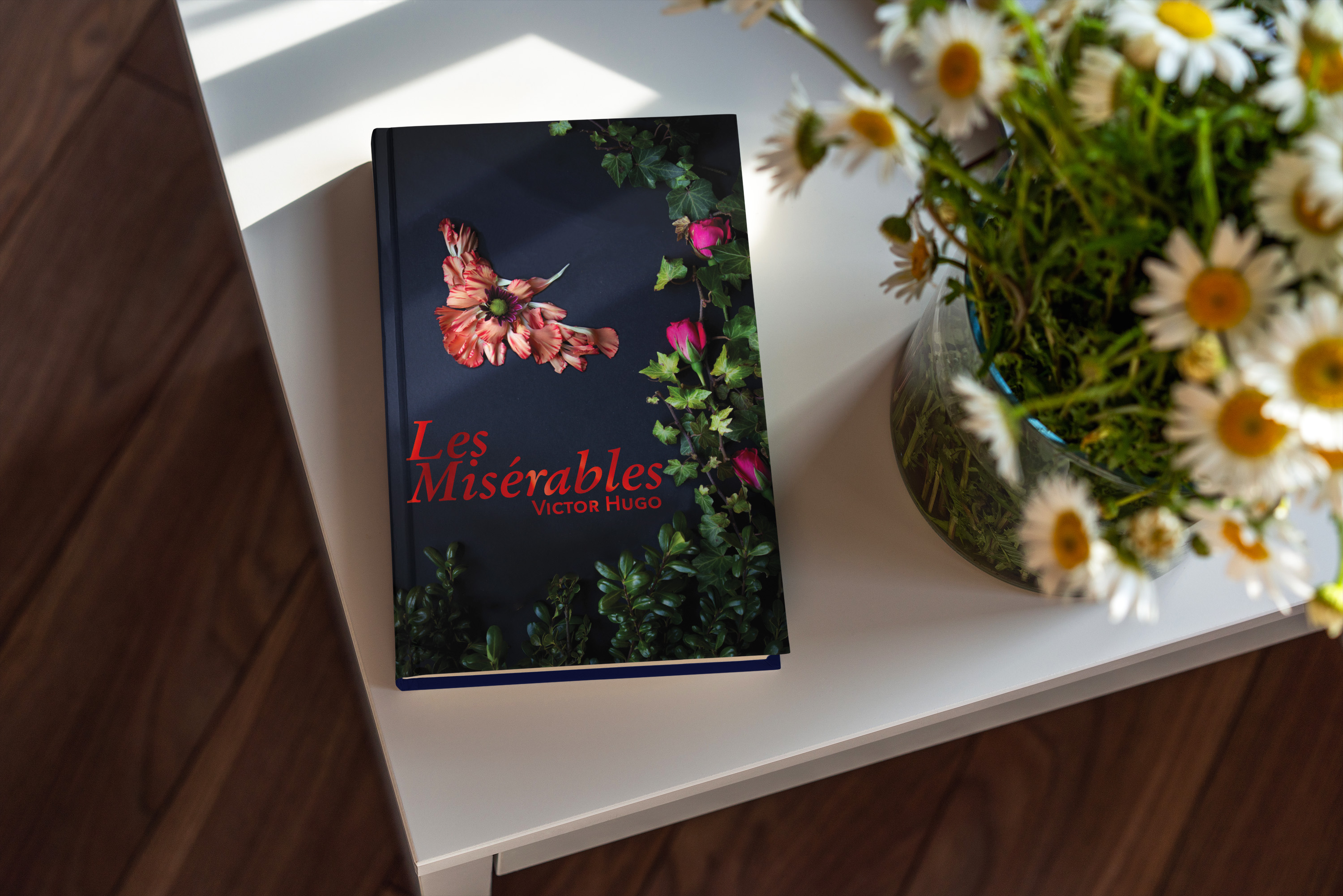
One of my favorite books that was on our list was Les Misérables. After some additional research into the themes of the book, I found several that could be explored for covers. I especially liked Hugo’s use of birds to describe some characters and I wanted to include that motif.
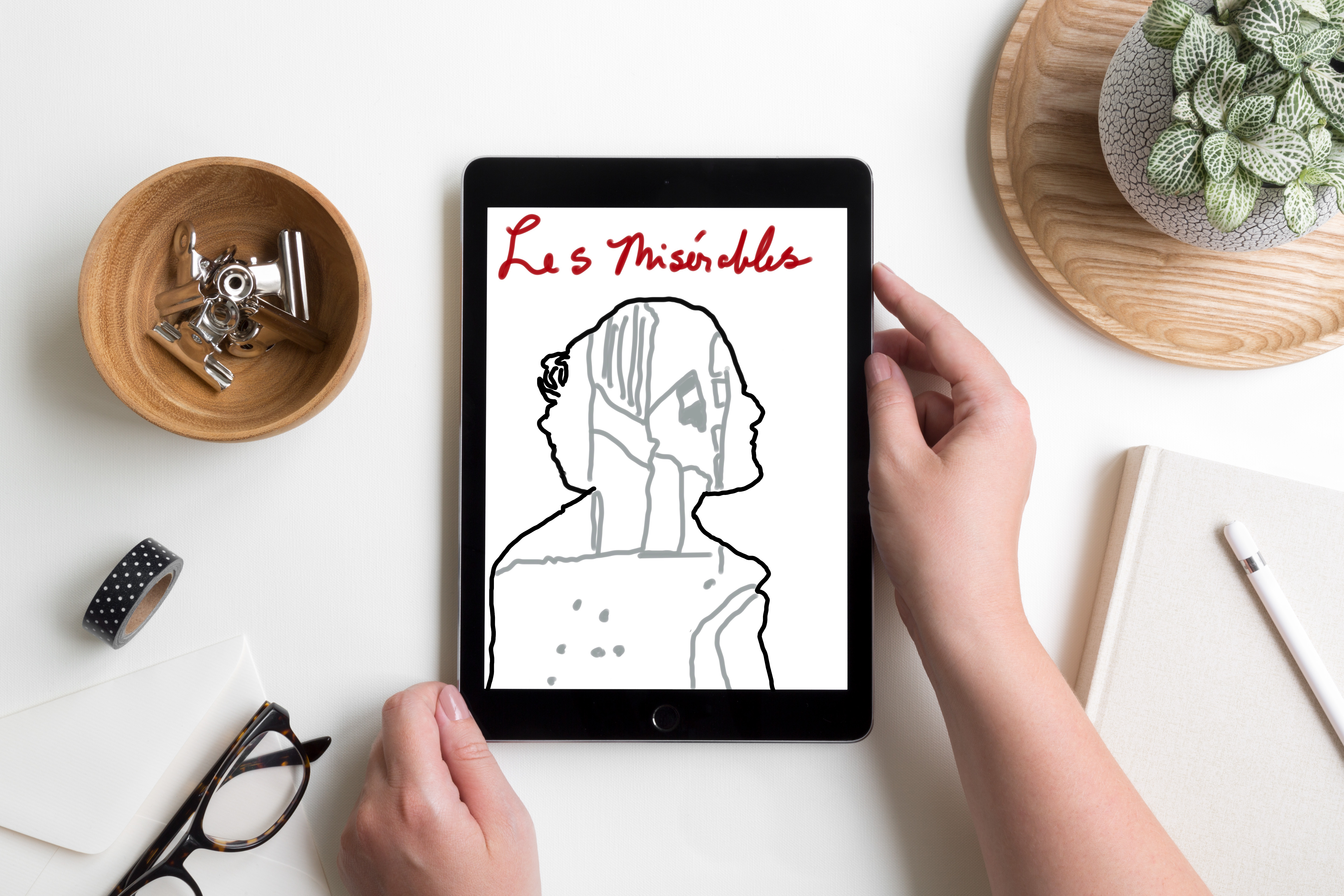
Physical & Digital Sketches
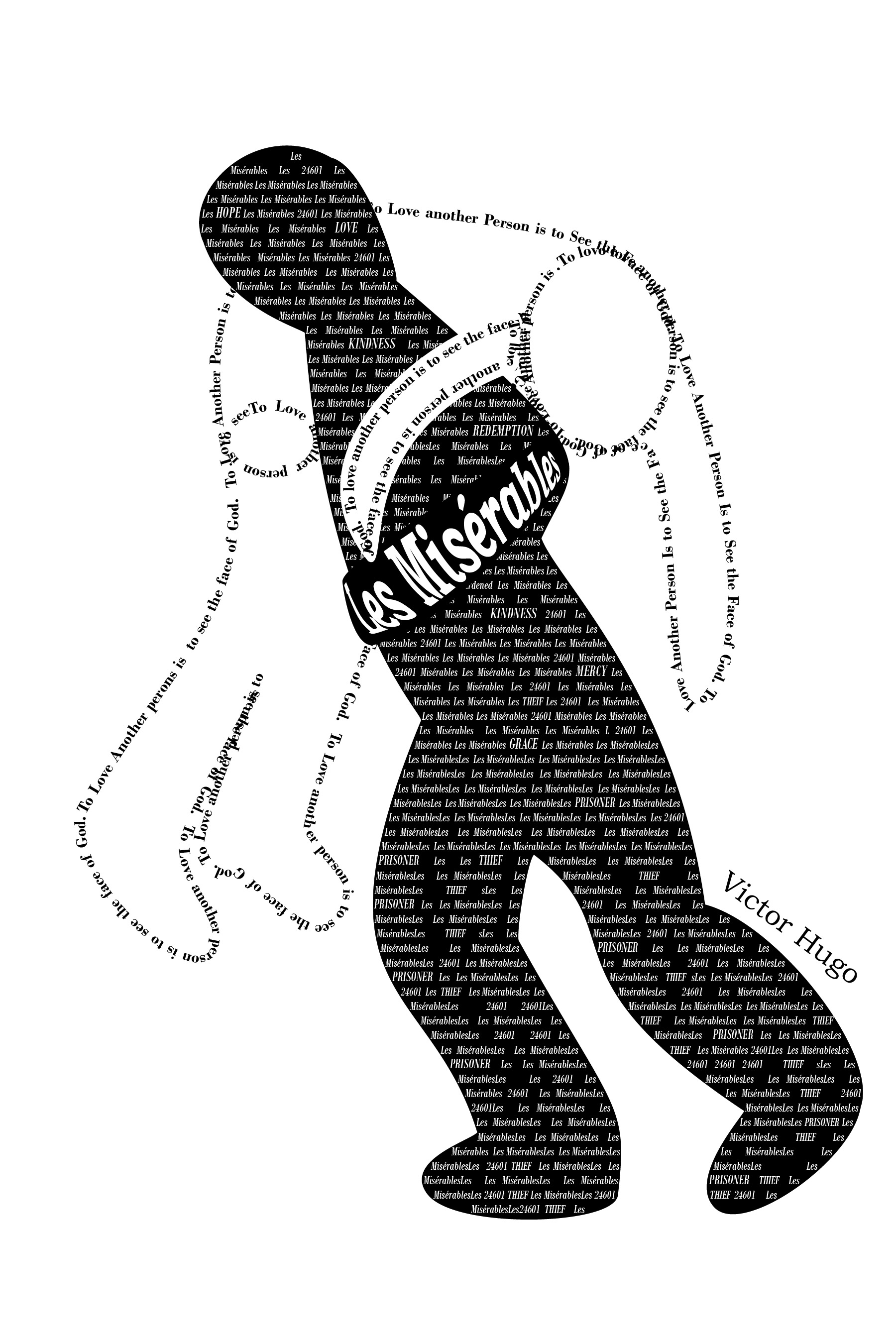
My initial sketches were rough, but I had ideas about where I wanted to go with each one. Once I had sketched out some thoughts I moved on to playing with digital sketches. There were several iterations as I tweaked and refined each cover.
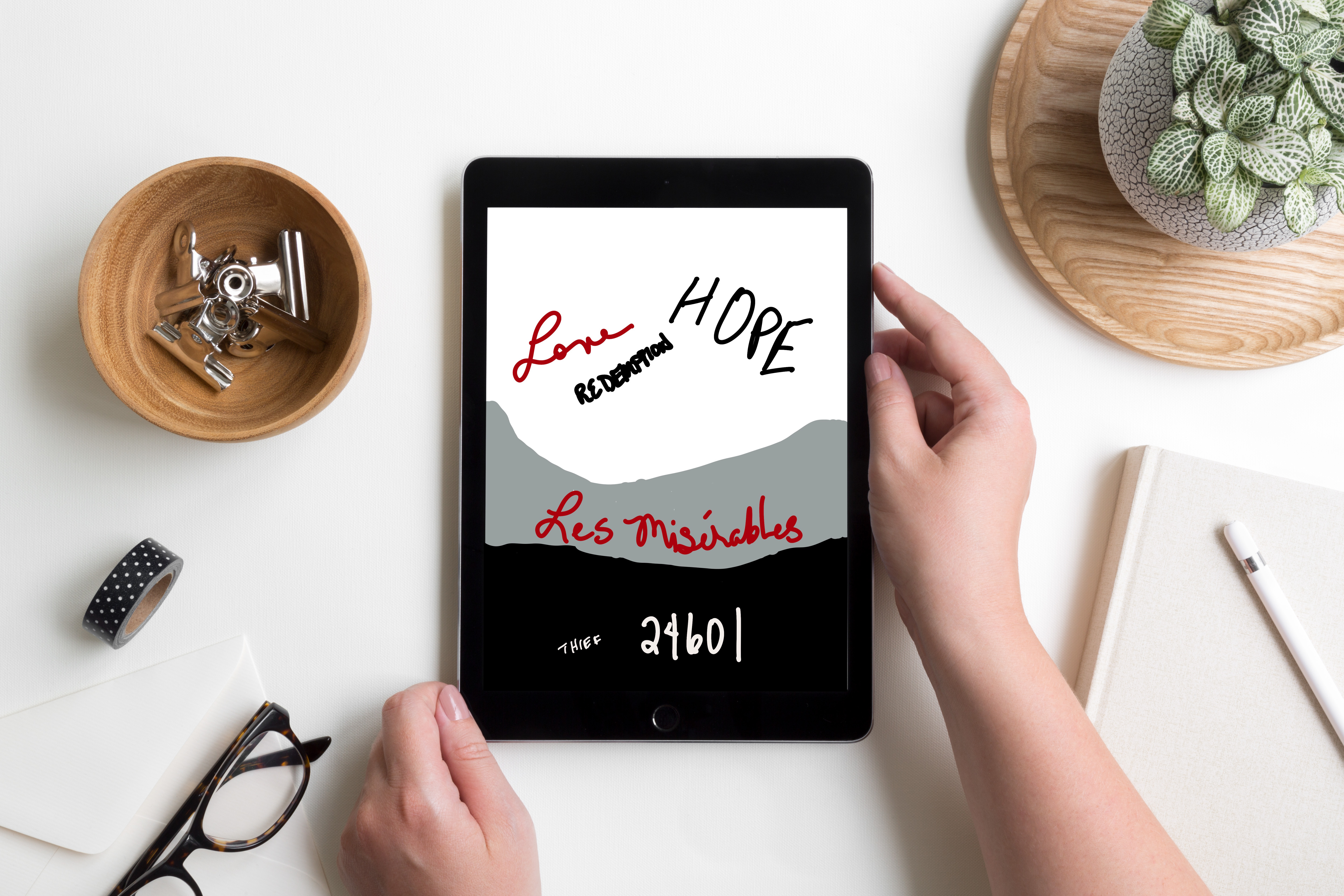
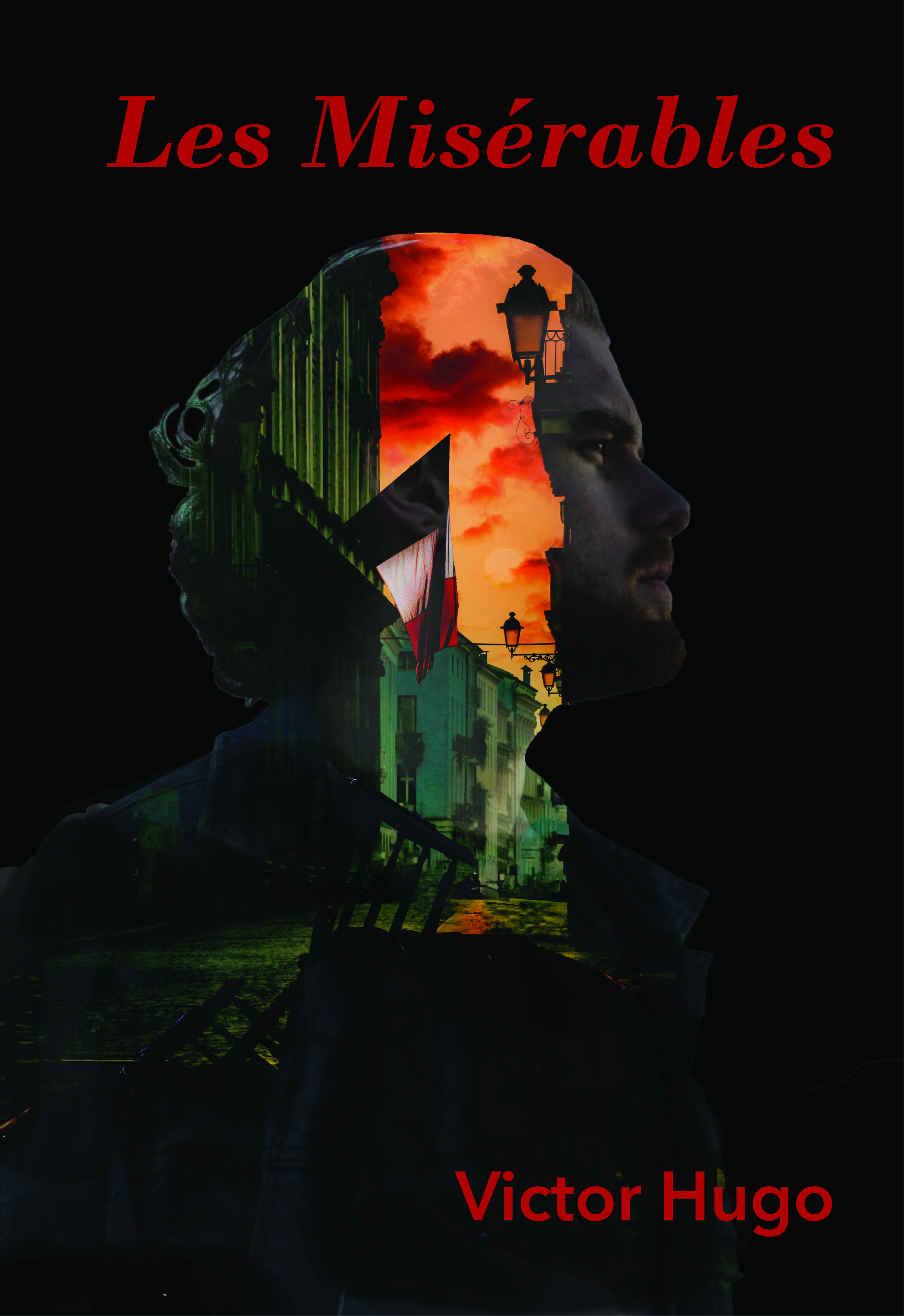
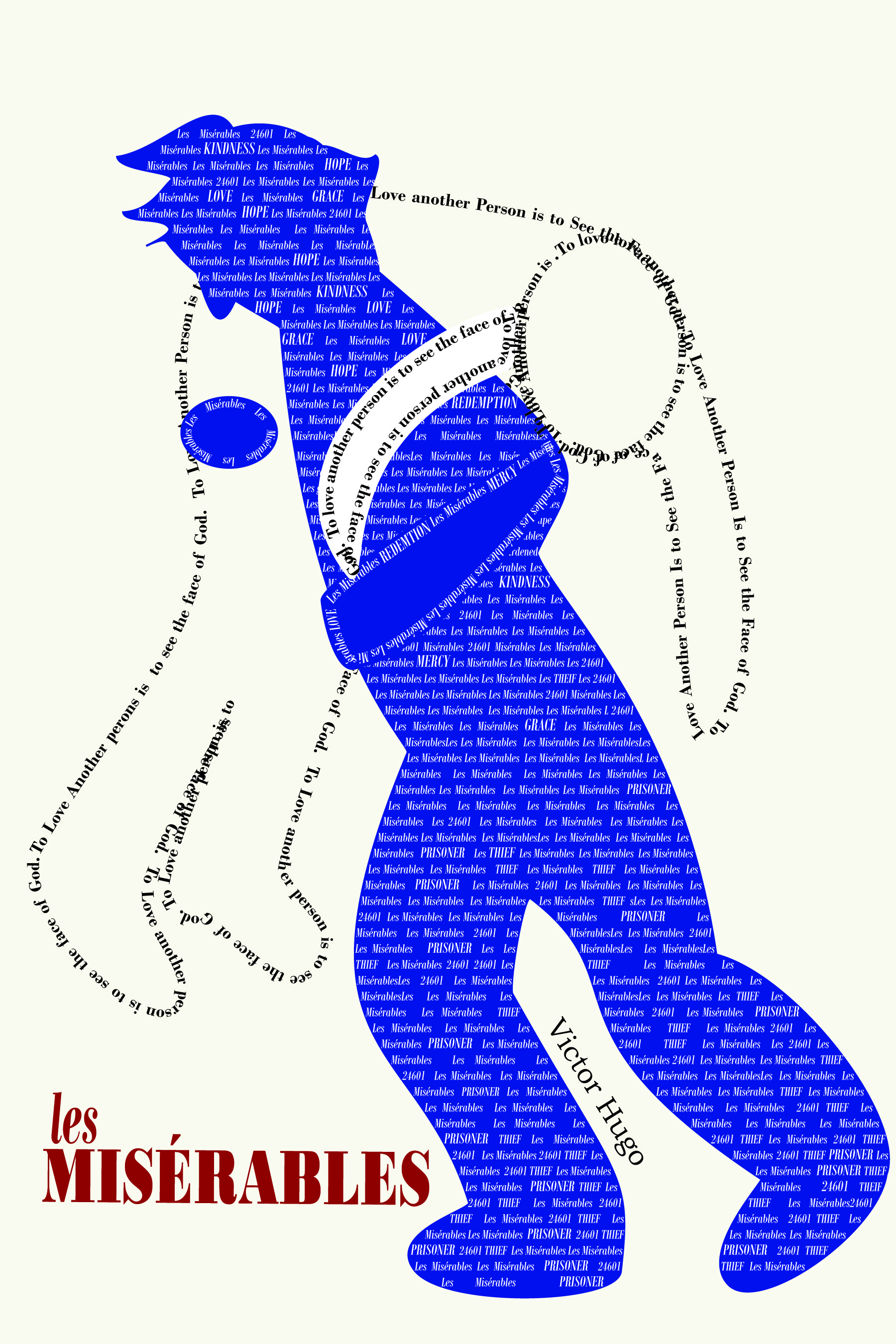
Final Designs
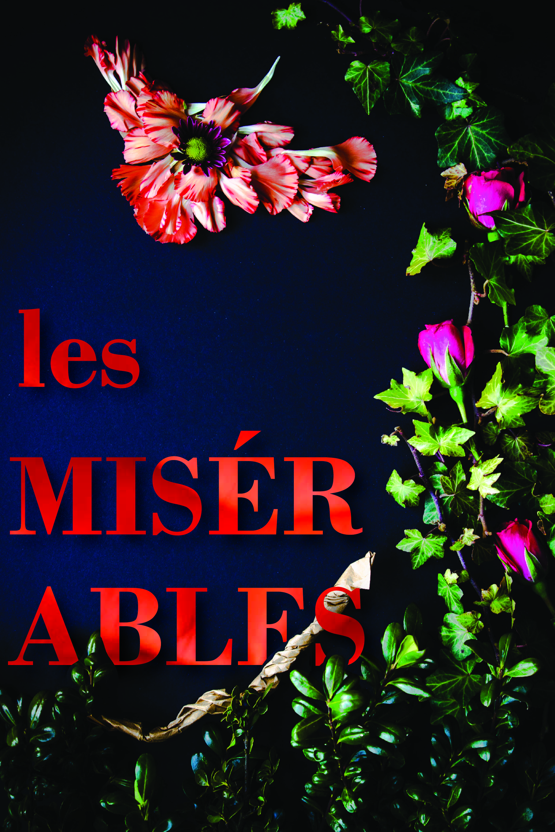
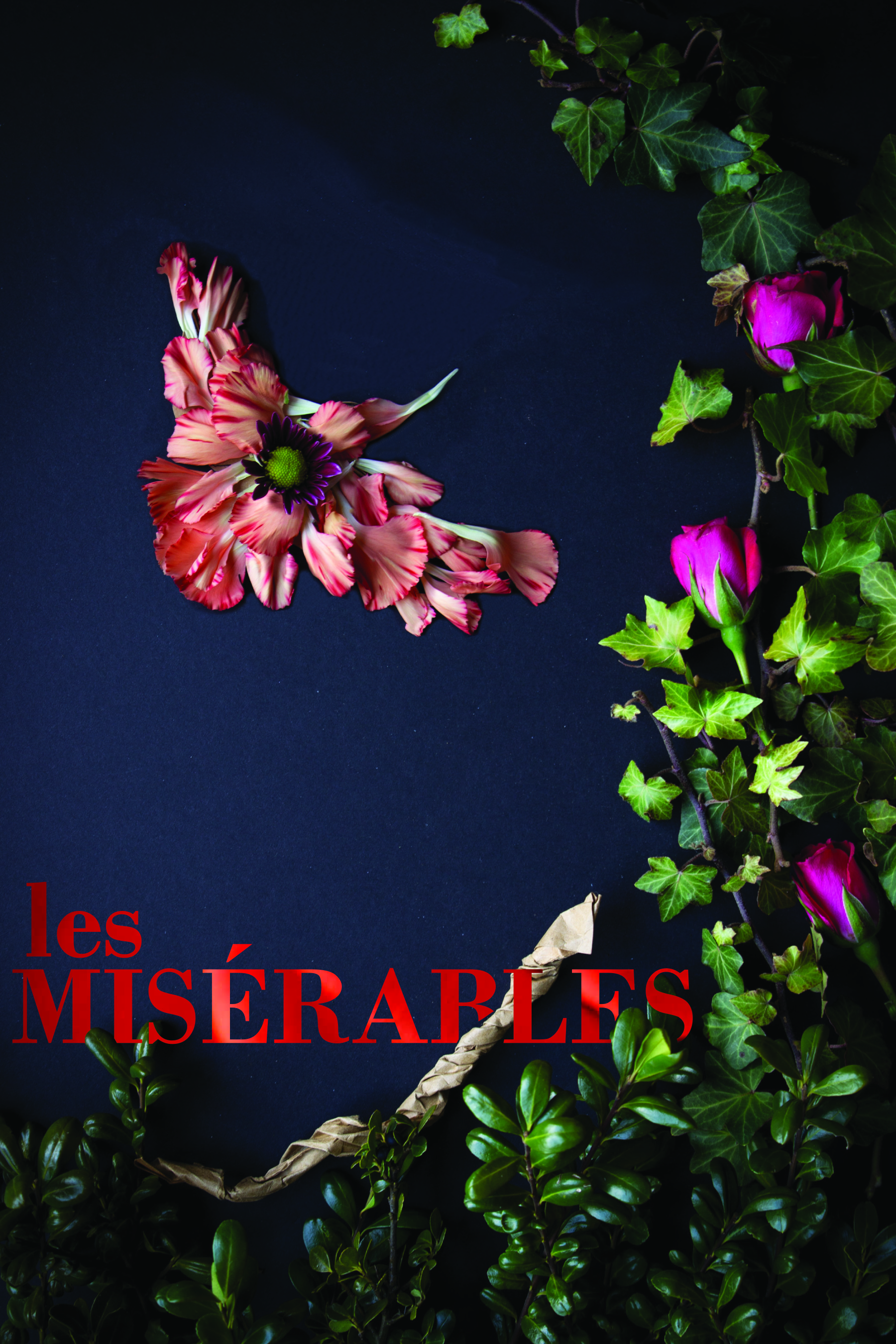
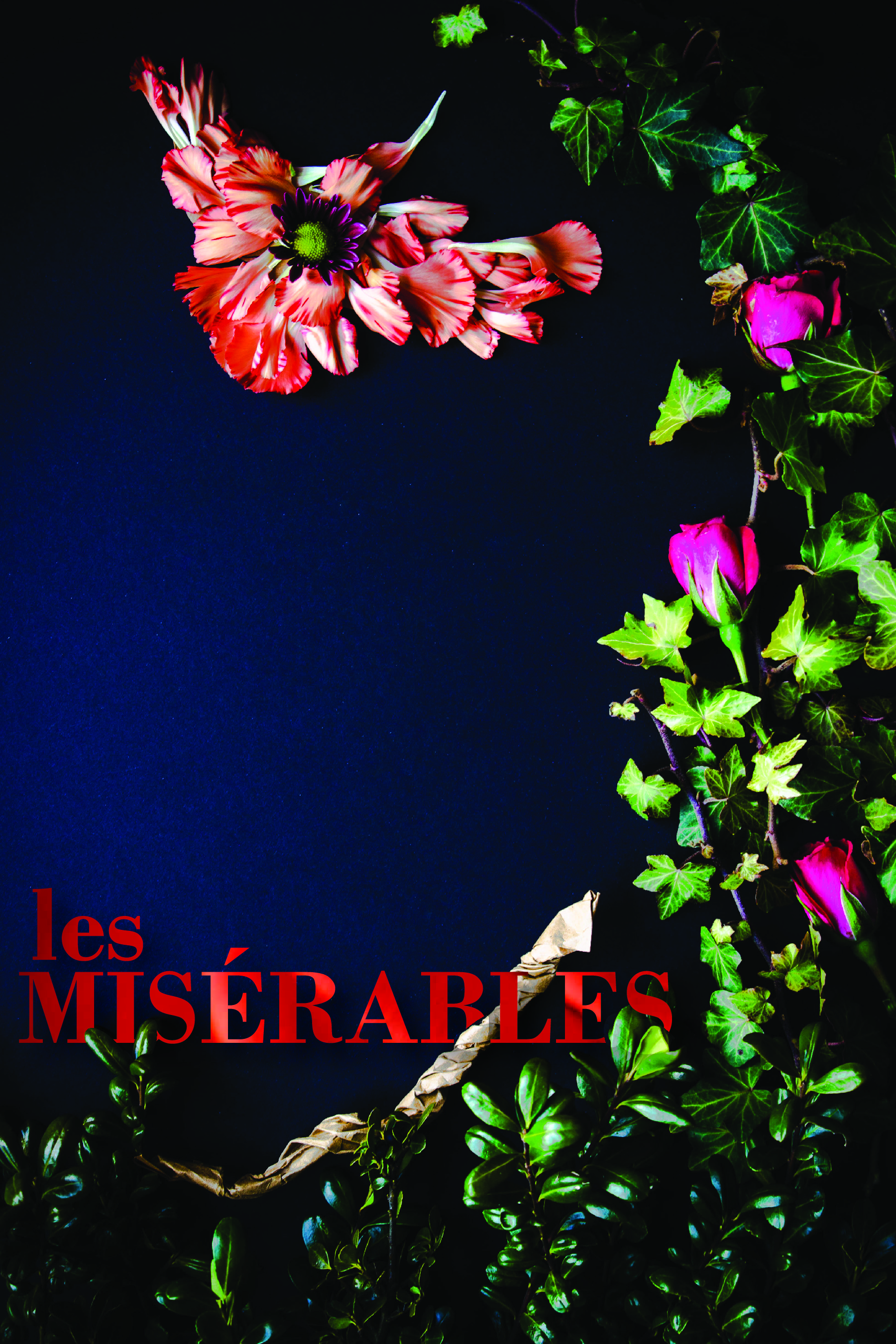
For this first cover, I found two quotes about Cossette by Hugo. In the first one, he describes her as a Lark. I found it interesting that a Lark can’t fully sing until it flies. Then, at another point, Hugo says, “Cosette was not very timid by nature. There flowed in her veins some of the bohemian and the adventuress who runs barefoot. It will be remembered that she was more of a lark than a dove. There was a foundation of wildness and bravery in her.” I used elements from my garden to create the border as well as the bird. I took macro shots of some of the flowers then used them as background for the letters of the font of the title and the author’s name.
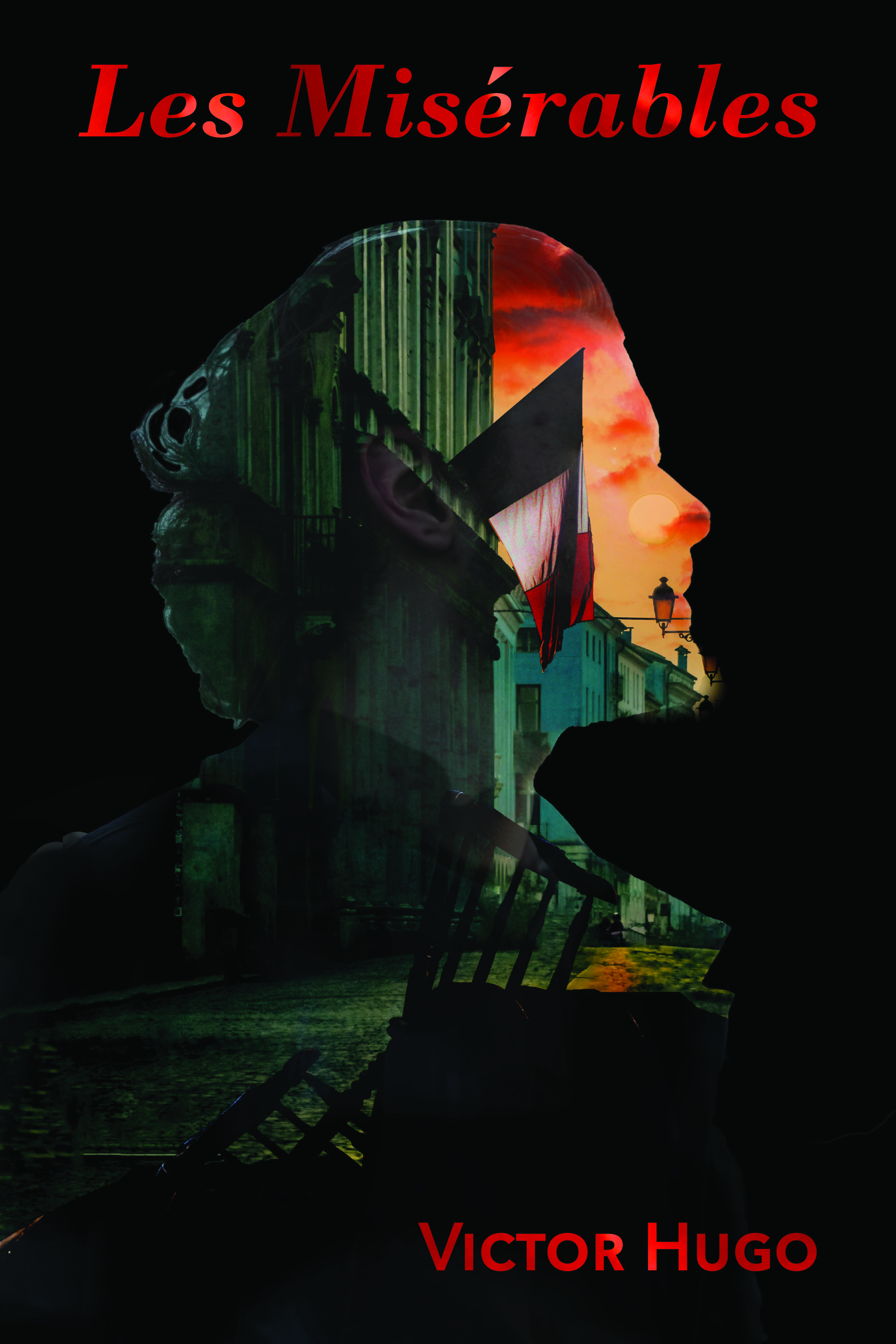
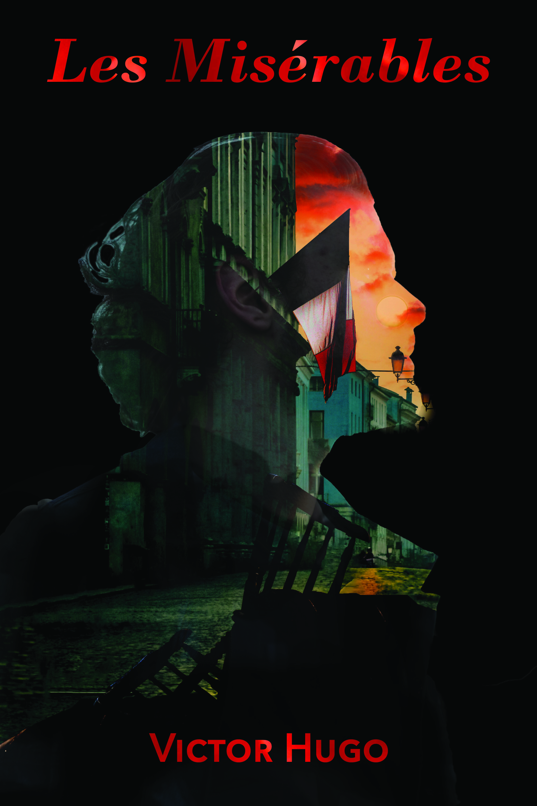
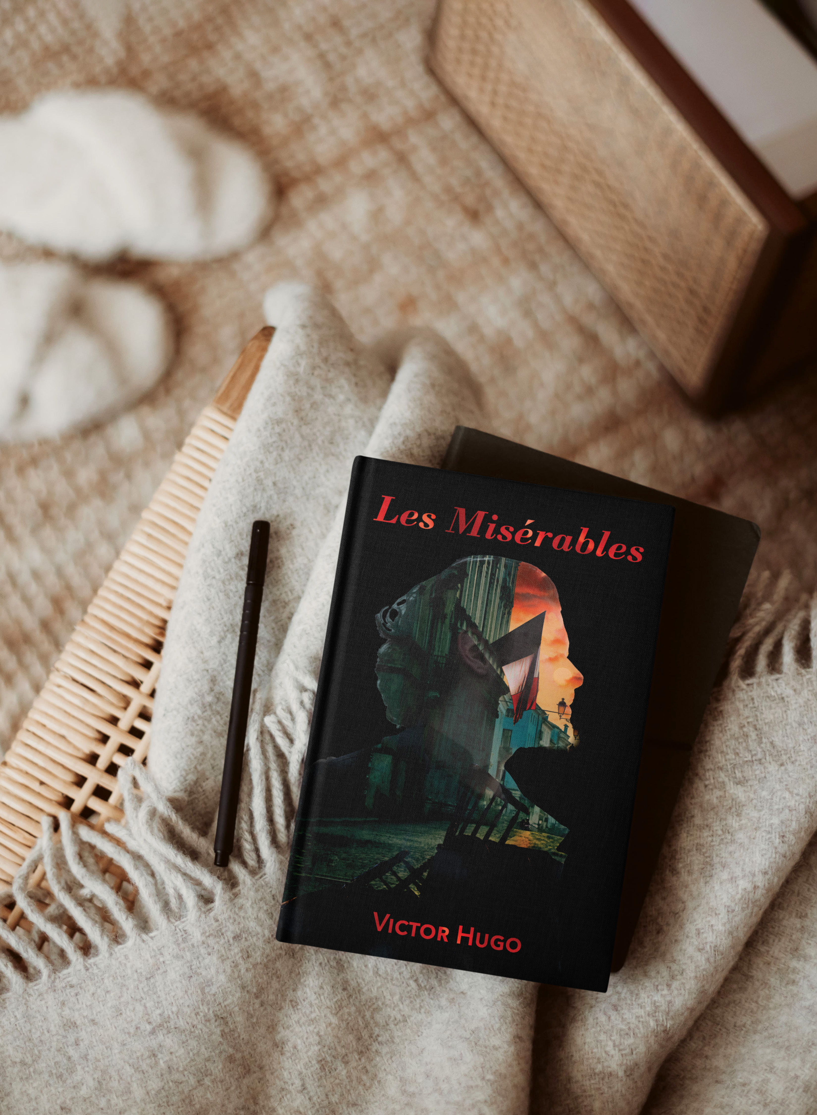
This cover is more traditional and reflects the soldiers at the barricade. They have a vision; a reason they feel they need to go to battle. I needed to create the barricade for this cover and used Photoshop to build it then layered it with the scene behind it. Then I created the double exposure using layer masks.
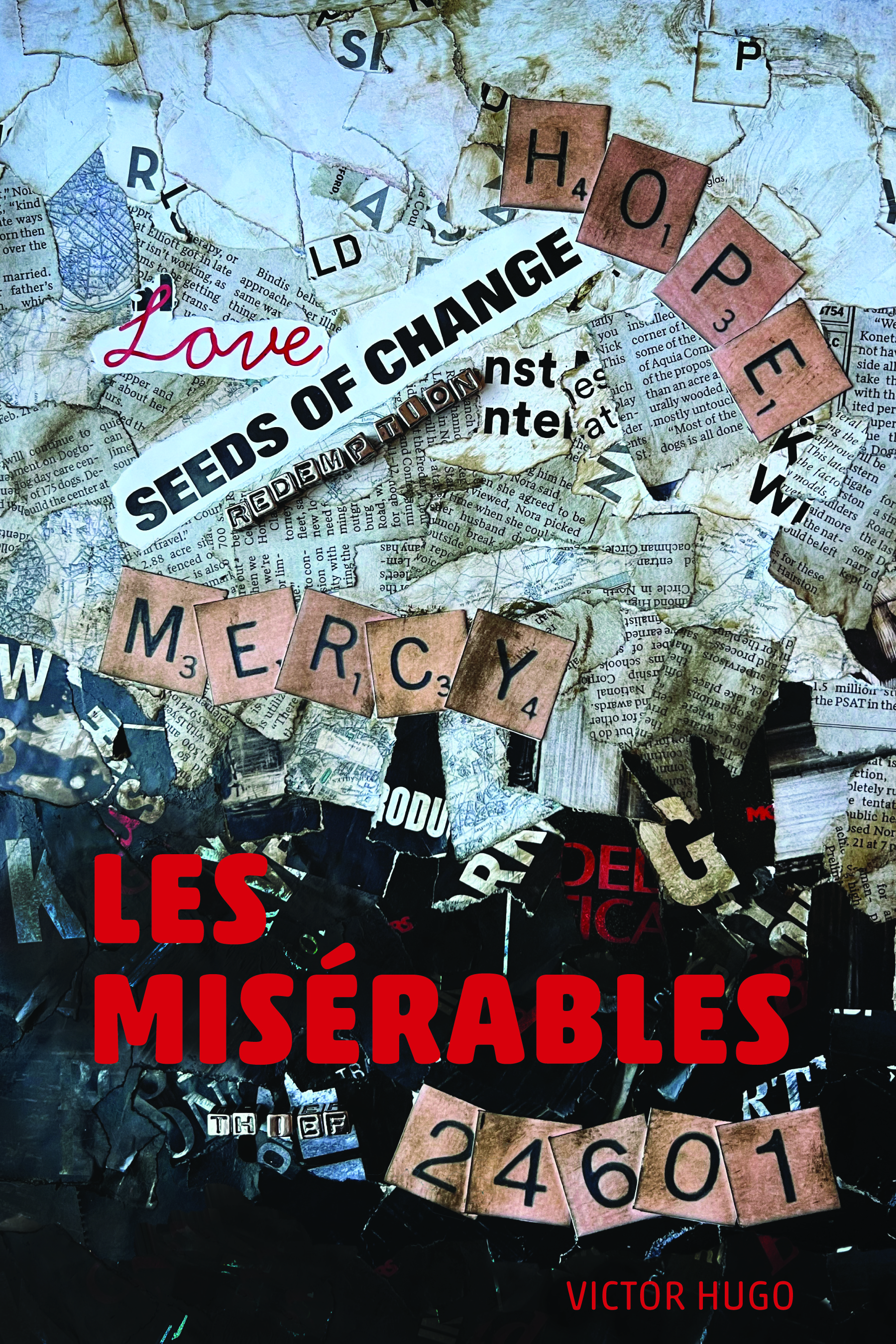
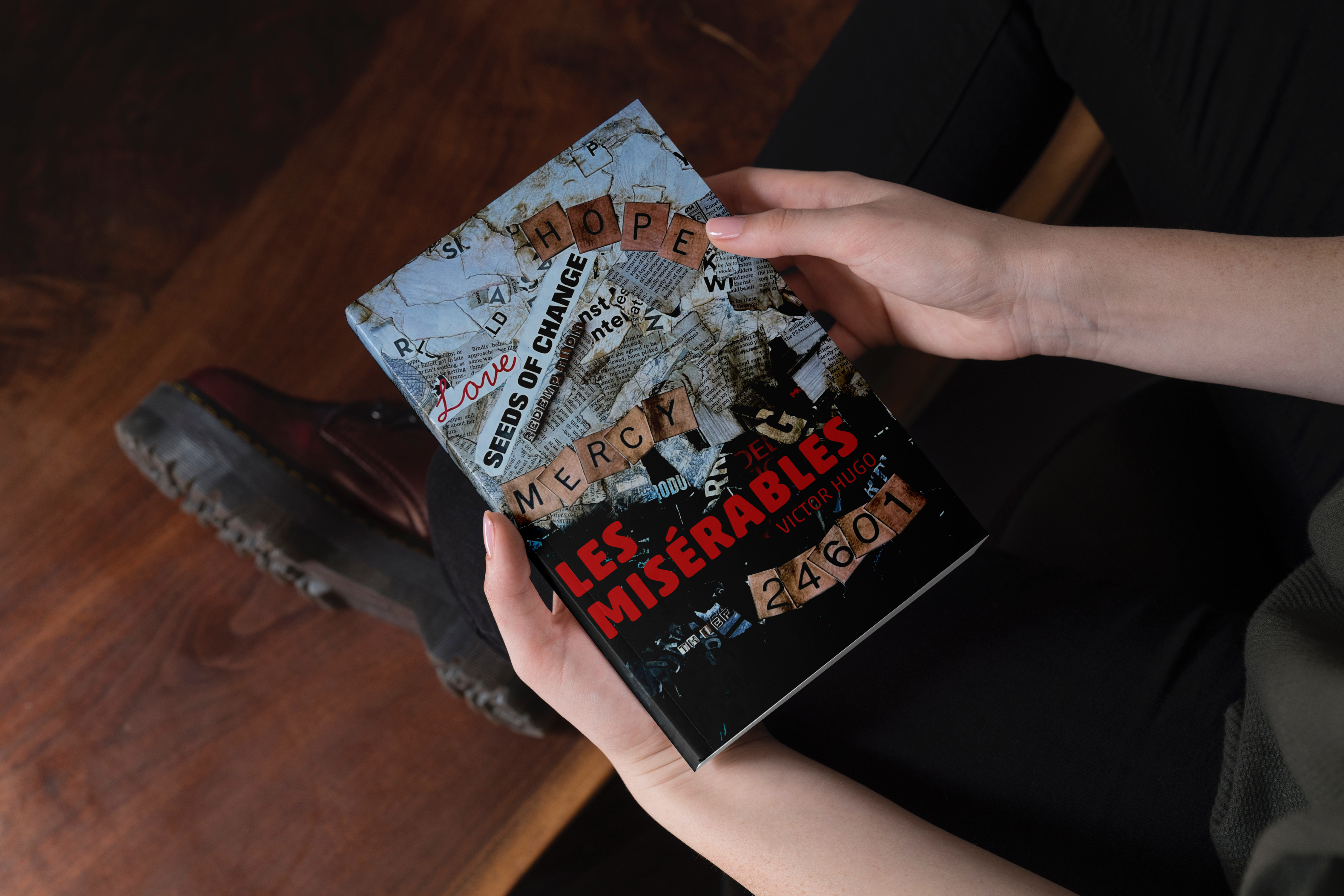
For my typographic cover, I wanted to represent the theme of transformational change that permeates the book, particularly that of Jean Val Jean’s. He begins as a prisoner, a thief, believing that is all he will ever be. He is one of the, “Les Misérables.” Mercy and Love lead to change and hope. In my initial efforts for this cover, I felt my message was getting lost. So, I changed directions completely. I feel the collage captured my intent much more completely.
This project really helped me stretch. I appreciated the critiques I received. They were insightful and helped me improve my designs in my efforts to capture the themes related Les Misérables.
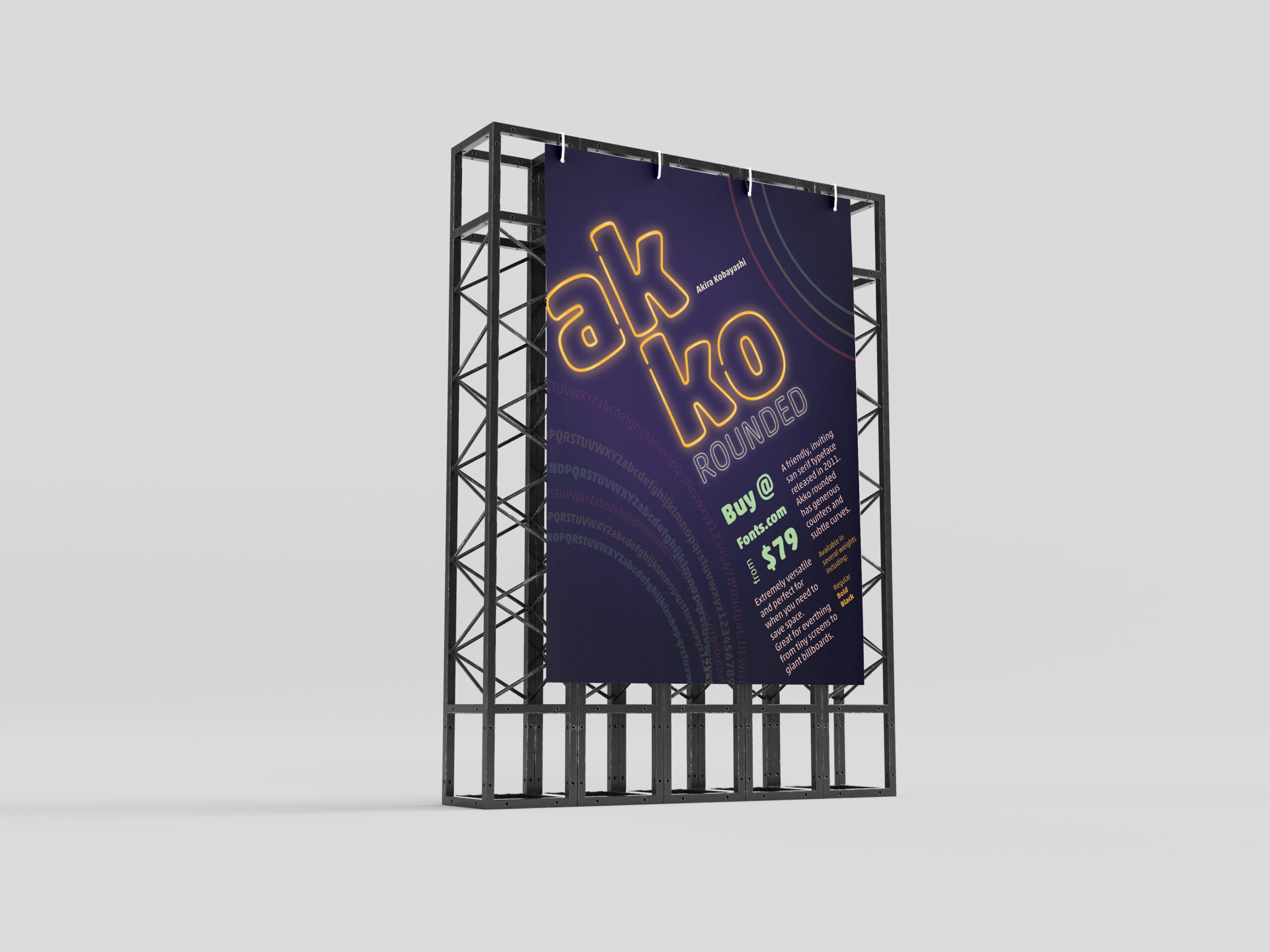
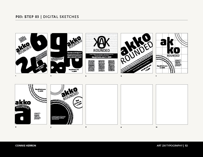
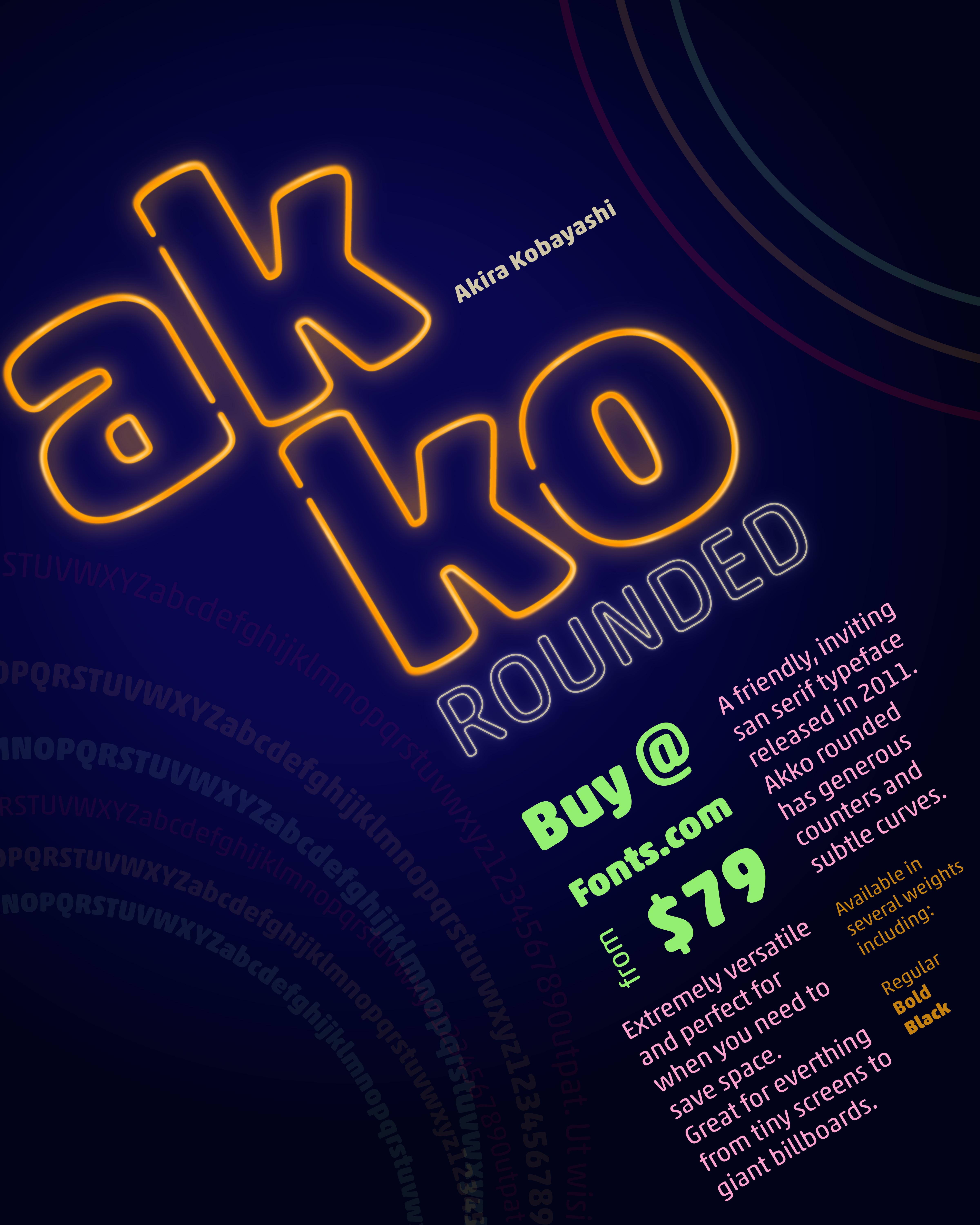
In one of my classes, we were given the task to create a promotional print poster for a typeface for fonts.com. I was assigned Akko Rounded. Akira Kobayashi wanted to design a font that exhibited a “fun, friendly” nature. I wanted to highlight that feeling and the curves of the style of the font in my poster.
Beginning Ideas
As I first started working on ideas, I played with several different ways information could be placed on the poster. I needed to have the name of the font, the designer, cost to purchase it, where to purchase it, the font, and historical background. Focusing on negative space, alignment and overlapping seemed to work the best for as I tried to visualize this. The longer I worked with Akko Rounded the more I felt like I was moving towards designing a poster from the Eighties. So, why not take it that direction as much as possible?
Final Version
I chose a neon pallet for the poster and created a neon effect on the name, “Akko Rounded”. I wanted the rings to feel like they were flashing in the background. I gave the information about where to buy it and the amount the next level in the hierarchy, with its color and placement. The sizes and other details are next in the grid surrounding that information. Then, I placed all of that on the diagonal instead of keeping it vertical to give it visual interest. This is what allowed me to add movement to the circles in the corners. I also used the circles to create some asymmetrical balance by having one be the font weights.
I enjoyed working on this project and with Akko Rounded. It is, as described, a fun and friendly typeface.