Category: History

  • DC on Thanksgiving

    DC on Thanksgiving

    Photo of a pond surrounded by Fall trees in the rain near the Lincoln memorial in Washington DC

    When your niece, from Georgia, will be driving through the area from New York on her way home and plans to stop at the Lincoln Memorial to sing with the group you find a way (you hope) to go see her. Given that I have been sick for most of the month with a cold and (pick a thing), we weren’t sure until the day before that we would be able to get there.

    Photo of Washington Monument  surrounded by golden trees and grass. There is  a man walking towards it on a path in the rain.

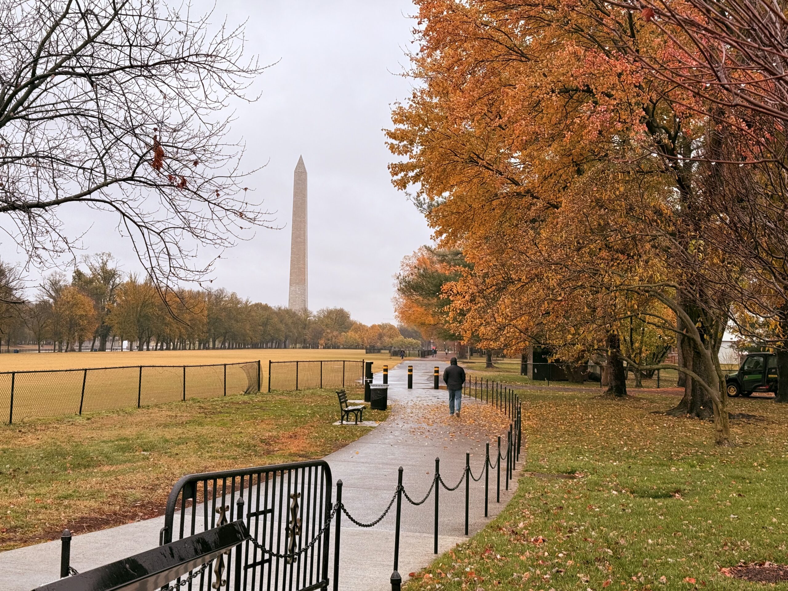
    Of course, it also decided to rain. However, the quality of light and colors change in rain. A few other walkers or runners also taking advantage of the calm lapped us as we slowly walked around the paths. Something about being around all of the memorials on Thanksgiving was particularly moving.

    Photo of the Washington monument surrounded by golden Autumn trees and grass with rain clouds in the background

    The rain meant my niece didn’t get to sing, but I loved that I was able to see her for a moment before they drove down the road towards home.

  • “Design with Communication in Mind”

    “Design with Communication in Mind”

    Vintage Coke Ad

    Coke has been around for a long time and so have their ads. The shape of the bottle, the swish in the type, the color of their logo are all the things they used from the beginning to set their unique brand so that you instantly knew what drink you would want even if you couldn’t read anything in the ad. In this ad from 1947 their iconic emblem is traveling from the futuristic factory right into your hand. The ad is all about communicating to you that you can trust Coke to be a quality drink all the time and you want one. So what principles are they using to do that?

    arrows on the ad showing repetition, proximity and alignment of the bottles in the ad

    Repetition, Proximity & Alignment

    Anything in a design can be repeated to add emphasis. It can be a:

    • word
    • object
    • ruled line
    • color
    • etc.

    In this ad the bottle is the main element repeated. At the time it was the iconic shape associated with their drink and they wanted it instantly recognizable. Other design elements are used with the repeating bottle. They’ve used proximity to make the bottle travel from a futuristic looking factory to you, the customer in way that you could take it right off the page. There are water droplets glistening on the bottle to insinuate that it would be a cold drink on a hot day. The bottles are also aligned so they point at the ward “trust” emphasizing and drawing your eye to the caption.

    Proximity is when related items are grouped together.

    The bottles are grouped together. The creators also repeated the word “quality” and placed them in close proximity, to one another to emphasize it’s importance. They want you to associate quality and trust with the drink and believe that is what you will get every time you buy it. There is one more example of proximity on the page.

    circles on quality showing repetition and proximity
    arrows pointing the red sign and the price on the ad showing proximity

    The price.

    They wanted you to know instantly looking at the page how much it would cost to go get a cold bottle of Coke. The Coke sign, something everyone would have looked for at the time to find where Coke was sold, is right next to the price which is right next to the bottles. All communicating what to look for, how much it would cost and what they want you to want.

    Color & Contrast

    Color and Contrast are the final elements used in the ad. Coke has maintained a brand identity almost from the beginning. The red color with that particular font and swish are part of their trademark look. People also knew look for the green bottle. You can still find it on the shelves.

    Contrast is used with the futuristic factory in the background. During this time mass production was still relatively new and considered the wave of the future. It was during WWII and there was a focus on moving toward a brighter time. The futuristic factory alludes to Coke being a part of that future.

    color and contrast coke ad
    Share a coke ad

    Bringing it Forward

    Coke HAS been around for a long time. In more recent ads they looked to remind people of that. They invoke the feeling of some of their vintage ads, they still have the red color, that swish of the font, and the shape of the bottle is still there. Things like repetition, proximity, color, alignment and contrast can be used not just in a single ad, but across the years to invoke a feeling and create a brand that people instantly recognize.

  • Monday Walkabout: Fredericksburg Street Art

    Monday Walkabout: Fredericksburg Street Art

    Drive over the Chatham Bridge towards Fredericksburg and you will see another fantastic feature of Old Town.  It’s Murals.


    William Street Mural

    This was painted by Mirinda Reynolds, Carol Coffman and a small group of high school students.


    The Warmth of Fredericksburg

    This is one part of 5 panels.  It’s titled “The Warmth of Fredericksburg” and was painted by Jay D. Anderson.


    There are so many things I love about both of these.  The details, the tone, the sentiments.  They’re amazing.

  • Monday Walkabout : Black and White Edition

    Monday Walkabout : Black and White Edition

    Downtown Fredericksburg is an eclectic town filled with historic architecture, tatoo parlors, beautiful murals, antique shops and seriously fantastic food.   And yet, you can still find a place a to park.  Even better!

    I started out this day with a view of the steeple from St. George’s Episcopal Church.    The current structure dates back to 1849 and George Washington attended the congregation in the orginal wooden structure that was on the site on 1738.


    St. Georg's Episcopal Church


    There are plenty of details that add to the charm of oldtown as well.

    Sconces outside shops


    Sconce


    And patios down alleyways.


    Secret Patio


    And ironwork steps


    Ironwork Steps


    There is just so much to explore.

  • Monday Walkabout – Old Town Fredericksburg

    Monday Walkabout – Old Town Fredericksburg

    Fredericksburg, Virginia sits right on the Rappahannock River. George Washington, Mary Washington, James Monroe lived in the area just to name a few.  Then there are the civil war sites.  More than you can shake a stick at, that’s for sure.  Several pivotal battles occured in the area.  At some point, I’ll have to tell you the story of The Sunken Road and the man who crossed enemy lines.  It’s an amazing story.


    Confederate Cemetary


    My walk began at the Confederate Cemetary.  The Civil War is one I hope to never see repeated in the United States again.  I’m always a little quieter when I walk near places like this.


    Cemetary Gate


    From there I went downtown.  I turned a corner as I was walking and this bright blue door practically begged to have it’s picture taken.  I only needed to dodge a few cars to get it, too.


    Bright Blue Door


    Down the road a bit is the Fredericksburg Baptist Church.  It is a beautiful building.  I have a lot of respect for their history and the work they are trying to do.  Part of that history is that the building sustained considerable damage during the Battle of Fredericksburg and while it was used as an army field hospital during the Civil War.

    Today they are a thriving congregation. These purple ribbons represent those who made a commitment to read the Bible with intent.  I LOVE this!


    Purple Ribbons


    Fredericksburg is a fantastic place and I can’t wait to share bits and pieces of it with you.